It used to be that when you added content to a card — files from your laptop or Web content from your Intranet or the Internet, or a canvas — the newest content was added at the top of the list.
Of course, you could always rearrange them, by grabbing and dragging them up or down the list, but this it not a feature that many users discovered on their own :-(
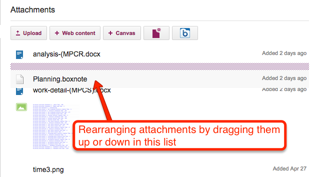
Rearranging attachments on a card
Well, for greater consistency with how the chat and history are shown within a card’s details, we are now going to show attachments in chronological order as well — the latest files and URLs that you added to a card will appear at the bottom of the list, and the view of these will be automatically scrolled to show the latest items:
A new tutorial video, showing you how Kerika’s Chat combines the best of instant messaging and email, and lets you have very focused conversations on your Task Boards, Scrum Boards and Whiteboards:
Animation often gets a bad reputation, and often this reputation is well deserved because too many designers and developers use animation gratuitously: just because they can, or just because they want to show off their technical skills.
At Kerika we have been very cautious about using animation, and have generally restricted its use to scenarios where it can help give users a “sense of place”: providing transitions from one display to another, so that a user has a sense of having journeyed from one part of the system to another.
Animations are particular useful when returning to where you come from: an effective animation can help users understand that they have returned from their journey.
Using animation to unfold drop-down dialogs helps the user understand that the dialogs are literally unfurling on top of the Task Board or Scrum Board: in other words, the user isn’t going anywhere different, just unfolding another display for temporary use.
With our latest version, we added some more animation: now, when you open a card on your Task Board or Scrum Board, it will appear to literally open in front of your eyes.
Animation is also used when you close a card: it appears to collapse in front of you in a way that draws your eye to its position within a crowded column.
This kind of animation, we believe, is useful rather than gratuitous: it helps the user understand what is happening when she opens or closes a card.
(We may consider some other touches of animation where we think it could help provide useful transitions, but we have to be mindful of the performance hit of animations as well…)
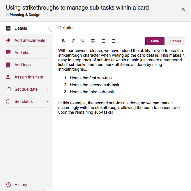
With our latest update, it’s become easy to keep track of sub-tasks for cards on a Task Board or Scrum Board; here’s an example:
Using strikethroughs to keep track of sub-tasks
In the example shown above, the second item in the numbered list has been been taken care of, and so it has been struck-through, making it clear to the rest of the team that it isn’t an issue any more.
We have added the capability of marking text within card details with a strike-through, and this, combined with the easy way in which you can create numbered lists, makes it easy to track sub-tasks!
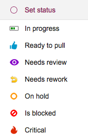
At the time we added “In Progress” as a new status value, we also removed the “Done” status, mostly because the drop-down list of status choices was becoming rather long — and “Done” was not quite like all the other choices that we were presenting for marking a card’s status.
This is what the old choices looked like:
Old status values
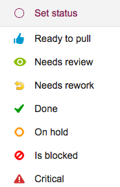
And this is what the new status choices look like:
New icons for status settings
There are two small UI tweaks here that we made:
A purple color is now used for “Needs review” — this previously was green, but green was really the best choice for “In Progress”, and we didn’t want to use the same color for two different states.
The icon for “Critical” has been changed to look like a fire: that’s because we want to reuse the old triangle icon in the future for a great new feature that we are still brainstorming — a way to mark certain cards as “troubled”.
Building a great user experience is rarely the result of big, bold actions: more often it is the cumulative gain of a large number of very small tweaks we make to our user interface design.
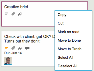
Here’s an example: the right-click menu, when you click on a card on a Task Board or Scrum Board, used to look like this…
Old right click menu
This menu is a little crowded, and one irritating source of errors was that people would sometimes click on one of the Move choices (Move to Done, Move to Trash or Move to Backlog) when they intended to do click on one of the others choices instead.
The irritation came from the fact that these Move operations had a much bigger impact than the others: for example, if you accidentally cut a card, you can reverse that operation by selecting the cut cards once more, which would effectively “undo” the cut.
But, if you move a card to Trash or Backlog, it was a lot more hassle to get it back: you had to make sure the Trash or Backlog was currently being displayed — and in many large boards these columns are routinely hidden from view by the user — and then find and drag that card back to where it was.
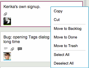
So, here’s our small UI tweak to reduce the chances of this error:
Right-click menu has new styling
A simple visual cue, in the form of grey horizontal separator lines, helps remind the user that some of these right-click mouse operations are “more significant” than others, by creating a visual segregation of these options from others.
A simple UI tweak that helps reduce errors by our users, and one that adds up to a great user experience!
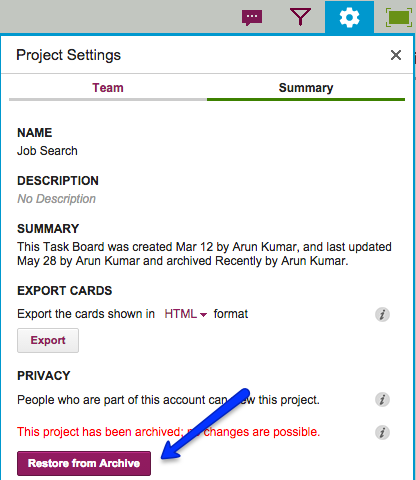
This button is shown only to Account Owners, since the power to archive a project or template, or to restore an archived item, is restricted to the Account Owner.
Every card, on every Kerika Task Board or Scrum Board, contains within it a full history: a log of all the changes that have been made to it.
(A few actions are ignored because they can occur so often, and are often inconsequential, e.g. moving a card up/down within the same column. In contrast, moving a card across columns is considered consequential, and is therefore logged in the card history.)
We recently made a usability improvement in the way the Card History appears: the log of changes is now shown in chronological order, rather than reverse chronological as was the case before.
This makes history look more like chat, and should make it more usable!
(Normally, teams prefer to have just a single Project Leader, but sometimes it is helpful and appropriate to designate more than one person as Project Leader; among other things it provides redundancy, so that the single Project Leader doesn’t become a bottleneck for handling requests.)
Just how active a Project Leader is depends upon the dynamics of the team: in some teams the Project Leader is just an administrative role, filled by someone who is like a Team Member in every other respect in terms of how much work she takes on, while in other teams the role may be more formal.
It turned out there was a bug in how Kerika handled notifications and requests when there were several Project Leaders on a single board: these notifications and requests were getting routed to just one Project Leader instead of all of them, so there was still a potential for having a bottleneck.
With our latest release we have fixed that problem: now, all notifications and requests get routed to all Project Leaders, so any of them could act upon it. This should remove the bottleneck!
When a Team Member deletes a card, it just gets moved to the board’s Trash; it doesn’t get immediately deleted from Kerika’s database even though it disappears from your view right away.
That’s because the “delete” action in Kerika is really a “move to Trash” action: you are removing something from view, but not necessarily getting rid of it for good.
Any Team Member can delete a card, but only a Project Leader can completely and permanently get rid of it — in other words, “taking out the trash” is one of the privileges reserved for Project Leaders (and Account Owners).
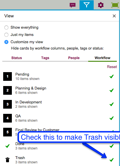
The Trash column is normally not shown on your Task Board or Scrum Board, but you can bring it view easily by clicking on the Filter button:
Making Trash visible
With our latest version, it’s easy to see who moved the card to the Trash: we show this right on the card itself.