Category Archives: Usability

Posts related to product design, user experience and usability

Kerika’s blocks of richly formatted text: an example of “glass box documents”

Our next release will primarily focused around the text block feature, which is turning out to be perhaps the single most popular feature of Kerika.

When we first built Kerika, the ability to put formatted text on Idea Pages was viewed as an incidental feature: we figured that people would want to draw flowcharts, and in doing so they would need to put small bits of text on the canvas to use as labels and markers. Nothing more.

So, we considered a variety of open-source programs that provided HTML editing capabilities for our initial versions of Kerika , before settling on Whyzziwig which appeared to have more functionality than we thought we would ever need…

However, as we started using Kerika ourselves, and talked extensively to our helpful users, we slowly realized that text blocks were a very helpful feature indeed: perhaps the most important feature in Kerika’s bag of tricks.

We have dubbed this the “glassbox documents” phenomenon: if you are sharing user requirements or collaborating on a design, you don’t need the full capabilities that come with Microsoft Word or Google Docs. Instead, what you really need is the ability to quickly write relatively small bits of text, perhaps a few paragraphs long, with a table or some links and pictures, and use these to mark up an Idea Page.

Here’s an example of how we used these text blocks for developing the next version of Kerika, which will contain a hugely improved text block feature:
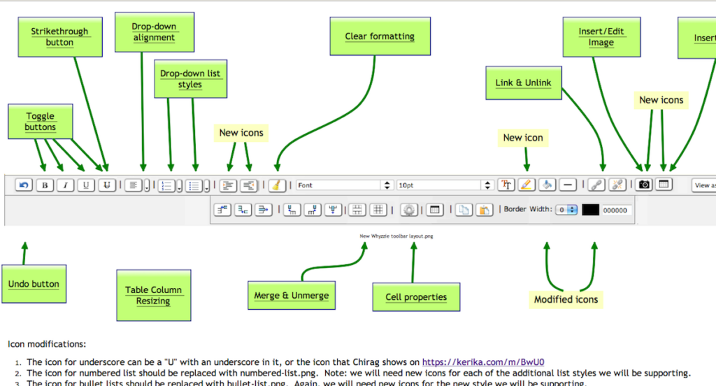
Example of using Kerika to design a user interface


This picture shows an Idea Page that we used to share ideas between the designers, users and developers about how the text block feature could be improved.

  • In the middle of the Idea Page, we have a mockup of a new text block toolbar, to replace the existing Whyzziwig toolbar.
  • Above it are various pages that define the working of each button: inside each of these sub-pages we have small blocks of text that provide the detailed requirements for a particular button, as well as design notes from the developers and test data from the QA team.
  • Towards the bottom you can see a larger text block contain additional notes about the design.

Using text blocks in this manner, to capture and share our ideas and designs, we have reached that ultimate state of perfect collaboration: even though the Kerika team is distributed between Bellevue and Issaquah in Washington State, and Gujarat and New Delhi in India, we have zero emails being sent within the team!

This is the power of a glassbox document: the ability to sharply increase productivity and shared understanding of requirements and design, by putting text directly on an Idea Page instead of hiding it inside a conventional document (which we would call a “blackbox document”).
How to say “Hello, World!” in 1,287 words using Microsoft Word

People using Kerika love the text block feature – the one that lets you create richly formatted text blocks on a Kerika page that contain pictures, tables, lists and links – but all too often they try to create these text blocks by copying and pasting text from a Microsoft Word document.

The problem with doing this is that Microsoft Word produces a gigantic amount of HTML junk, even with the simplest text.

Here’s an example: create a new Microsoft Word document and type in the words “Hello, World!”. That’s it: just two words, a total of 13 characters including spaces and punctuation, using your default font. Nothing fancy – no colors, bold or italics, no lists, nothing at all. Just two words.

Now try to copy and paste this text into something that will display the HTML generated by Microsoft Word. One option is to paste this text into a Kerika text block, and then use the “View as HTML” option to see all the HTML that comes with these two words, but we will be temporarily removing the “View as HTML” feature in our next version as part of our rewrite of the text block feature. (More on that later…)

You will find that Microsoft Word produces an astonishing 1,287 words, which add up to 18,008 characters of HTML, just to represent a total of 13 characters of content. In other words, your simple bit of Microsoft Word text exploded by a factor of 1,385.

(If you look at the HTML, you can see, of course, that this expansion factor doesn’t stay constant: a lot of the HTML is simply a dump of a lot of styling information that wouldn’t change proportionately as you increased the size of the original Microsoft Word content, but still…!)

Here’s how you can say “Hello, World!” using 1,287 word of HTML:

Not so smart money: how to produce a Web page with just 15% content

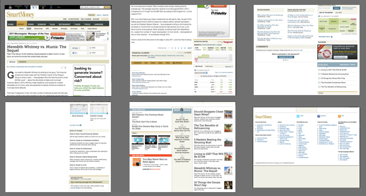
Smartmoney.com, the personal finance website that is owned by Dow Jones (i.e. by Rupert Murdoch’s News Corp.) offers a singular example of how one can design a website so that chrome, fluff and advertising overwhelms the content.

Here are some screenshots from a single page of a SmartMoney article today: we needed 6 screenshots to show you the page because it is around 3,900 pixels in height.

Screen captures of a single Smartmoney.com page

One might assume that a page that long would be filled with content, but in fact, it is filled with advertising, page design elements (also known as “chrome”), links to various News Corp services and other pages (i.e. “fluff”), and even just blank screen space.

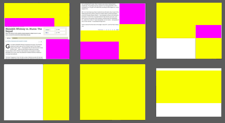
To get a better idea of just how much crap there is on this screen, consider this color coding of the page, with purple denoting advertising, yellow denoting chrome or other fluff, and white indicating blank screen space:

The same Smartmoney.com page, color-coded to show what it contains

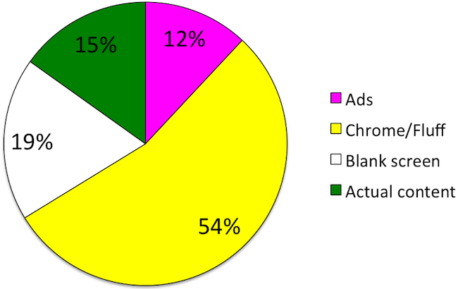
You can see at a glance just how little of the page is actually devoted to the article. In fact, by counting pixels we figured that just 15% of the page is devoted to the article:

Pie chart showing composition of Smarmoney.com article
What's on this single Smartmoney.com page

This is not entirely accidental, of course: Smartmoney.com relies upon advertising, so it will try to stretch out an article over multiple pages so that it can show you more advertising as you plow through page after page.

(This particular article has been stretched over 6 separate Smartmoney.com pages, each of which contains the same pitiful 15%, or even less, of pixels devoted to actual content.)

Yet, even if advertising is the laudable goal here, one simply can’t overlook the bad page design: the largest component of this page (54%) is either page decoration or other fluff – a desperate attempt to get people to stay on the site. And considering that more than half of the crap is “below the fold”, why would Smartmoney.com even expect users to wade through it?

Googleusercontent.com can trip you up, if you disable third-party cookies

Most browsers allow third-party cookies, by default. And, most of the time, these cookies are used by advertising networks to track users as they move across different websites.

Some folks take the trouble of disabling third-party cookies, which can be done using your browser’s “Preferences” settings: the actual mechanism varies based upon which browser you are using.

If you do turn off third-party cookies, you may find that images that you upload to your Kerika pages do not appear correctly. That’s because all files that you upload to your Kerika pages are stored in your own Google account, so when you are viewing a Kerika project page, some of that content is coming from your Google Docs account.

Recently, Google has started storing images in a new domain, called googleusercontent.com. This domain is used for a variety of purposes, including cached copies of websites visited by the Google search engine, but the general purpose of this domain appears to be to store static content: i.e. content that is not expected to change.

So, if you have turned off third-party cookies in your browser, you may find that images are not shown when you visit your Kerika page. And, the whole process may be something of a mystery to you, although our latest version includes a new warning message when we detect that this problem might exist.

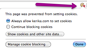
It’s easiest to spot this problem if you are using the Google Chrome browser because that shows you, at the far right end of the address bar, that there is a potential problem with cookies on the page you are currently viewing. Here’s an example:

Cookie warning from Google Chrome

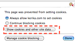
The address bar shows a broken cookie image, and when you click on that cookie image you get a dialog box that tells your page is having problems with cookies. When you see this, click on the “Show cookies and other site data…” button

Click on this button

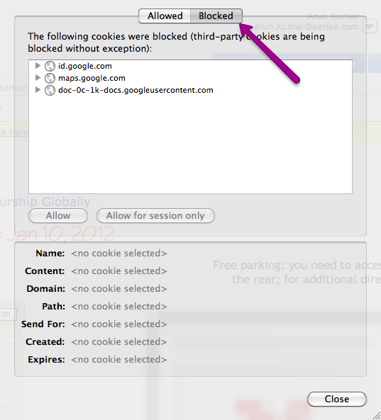
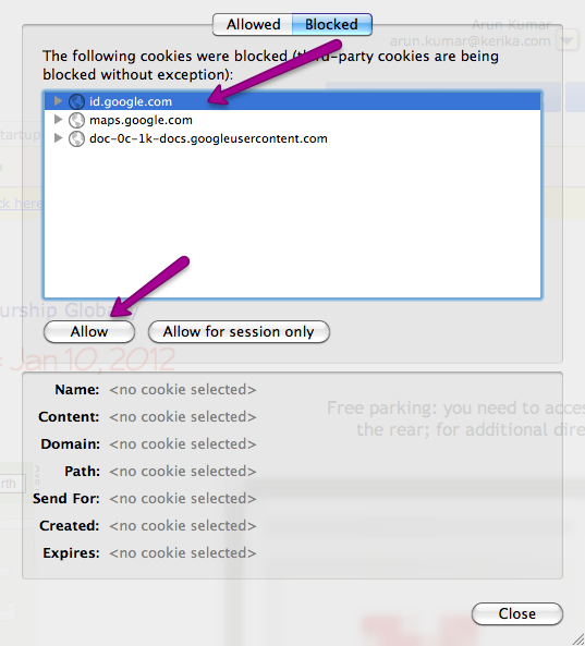
And this will then show you details of the cookies that are being allowed, and the ones that are being blocked:

Blocked cookies
Blocked cookies

You need to allow cookies from googleusercontent.com in order for your images to show up correctly on your Kerika pages.

Unblocking individual cookies

However, the problem with googleusercontent.com may not end here: when you enable cookies from somewhere.googleusercontent.com, you are only permitting cookies from that particular sub-domain! In the example above, we are allowing cookies from doc-0k-0c-docs.googleusercontent.com.

Allowing cookies from somewhere.googleusercontent.com doesn’t mean that you have also allowed cookies from somewhere-else.googleusercontent.com: in other words, allowing cookies from one sub-domain of googleusercontent.com doesn’t automatically mean you are allowing cookies from all other sub-domains of googleusercontent.com.

And this can cause repeated problems when you are using Kerika, because when you upload images to your Kerika page, Google may place these on entirely different sub-domains of googleusercontent.com. We have no control over which sub-domain Google chooses at any point, so you could have one page show images correctly – after you have permitted cookies from that sub-domain – and another sub-domain get blocked when you navigate to another Kerika page, even a page that’s part of the same Kerika project.

It’s a tricky problem, and the solution doesn’t lie in our hands since it is entirely up to Google as to where they choose to store your documents within the hundreds of domains and the thousands of sub-domains that they control. The easiest bet, of course, is to allow third-party cookies – which you may already be doing, unless you have changed your browser defaults – but if that’s not acceptable to you, you might want to look at using the Chrome browser and watching out for that broken cookie image in your address bar.

UPDATED NOV 11, 2016:

A reader, Carey Dessaix from Australia, offers a better solution to just allowing all third-party cookies:

Adding “[*.]googleusercontent.com” is a solution.

Just go to Chrome settings > Advanced Settings > Privacy > Content settings.

Click “Manage exceptions” and add the following as allowed which will allow allow subdomains including the actual domain as well.

[*.]googleusercontent.com

(Thanks, Carey!)

Big improvements in usability with our latest version!

We rolled out our latest version over the weekend, and it features some big improvements in usability. As usual, feedback has come in from all sources, and is always welcome, but for this particular version we need to acknowledge the particular contributions of Alexander Caskey, Barry Smith, Seaton Gras, Andrew Burns, and Travis Woo.

We were able to incorporate most of the improvements that were identified, although one significant one couldn’t make it in this particular release. (That’s to do with providing a project-centric view, and we will talk about that in a separate blog post.)

So, here’s the bundle of goodness that is Kerika today:

  1. There are fewer buttons on the Toolbar, and we have made them more clearly visible.
  2. We combined the old Team and Share buttons into a single Share! button, since “sharing” and “managing a team” are very closely related activities.
  3. We have also dropped the old Join! button that let people ask to join projects owned by other users. This button apparently had little practical use, and dropping it helped simplify the overall user interface.
  4. The Preferences button has been moved: it is now part of the “Manage Account” drop-down menu. We have also implemented something we call “implied preferences”: now, when you set a particular style preference, such as a font style or color, Kerika assumes that this is your new preference going forward (until you change it something new in the future).
  5. We simplified the user interface by completely hiding buttons and menu options that are unavailable. For example, if you are viewing a page where you don’t have permission to make changes, the drawing toolbar on the left disappears.
  6. We have made some extensive improvements to the formatted text feature (the one that you access with by pressing the “T” button on the drawing toolbar). When you are creating or modifying a block of formatted text, the toolbar for this now appears above the canvas area, where it doesn’t get in your way, and the drawing toolbar is temporarily hidden.
  7. We have hugely expanded the selection of fonts and colors that are available, and made it much easier to change the appearance of several items on a page at the same time.
  8. A “help bar” appears when you are viewing an account to help guide you.
  9. We have added more pricing levels to support smaller teams.
  10. We have made numerous fixes to the feature that produces snapshots (thumbnail pictures) of your project pages. We got most of the kinks out; there are a small handful that we are working on this week.

We will be continuing to work on usability: over the next several weeks we will be making some changes to support a “project-oriented view” for you, as well as improvements that will make Kerika more tablet-friendly.

Why it took so long to get the Back Button working

We finally got the browser Back button working (along with the keyboard backspace key) to help you navigate back and forwards through your Kerika pages and other websites that you may be browsing at the same time.

You might be wondering why it took so long; after all, the Back button has existed in browser since the very beginning, and “breaking the Back button” is one of Jakob Nielsen‘s cardinal sins of Web usability.

The story is somewhat complicated, and it helps to understand two critical features of Kerika:

  • Kerika lets you have multiple projects open at any time, each within its own tab. In other words, Kerika lets you create tabs within a browser tab. Since all of these Kerika tabs are within a single browser tab, in some sense they all share the same URL as far as the browser is concerned. This makes things tricky for us, since each Kerika page actually has its own unique URL. So, how can we map several URLs, for several Kerika pages, to a single browser tab? Hmm…
  • Kerika offers super-fast updates when somebody on your project team makes a change to a project page that you are viewing: we aim for sub-second responsiveness in terms of letting you know that something has changed in your project. You don’t get that kind of speed using AJAX, which is what most people think means “real-time Web”. (That’s just so Web 2.0…) Instead, we use a newer technology called Comet, which is based upon the concept of “long polling”.

These constraints made it tricky for us to get the Back button working: we had to be able to “load” the browser’s Back button with a new URL every time you switch between Kerika tabs, and we had to do this fast enough to not compromise our exacting standards for delivering real-time performance.

We were finally able to do this because modern browsers are now offering Web applications easier ways to load the Back button stack in each browser tab. This is relatively new, and now supported across enough modern browsers for us to be able to offer this (seemingly routine) feature!

A major new release: snapshots of pages within pages!

The latest version of Kerika, hot off the presses, contains our biggest innovation yet: if you have pages contained within pages, these will now show up as small snapshots.

Here’s an example of a set of projects, as viewed from the My Projects page of an Account:

A thumbnail view of a project page

Projects can now be viewed as little thumbnails: this lets you see, at a glance, what’s inside a particular project!

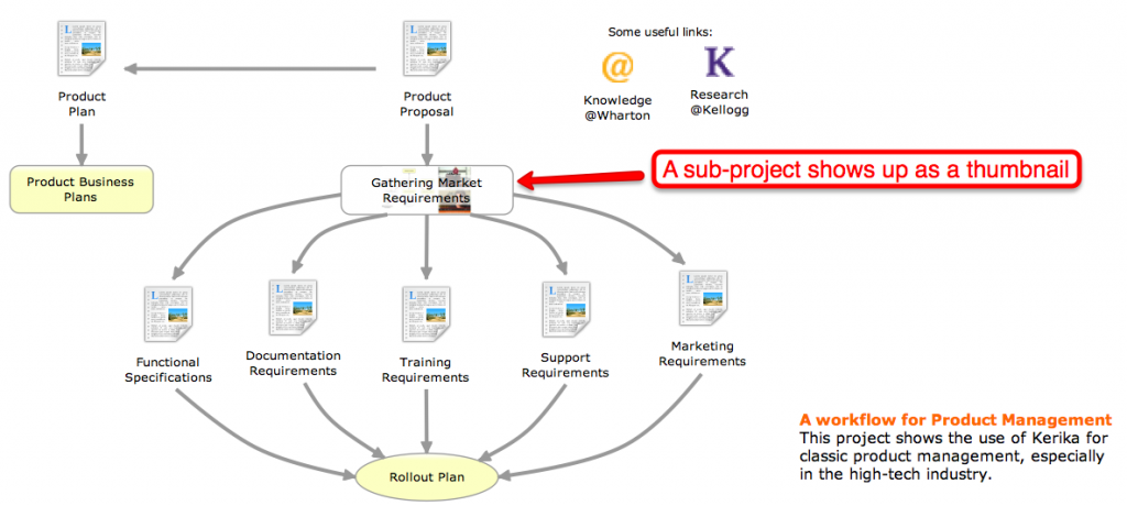
This feature extends all the way inside a project that consists of a series of nested pages. Take, for example, the Product Management page shown above: if you open it up, you will see that it contains some sub-projects within it, and these sub-projects – which have their own pages – can also be viewed as thumbnails:

A subproject also shows up as a thumbnail

This feature is probably the coolest innovation ever! It took a really long time for us to build, since we were working on this while doing all the other usability improvements, bug fixes and new features we have delivered over the past few months, and we think it will improve the overall usability of Kerika in a very big way.

There are all sorts of side-benefits to this feature:

  • Now, you can upload a snapshot of the project to LinkedIn and Facebook along with your comments; the picture will contain a live link to your project.
  • We have made it possible for you to embed a snapshot of a Kerika page in your own website or blog, using the Share! button that’s now more powerful than ever.

These snapshots of pages are automatically updated whenever a member of your project team makes a change to the project: we wait a couple of minutes after the last change has been made before producing a new snapshot to avoids sending you a flurry of new images.

There are also two new ways for you to embed either a Kerika page, which you can use as a regular website page, or the entire Kerika application, in your own website or blog. (This is a big enough topic to deserve it’s own blog post.)

And there’s more to our latest version!

  • You can see the page URL of any project at any time (unless you are using Internet Explorer which continues to lag in its support for the HTML5 standard.)
  • When you upload documents to a project page, they are now stored in your own Google Docs account, not the Google Docs account of the Project Leader. This is a big change, but one that was necessary to allow the use of the same document in multiple projects. Previously, we passed ownership of the document to the Project Leader, but this meant that ownership could pass through several people’s hands if the same document was used in multiple projects.
  • The browser’s Back button (and the keyboard backspace key) work now! Yeah, it took us a while to get this working, but there were some serious hurdles that we had to overcome first, relating to the way different browsers support HTML5. More on this in a subsequent blog post.
  • We have added a new diamond shape to help you draw flowcharts. We are not keen to add a lot of shapes; we want to keep the Kerika user interface clean and uncluttered, but we felt that a diamond shape could really help with flowcharts so we have added our first new shape in six months!
  • Pages now automatically refresh if the application detects that there was a problem connecting to the server. The old dialog box that used to pop-up asking you to refresh your browser – which we found as annoying as you did – has gone away.
  • You can now add a Twitter feed to a page by just providing “@name” as the URL. Adding Twitter feeds to Kerika pages is becoming more popular with our users, so we made the process of using the Magic Plus button simpler: just enter “@kerika”, for example, when you use the Magic Plus button to add content from the Internet and you will get our Twitter feed added to your Kerika page.
  • Speaking of which, the Magic Plus button got even more magicky: now you can add content from dozens of third-party sources to a Kerika page. (You can see a handful of them listed on our website, but don’t be shy: just add any kind of URL and see if Kerika can’t automagically figure out how best to show it on your project pages.)

We also spent some time improving our text blocks, after seeing just how popular this feature was becoming with our users:

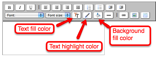
  • We have better icons for the buttons; the old ones weren’t as intuitive as they could have been.
  • We have added a new background fill color so that you can have even fancier text blocks.
The text block feature has better buttons and a new background fill color capability

We have done a ton of usability improvements and bug fixes, as usual, and we will continue to do so in the future…

  • One usability improvement was to “undo” a previous improvement: we had made a change in our last version that we thought was a good idea, but it turned out that everyone liked it, even us, so we have taken that out. Now, when you resize an item on your page using the grab handles, the item resizes in just one direction rather than in all directions.
  • We made it easier to add large (high-resolution) pictures to your Kerika pages. Previously, high-res pictures would appear initially with full resolution and crowd out everything on the canvas. Now, pictures appear with a maximum initial size of 640×480 pixels, and you can, of course, resize it to be larger if you like.

Finally, we have revamped our website completely and would love to get your feedback. We are featuring sample projects on our home page, and the Example pages.

We want to feature your work on our site! Create projects that are open to the public, that show your skills and share your knowledge, that related to open-source, advocacy, political action, interests in hobbies and sports… It’s all good.

The “S” stands for Siri, for speech.

Apple just announced a new platform and nobody noticed.

Far too much of the commentary from Wall Street about the launch of the iPhone 4S has been superficial, focusing on the fact that it is a “4S” and not a “5”. Why, oh why, wail the analysts, couldn’t Apple just have called it the iPhone 5 and made everyone happy?

This misses a rather big point about the iPhone 4S: the “S” may ostensibly stand for “speed”, since the new phones have a faster processor, but in our opinion the “S” really stands for Siri, as in “speech”.

OK, so we don’t have our hands on a real iPhone either, which means we are guessing, too, and using the very limited collection of videos and demos that are publicly available for our guesswork/analysis, the most extensive of which is Apple’s own promotional video.

This promo video, however, does provide a very good indicator of the vast potential of the new speech platform that Apple has just launched. Yes, there’s a whole new platform for personal computing out there now, thanks to Siri, and it’s not just limited to iPhones.

Siri is more than speech processing: it is an impressive attempt to bring interactive voice response (IVR) to the masses in a way that does not immediately induce rage against the machine. There are two major innovations with Siri, only one of which has gotten any real attention:

  • There is the AI needed to understand the user’s speech and translate the nouns, verbs and indirect references (like “this weekend”) into API calls, and here Siri promises to be a considerable leap forward from the kind of hugely annoying systems we all accustomed to dealing with when we call our bank or insurance company.
    There is also the AI needed to generate voice output from the system, and here Siri looks like it could do with some work, particularly if it is to sound less synthetic.
  • The far more impressive work is the Siri’s integration with the calendar, email, Google Maps and iTunes programs, as well as external web services like weather.com. This is the new platform that just got launched: the integration of a speech interface to all personal computing devices: not just phones, but also tablets, laptops and TVs.

The iPhone 4S will debut with Siri working seamlessly with mail, calendar, Google Maps, SMS, weather, and basic Web searches. But this is just the start: what Siri does today is similar to what the iPhone 1 did on the day it launched, when it came with a handful of standard applications for email, calendar, SMS, weather and basic Web searches. (Hmm… sound familiar?)

If the iPhone 1 was impressive right out the box, before hundreds of thousands of applications had been written for it, imagine what the Siri platform will be like when there are hundreds of thousands of existing applications and software packages that support a speech interface.

Apple has launched what they hope with be the speech platform for personal computing. Sooner than we developers would like, we will have to start supporting a speech interface to our personal computing applications, and it will have to be a much smarter interface than anything that came before.

If Apple succeeds in making the Siri interface a de facto standard, they will own a fundamental platform technology that would make Bill Gates envious.

Our latest version, and then some!

In the immortal words of Jim Anchower: “Hola, amigos. I know it’s been a long time since I rapped at ya.”

Our apologies for not posting blog entries for a while, but we have the usual excuse for that, and this time it’s true: “We’ve been incredibly busy building great software!” It’s going to be hard to summarize all the work that we have done since June, but let’s give it a shot:

  1. We have curved lines now. And not just any old curved lines, but the most flexible and easy to use drawing program that you are likely to encounter anywhere. You can take a line and bend it in as many ways as you like, and – this is the kicker – straighten it out as easily as you bent it in the first place. There’s a quick demo video on YouTube that you should check out.
  2. We have greatly improved the text blocks feature of Kerika. The toolbar looks better on all browsers now (Safari and Chrome used to make it look all scrunched up before), and we have added some cool features like using it to add an image to your Kerika page that’s a link to another website. (So you could, for example, add a logo for a company to your Kerika page and have that be a link to your company’s website.) Check out the nifty tutorial on YouTube on text blocks.
  3. You can set your styling preferences: colors, fonts, lines, etc. Previously, all the drawing you did on your Kerika pages was with just one set of colors, fonts, etc., but now you can set your own styling preferences, with a new button, and also adjust the appearance of individual items.
  4. We have improved the whole Invitations & Requests process. Now, when you invite people to join your projects, the emails that get sent out are much better looking and much more helpful, and the same goes for requests that come to you from people who want to join your projects, or change their roles in your projects. Check out this quick tutorial on how invitations and requests work.
  5. We have made it easier for you to personalize your Account. You can add a picture and your own company logo, which means that when you use Kerika your users see your logo, not ours! Check out this quick tutorial on how to personalize your Account.
  6. We have hugely increased the kinds of third-party content you can embed on your Kerika pages. The list is so long, we really should put that in a separate blog post. We have gone way beyond YouTube videos now; we are talking about all the major video sites (Vimeo, etc.), Hulu, Google Maps, Scribd and Slideshare… The mind boggles.
  7. Full screen view of projects. There’s a little button now, at the top-right corner of the Kerika canvas: click on it and you will go into full-screen mode, where the canvas takes up all the space and all the toolbars disappear. This makes it easy to surf pages that contain lots of content, or work more easily with your Google Docs.
  8. Full support for Internet Explorer 9 (IE9). Not as easy as you might think, given that Microsoft has historically gone their own way, but we have sweated the details and now Kerika works great with IE9. As Microsoft continues to converge around common standards, this should get easier for us over time.
  9. Full support for all desktop platforms. OK, so this isn’t really a new feature, but since we are bragging we might as well emphasize that Kerika works, and is tested, to work identically on Safari, Chrome and Firefox on Windows 7, Mac OSX and Linux.
  10. Literally hundreds of usability improvements. Yeah, okay, we should have gotten it all right in the first place, but our focus over the past few months has been very much on working directly with our early adopters, observing them use the product, and noting all the tiny friction points that we could improve upon. We are not saying that we have all the friction removed, we are just bragging about the hundreds of tweaks we have made in the past 3 months.

Since June, we have had two major releases: one at the end of July that had nearly 150 bug fixes and usability improvements, and one this week, with over 120 bug fixes and usability improvements.

The product is now in great shape from an infrastructure perspective: the core software has been well debugged and is now very robust. Performance is great: you should get sub-second responsiveness when working in an environment with decent broadband wireless, where you see updates to your project pages in less than one second after a team member makes a change. (We test this with users in Seattle and India working simultaneously on the same project.)

Having this robust infrastructure that’s been well debugged and tuned makes it easy for us to add new features. In the coming weeks, look for more social media hooks, a revamped website, an extensive collection of public projects (that you can use as templates for your own work), and more. Much more. After all, if “less is more”, just think how much more “more” could be ;-)

So, why are we still learning typesetting?

Many, many years ago, as a young boy living in Delhi I had the good fortune of being a neighbor and friend to the then-elderly, since deceased, M. Chalapathi Rau, the publisher and editor of the newspaper National Herald which had been founded by Jawarharlal Nehru himself during India’s freedom struggle. (“M.C” or “Magnus” as he was known to his friends was a man of many talents and a true eminence grise who unobtrusively operated the levers of power in India.)

To help me research a school project, M.C. took me to his newspaper’s printing press, a vast, clanking space where I watched with great fascination the painstaking process of laying out moveable type by hand: a craftsman’s job that had remained essentially unchanged, at least in India, since the 19th century. I did my school project, thinking that this would be my first and last experience with typesetting…

At college, however, typesetting reappeared: in order to get a job, one had to have a beautifully laid out resume, particularly if one had no “professional experience” to list other than the insalubrious qualification of having toiled in the scullery of a campus dining hall for minimum wage. So, I dutifully learned the obscure commands that helped set fonts and margins using troff, the first document preparation software for Unix computers.

I prepared and padded my resume, bluffed my way into my first job, and assumed that that would be my last encounter with typesetting. Ironically, my first job was at AT&T Bell Labs, working on Unix-based applications.

Typesetting is closely tied to the history of Unix, and, indeed, provided the raison d’etre for Unix’s existence. In 1971, when Ken Thompson and Dennis Ritchie (and others) at Bell Labs wanted to get funding for developing the Unix operating system, their business case was based upon the rather tenuous argument that developing this new operating system (Unix) would help them develop a better typesetting program (troff), which could be used by Bell Labs to file patents.

In those halcyon days, Bell Labs generously recognized and encouraged geniuses to explore their ideas, and, more mundanely, Bell Labs actually did need a better typesetting programs: since it’s inception in 1925 the organization had averaged one patent per business day (and collected about nine Nobel Prizes by the time I showed up as a very junior programmer).

So troff, the typesetting program, is responsible for the creation of Unix, which means that typesetting is the reason why Linux, cloud computing, Google, Facebook, Twitter, etc. all exist today!

Typesetting occupied a relatively small part of my workday until I started moving into management roles, which coincided with the widespread adoption of Microsoft’s Word software. Suddenly, most of my day was spent typesetting memos, performance appraisals, proposals, etc. I emphasize “typesetting”, rather than “writing”, because Microsoft Word remains, at heart, a typesetting program, not a writing program. It requires you to learn the same obscure catechism of tab settings, kerns and serifs, character and line spacings that those ancient typesetters at the National Herald had mastered as a craft.

And, yet, no one considers it strange that all of us highly trained, highly paid “knowledge workers” are required to master a craft that was first invented in China in 1040 AD!

The advent of the modern Web, starting with the release of the Netscape browser in 1995, has provided little relief: we exchanged one set of obscure keystroke combinations for another, equally opaque set of symbols (i.e. HTML). It is only in recent years that blogging tools, like the excellent WordPress software I use to pen this essay, has helped hide the typesetting and allow users to focus on the writing.

Between the release of the Netscape browser and the current robustness of WordPress came the advent of Google Docs. Google Docs’ primary innovation (or, more precisely, Writely’s primary innovation — remember Writely?) was to offer online editing; Google Docs did nothing to fundamentally alter the typesetting nature of word processing.

Google Docs continues to evolve, but as a persistent shadow of Microsoft Office. This makes sense from a business perspective, of course: it is easier for Google to get customers signed up if they can state simply that Google Docs works like the familiar Microsoft Office, and is a lot cheaper and easier to access. It would be much harder to get people to sign up for a Google Docs that seemed to fundamentally alien in comparison to that reliable reference, Microsoft Office.

And, so it continues… Centuries after the invention of moveable type, we remain trapped in its formatting conventions. At Kerika, we are starting to think seriously about making our embedded text editor (which is based upon Whizzywig) be the primary way for people to write for the Web. Kerika is all about creating and sharing pages stuffed with your greatest ideas and coolest content, and it’s high time we put aside typesetting. For good.