Category Archives: Usability

Posts related to product design, user experience and usability

Coming up: a “unified inbox” view of all your projects

We should be wrapping up yet another new version of Kerika in the next few days: we have been focusing on how to make it easier for people to get to all of their projects, across all the accounts they are working in.

Some quick background: Kerika lets you create projects in your own account, of course, but also in the accounts of other people who have added you to their project teams. This means that over time you can end up creating, and working on, projects that are owned by several different accounts. Our users have asked for this to be improved in two ways:

  • Users want to make sure they are creating projects in the right accounts, so people want to get a little reminder of which account is being used, each time they create a new project.
  • Users want fast access to all of their projects, across all of their accounts.

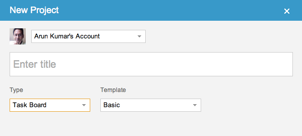
Here’s what we are doing to help: first, make it clear to you which account is being used to create your new project. The dialog for creating a new project will look like this:

New Project dialog

So, right up front you can see the name of the account you will be creating your new project in, and the face of the account owner. If you want to create your project in a different account, you can switch right on this dialog with one easy action.

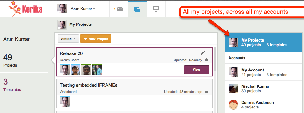
The second big change is to create what we call a “unified inbox” view of all your projects, similar to how email clients work that let you see all your emails in one place, across all your accounts.

When you are looking at your projects, the “My Projects” link will show you all your projects, across all your accounts:

Unified Inbox

Just below the “My Projects” link are all the accounts that you have access to, starting with your own (which is always called “My Account”), and followed by the accounts that have projects that were updated most recently. This makes it easier for you to access not just all your projects, but also the accounts that are most active.

This improvement, like everything else we have done, has been driven by valuable user feedback! Next up, once we get this version wrapped up, is simpler billing system and integration with the Google Apps Marketplace and the Google Chrome Web Store.
Improved integration with Google Drive, faster performance, and full iPad support

Along with our best wishes for this holiday season, we have a small present to put under the tree as well: a new version of Kerika will be available on Christmas Day! This new version will come with:

  • Improved integration with Google Drive: now, you will be able share any kind of files, including music, videos, Flash, and other binary data, simply by adding them to your project cards or canvases. (When you log into Kerika again, you will be asked to reauthorize Kerika’s access to your Google Apps,)
  • Improved performance: projects should load at least twice as fast as they did before, making it a lot easier to use Kerika in coffee shops and other places with unreliable WiFi.
  • Full, fun iPad support: you will be able to access your Kerika projects using the Safari or Chrome browser on your tablet (no need to download any apps).
  • Better support for visitors: you can give project stakeholders (like your clients, for example) read-only access to your projects. They will be able to view everything in your projects except for your chat, which will remain private to the team members.

There are also usability tweaks:

  • Attachments can now be opened with a single click.
  • The “Move” action can now be found in the menu at the top of the columns.

What we are working on next:

  • A consolidated view of all your projects, similar in concept to the “unified inbox” you find on your smartphone.
  • Easier ways to manage your account, and integration with the Google Apps Marketplace and the Chrome Web Store.
  • Work estimation, work logging, and exporting of project data.

Thanks again for all your support: the very encouraging feedback we have been getting from our users continues to fuel our efforts!

Giving real thanks, this Thanksgiving

This Thanksgiving holiday, we have good cause to be grateful to all the folks who gave us detailed feedback on our new task management software, and helped us identify about 25 different improvements that we plan to make over the next week covering areas such as:

  • Eliminating any confusion that might exist regarding project privacy;
  • Making it easier to edit card titles;
  • Making it easier to chat on individual cards;
  • Improving the emails that are sent when people are added or removed from projects;
  • Improving the overall performance, by at least by 50%;
  • Simplifying the experience for new users;
  • Simplifying the use of canvases and whiteboards;
  • Adding helpful hints throughout the product; and
  • Eliminating references to “Kanban” which some people find confusing (without eliminating any functionality).

We will be updating Kerika next week, and will continue to release new versions every two weeks, and over the next month we plan to market and publicize the software more.

Task management comes to Kerika

At long last, task management comes to Kerika!

We are launching a brand-new version of Kerika this weekend: the fruits of over 8 months of intense research and design of the only taskboard that’s designed specially for distributed teams. There’s a short video that we urge you to watch: it provides a good overview of Kerika’s new capabilities:

  • You can organize your work using cards on a virtual task board: the interface is easy to understand and delightful to use.
  • Each card can contain details of the work, and, of course, you can add content from your laptop or the Web to each card.
  • Each card can be assigned to one or more people from your project team: Kerika lets you see at a glance who is working on what.
  • Chat is integrated directly with your work: you can send messages that are attached to your cards, or the entire taskboard.
  • You can get started with one of our standard project templates, or create your own process templates to reflect your organization’s best practices and proprietary methodologies.
  • Kerika’s unique whiteboard capabilities are integrated with the new task management: you can add a canvas to each card for sharing ideas, and everything updates in real-time as usual.
  • And our special focus continues to be the challenges faced by teams that are distributed over different locations — it could be that you are working with people offshore, or simply working from home: Kerika makes it easy for you to see, at a glance, exactly what’s changed on each work item in each project.

As usual, we look forward to your feedback! (Contact us by email.)

A new user interface, with much improved usability

We are launching a brand-new version of Kerika, with a completely reworked user interface and a ton of new features including support for iPads and other full-sized tablets.

The new UI is different enough that we have put together a 2-minute video that we recommend you watch before you sign in next; it will really help you get the most out of the new software. The interface is new, but all your old projects and data are all intact!

The new interface is part of a larger transformation we are undertaking that will add project management capabilities to our existing collaboration features: we want to provide support for Kanban-style projects, Agile/Scrum projects, and customized workflows. We have finished designing the new features and if you would be willing to take a look at our mockups and give us your opinion, it would be greatly appreciated!

Meanwhile, please enjoy the new version, particularly if you have an iPad or other full-sized tablet. To access Kerika on your tablet, just log into the kerika.com site using your tablet’s browser: there is no need to download any app because we have rebuilt the user interface to work just fine inside your tablet’s browser.

Kerika isn’t written in Indonesian. (And Google Docs isn’t in Vietnamese either…)

An odd problem that we cannot quite figure out: every once in a while Google’s Chrome browser will tell the user that the application is written in Indonesian, and then offer to do a translation.

We cannot figure out what’s going on with this: all of the code is written in Javascript and Scalable Vector Graphics (SVG), so why would Chrome consider it to be an Indonesian page?

The problem must lie with Google Chrome itself: now, we are noticing that it will sometimes report that Google Docs is written in Vietnamese, as this screenshot shows!

Our latest version: better integration with Google, and more UI coolness

You will have a new version of Kerika tomorrow, with a bunch of great new features. One big improvement is in Kerika’s integration with Google: we are upgrading to Google’s newer, better authentication system, so you will be asked to sign-in through Google again as if you were a brand new user — but don’t worry, none of your old projects or data are affected in any way by this change! The new sign-in process consolidates in one place all the permissions that Kerika requests with respect to your Google account; they include:

  • Access to your basic information: name, email address and photograph, which we use to make sure your Kerika account is set up properly. Now, the photo you use on Google will be used automatically for your Kerika projects as well.
  • Access to your Google Docs account, which, as before, we use to store the files you upload to your Kerika projects. Now, when you upload files to a Kerika project, they will be stored in the Google Docs account of the Account Owner. This makes it easier for Account Owners to manage all the content assets related to their projects.
  • Access to your contacts: this will be used in our next release (look for it in a couple of weeks) which will have auto-completion of names and email addresses when you invite people to join your projects.

There’s a long list of benefits that come with the new version of Kerika:

  1. When you add a URL to a Kerika page, that web site will show up as an embedded page within your Kerika page (i.e. as an IFRAME): you can customize the size and the display, so that only the content you are interested in is shown. Which means that Kerika lets you literally cut-and-paste the Internet.
  2. When you add Web content to Kerika pages, the system automatically gets the title of the Web content, so you don’t have to enter that by hand. And, of course, you can always rename it if you like.
  3. When you upload files to Kerika projects, they will now be stored in sub-folders within your Google Docs that are named for the Kerika projects. This means your Google Docs account doesn’t get cluttered with files in the same way as it did before.
  4. If you use Google Drive, you will find that your Kerika documents are available across all your computers. Kerika is well integrated with Google Drive.
  5. When someone joins a project that already has a bunch of Google Docs, they won’t get a bunch of emails any more from Google letting them know that they have access to each of these files. (These emails were kind of annoying ;-)
  6. If someone is removed from a project team, they will no longer have access to the Google Docs that were part of that project.
  7. On Firefox, Chrome and Safari (but not IE9), you will see thumbnails of the documents on your Kerika projects, which makes it easier for you to quickly distinguish between several files.
  8. When you make a project open to the public, its documents are available only to people who know the URL of the documents. We feel this is a better approach to privacy when you considering making a project open to the public.
  9. When you are uploading a large file to your Kerika project, you don’t have to wait for the uploading to finish in order to do other work inside Kerika.
  10. When you copy a project, or use someone’s public project as a template, you will get your own copies of all the documents in that project.
  11. Switching between different Kerika pages is now much faster since images are now retrieved from your browser cache instead of from the server.
  12. A long-awaited bug fix: when you have images (pictures) on your Kerika pages, they will be shown properly on Internet Explorer 9 and Safari. (We had to fix a problem with the way these browsers dealt with Google Docs.)
  13. Text blocks can now have a border color as well.
  14. The emails sent when you invite people have been improved.
  15. And, finally, the thumbnails of Kerika pages — which you can post to Facebook, LinkedIn, Google+, etc. — are much improved.

Thanks for your continued support of Kerika, and for providing feedback on how we can improve the product. There’s more good stuff coming your way, so keep collaborating…

A new version, with more goodies..

We have released yet another version of Kerika, packed with useful features and bug fixes that will improve your experience with the product.

A lot of the improvements we made are “under-the-hood”, but here are a few changes that you can benefit from directly:

  • Snap-to-grid will make it easier for you to lay out shapes, documents, pictures, etc. on your Kerika pages. You can turn this on or off as you like, and adjust the size of the grid spacing, by setting your preferences: while you are using Kerika, click on your picture near the top edge of the browswer window and you can get to your user preferences.
  • Google Docs will always open in a new browser tab: this change makes for a more consistent and better user experience for everyone. Different browsers handle Google Docs differently, so to provide a more consistent experience for everyone your Google Docs will now alway open in a new browser tab rather than inside the Kerika canvas.
  • Easier ways to invite people: based upon very useful feedback from one of our users, we have added an “auto-acceptance” feature to invitations, and also redesigned the emails that get sent when people are invited to join your projects. These changes make it easier for you to invite people, and handle situations where the invitation emails get caught up in spam filters.
  • Custom colors: mix and match colors as you like, if you don’t like the 84 colors that come with the Kerika palette. If you need to use specific colors, e.g. to match your company’s branding, you can use hex codes to get the exact shade you want.
  • Faster tab switching: we improved this in a several ways, and one of them is to make sure your tabs show the page exactly as you had been viewing it previously before you switched to another tab.
  • The old “Magic Plus” button is now split into two: separate buttons to add Web content and to upload files from your computer. These buttons remain as magicky as ever, in terms of figuring out what kind of content you are adding to your Kerika pages and taking care of all the details, but now the buttons are separated out to improve usability.
  • Upload multiple files with the Upload File button: you could always add multiple files to your Kerika pages by dragging and dropping them onto the canvas; now you can grab multiple files using the Upload File button as well.
  • Merging cells in tables: a cool new feature allows you to merge cells within tables that you create. This makes it even easier to create great-looking content on your Kerika pages, with our text formatting tools.
  • Select multiple cells within the same column and apply formatting to all of them: another cool new feature for those of you who like creating formatted tables. You can select multiple cells within a text table by simply dragging your mouse across them. And, then, you can apply formatting (e.g. text color) to all of them with a single action.
  • Removing multiple rows and columns is easier: drag your mouse across several rows and columns of a table and remove them all with a single mouse click.
  • Easier to navigate large Kerika pages: if you want to drag something into a new part of the canvas, away from the current view, the canvas scrolls automatically to give you more space.

Thanks again for all your useful feedback; we have tons of improvements and new features coming up: our next version will include a number of improvements to our integration with Google Docs.

A simpler way to deal with thumbnails

Sometimes you have to admit that your bright ideas just didn’t turn out as well as you liked…

One such bright idea was to have Idea Pages show thumbnails of their contents when viewed from their parent pages. Here’s an example of this works in practice:

Old thumbnails implementation
How thumbnails of Idea Pages used to look

A great idea in theory; not so great in practice…

The original goal was two-fold:

  1. To let users know quickly which items on an Idea Page contained other pages;
  2. To give users a quick visual sense for what was contained in those pages;

In practice, however, the effect of these thumbnails showing through all the time was a splotchy, rather ugly effect. To remedy this, we are adopting a new mechanism that we hope will continue to meet our two goals: with our latest version, any item on an Idea Page that contains another page will appear with it’s text/label underlined, like this:

What thumbnails look like now

As you can see, items that contain pages now appear with their text labels underlined. If you move your mouse over a shape that has underlined text in its label, you see a thumbnail appear as before:

A thumbnail appears on mouseover

Selecting the shape now provides a green “+” button: this lets you open the page contained within that shape.

Thumbnail on selection

This new green “+” button also appears on shapes that don’t contain any pages within them: in that case, clicking on the “+” button lets you create a new page that is contained within that shape.

In effect, the old double-click mouse operation has been replaced with a green “+” button that appears when you select a shape with a single mouse click.

We hope you find these changes helpful; we earnestly seek your feedback!

A completely rebuilt text block capability in our latest version

We have been toiling away for the past 4 weeks on our latest version of Kerika, with the vast majority of time consumed with a complete rewrite of the Text Block feature. This is the feature that lets you place blocks of richly formatted text, including Web links, pictures and tables, onto your Kerika page. (What we termed, in an earlier post, “glassbox documents”.)

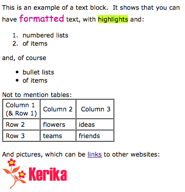
Here’s a simple example of a text block:

A simple example of a text block


Having realized just how important this feature is for our users, we decided to do a complete rewrite of all the code, abandoning the open-source library called Whyzziwig that we had been using previously in favor of our own implementation. We did all this work because it was clear that we needed to be in greater control of this particular feature’s destiny: something that’s impossible when you are using an open source library. As a result of all our hard work, you will now have a bunch of great new functionality!

  • An Undo button: at long last! We still need to create a broader Undo function that works across all of Kerika’s operations, but this particular button works nicely when you are editing a text block.
  • A strikethrough button: great for marking up requirements and discussions.
  • A new color picker: a simple palette of 84 colors with a cleaner user interface. Along with this comes an easier way to set the font, highlighting and background colors.
  • More options for numbered lists: including using alphabetic and Roman numerals.
  • More options for bullet lists.
  • A clear formatting button: this can be particularly helpful if you are importing content from Microsoft Office. (See our earlier post on just how much junk HTML is carried over if you copy material from a Microsoft Office document.)
  • Easier ways to add, edit and remove Web links: we have considerably simplified the user interface for attaching a Web link to some text (or to a picture that you have embedded inside your text block).
  • Easier way to embed pictures in text block: a simpler, cleaner user interface.

We also have reatly improved capabilities for creating and managing tables: this was where the bulk of the work was done! We have added a number of features that our users asked for, such as:

  • Setting Cell, Row and Column Properties: you can set horizontal and vertical alignment, as well as the background (fill color) for a single cell, an entire row, or an entire column.
  • Resizing column widths by dragging: something that we have wanted for a long time, and which took a lot of effort to build… Now you can re-size a column simply by dragging its edges, as you would with Word or Excel.
  • Copy and Paste: you can now copy and paste a single cell, an entire row, or an entire column. Great for moving stuff around inside tables!
  • Border color: easier to set, with our new Color Picker. And, to improve the usability and appearance of tables, we automatically make the outer border of tables twice as thick as the inner borders (that separate individual cells).

That’s not all that’s new in this release, but this particular blog post is long enough, so we will talk about other goodies in our next posting… Here’s a Kerika page that shows these changes: it’s open to the public to visit, so come on over!