Category Archives: Usability

Posts related to product design, user experience and usability

How Kerika integrates with your Google Contacts

When you sign up for Kerika, using your Google ID, you get sent to an authorization screen where Google asks whether it is OK for Kerika to access some of your Google-related information. One part of this involves access to your Google Contacts.

We often get queries about this, so we thought we would clarify something that’s really important: we don’t use your Google contacts to spam your friends and coworkers!

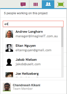
The Google Contacts are used for one reason only: to provide an auto-completion of names and email addresses when you are adding people to a project team. Here’s a simple illustration:

Adding people to a project team

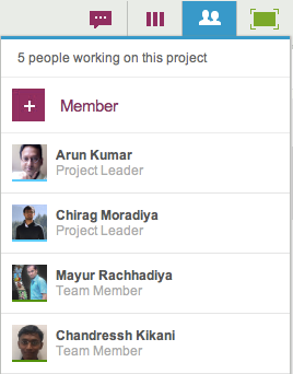
To add people to a project team, you would click on the People button, which appears on the top-right corner of the Kerika application, and this would show a display similar to the example above, where all the members of your project team are listed (along with their roles). To add a new person, you would click on the +Member link at the top, and then start typing in a name or email address:

Enter a name or email address

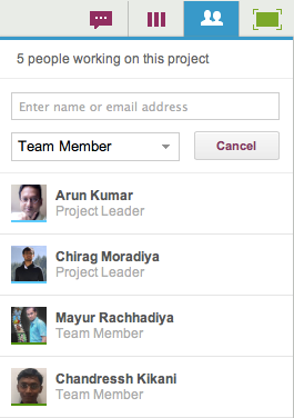
As you type in a name or email address, we pass on this string to Google which tries to match it up with entries in your Google contacts. These entries start showing up immediately, and get filtered progressively as you type in more characters:

Matching names against your Google Contacts

This matching of names and emails is done by Google, which means Kerika never has direct access to your Google Contacts!

This auto-completion is a handy feature: it eliminates a major source of errors, which is mistyping email addresses. This means that the chances of you inviting the wrong person to your project are much lower!


Making sure you never miss a project update

In addition to the styling changes we have made, we have also been working to make sure you always have easy access to your project updates, by improving and extending the onscreen notifications you get from Kerika. There are a whole bunch of improvements in our newest version:

  • Kerika reminds you when you are hiding a column on a task board: using the Workflow button, you can always personalize your view of a task board, hiding some columns if they are not of interest. Now, Kerika makes sure you don’t forget that you have some columns hidden, by showing a small indicator above the Workflow button:

    Indicator that you are hiding some columns on your task board
    Indicator that you are hiding some columns on your task board
  • And, if there are updates to cards on columns that you are hiding, these will never get missed:
    Updates on cards that I am not viewing
    Updates on cards that I am not viewing

    Clicking on the Workflow button will show you clearly which hidden columns have updates:

    Updates on hidden cards
    Updates on hidden cards

    In the example above, the “This Sprint” and “In Development” columns are currently hidden from view, and there are updates to cards on the “In Development” column.

  • If you have several projects underway, Kerika makes it easier than ever to know which of them have updates that you haven’t seen. This is done in two places in the user interface: first, your project tabs show orange indicators when there are unread notifications:
    Updates are highlighted on project tabs
    Updates are highlighted on project tabs

    And, when you are browsing your list of projects, you see orange highlights on the project cards as well, to let you know there are unread updates:

    Updates are highlighted on project cards
    Updates are highlighted on project cards
  • And, finally, a new feature makes it easy for you to find updated cards within columns, which is especially useful when you are dealing with a lot of cards, e.g. in a Product Backlog:

    Finding the next updated card in a column
    Finding the next updated card in a column

As with all our product improvements, the Kerika team has been testing the changes extensively by “dogfooding” the software: we use Kerika for all of our work, and we have been very pleased with these improvements which have really improved our own team productivity!


A cleaner look to Kerika: more open, more fun, and with clearer highlights

We have some styling changes in our latest version of Kerika, which we think makes the user interface seem more open and inviting, and makes it even easier to see highlights and notifications.

The new styling is something that we had been mulling over for a while: a number of users had said that the old styling was a little “too grey” (our thanks to Yakup Trana for being among the earliest to provide this feedback). The new styling essentially reverses the old look of grey cards on a white background.

The new look for your project cards is like this:

New look for project cards

The cards are easier to read, and more clearly defined. (We have also tweaked the color of the grey border around the cards, to make it slightly darker which makes for a crisper look.) A lot of the old horizontal lines have been removed as well, which makes for a cleaner look. By contrast, this is the old styling:

Old view of project cards

The contrast between the two is quite dramatic: the new Kerika is a lot cleaner and more inviting!

The new look for your task cards is like this:

New view of task cards

Task cards are easier to read, and the important highlights and notifications are also more crisply delivered. Here, by contrast, is the old Kerika styling:

Old view of task cards

Once again, a dramatic contrast, and clearly for the better! We have been testing this new styling within the Kerika team for the past 3 weeks, and have been continually tweaking it on a daily basis. We now feel it is the best we can do! Let us know what you think.

Google Plus doesn’t seem to like TIFF files; Mac’s Grab and Preview utilities are more annoying than ever…

We just encountered a weird bug in Google+: after being prompted over several days to upload a larger image as our cover photo, we decided to get a larger screenshot of the Kerika application.

On a Mac, there are several ways of doing this, but the most direct way is to use Mac’s Grab utility. This utility used to be a lot easier to use before Mountain Lion’s “improvements”: now, Grab disappears after you switch to another application, using the Cmd-Tab keys, which is really annoying because you have to relaunch it all the time.

But, that isn’t really our main beef right now… One long-standing annoyance of Grab is that it saves files in the TIFF format. We have no idea why: TIFF seems like a really ancient format these days.

If you try to upload a TIFF file to Google+, however, the file shows up inverted for some reason. This seems to be a weird bug on Google’s part: TIFF files, alone, are being inverted when they are uploaded.

To get around this, you have to save your TIFF-based screenshot as a PNG file (or JPEG, but then you have to make sure you don’t lose resolution in the process). This means opening the TIFF file in your Mac’s Preview utility, and then trying to save that as a PNG file.

Saving a file as a different type used to be simple with the old Preview, but no more: another one of Apple’s annoying “improvements” has been to eliminate the “Save As…” option from Preview’s File menu. So, you have to do something completely counter-intuitive: you need to duplicate the file, using the Duplicate option of the File menu, and then close that new window. Closing the new window alarms Preview enough to prompt you to save the file, at which point you are finally presented with a dialog box that lets you select the file type you want.

And then it’s back to Google+ to upload your new PNG screenshot…

Google and Apple are considered the leaders in usability, so there we have it: this is the state of the art!

The right way to do a right-click

There was a debate recently, within the Seattle Tech Startups email forum, about the pros and cons of offering a right mouse-click option within Web applications.

The right-mouse click is, of course, a desktop paradigm, so the question is: when, if ever, is it a good idea to supersede the browser menu with your own right-click menu?

Here’s where we stand on this issue:

  • Our users want it, overwhelmingly. Because Kerika’s user interface is consciously designed to mimic a desktop application, with simple mouse gestures for dragging cards across a project board or drawing on a canvas, our users naturally expect to have a right-click menu available.
  • Our menu options are better than the browser defaults. The browser defaults are generic, of course, and have little value in the context of the Kerika application. For example, a commonly used browser action might be to select some text and then search for that on the Web. Within the Kerika application, this isn’t a particular useful or commonplace action. If you want to search for something related to a project, you probably want to search within Kerika itself, rather than the entire Web.
  • The right-click menu is always supplemental, never central. We don’t offer anything on a right click menu, in any scenario, that isn’t also available through more explicit buttons or menu options. The right-click menu offers faster actions to commonplace actions, based upon user context, and it is designed for “power users” who want to absolutely minimize their mouse actions. For everyone else, regular menus and buttons offer all of Kerika’s functionality in a more explicit manner.
  • The right-click menu is always contextual, never generic. If you are going to take over the right-click, make it count: don’t offer a generic set of actions, but instead offer a highly tailored, context-sensitive menu of actions. For example, if you are working with shapes on a canvas, the right-click menu offers fast access to changing the appearance of the objects. But if you are working with Web links on a canvas, the right-click menu offers a different set of choices, like switching between a bookmark and an embedded view.
  • The right-click belongs on tablets, too. Something that’s often overlooked in this debate is that the right-click menu is easily accessible on iPads, too: a “long tap” acts as a right-click, so there’s no reason to not make use of that function.

What do you think? Let us know

Another week, another update: this time, it’s mostly styling (and better user management)

We are trying to get back to a faster rhythm of releases. Our goal is to have releases within 3 weeks: we want to complete our development and QA within 2 weeks, and then use the third week for “dogfooding” the software.

(As you might expect, we are fervent users of Kerika! Everything related to our business is done using Kerika project boards, and to make sure we are putting out the best possible product, we use a daily build of the software on a test server. This keeps us firmly on the bleeding edge of our own software development: it means that we get to try out our software in a real-life scenario — one that is absolutely mission-critical for the company! — before we pass it on to our users.)

Our newest version, released today, contains a number of under-the-hood fixes that will help us manage our growing number of users. And, we are happy to report, our users are indeed growing: we are adding new users in March at twice the rate we did in February!

From your perspective, it’s mostly some styling and minor user interface changes that will be visible. We have a better way to expose the Cut, Copy, Paste and Delete functions for cards, having heard from too many users that they couldn’t easily figure out how to delete projects, we have more uniform use of colors, and there is a right-click menu for dealing with project cards as well as task cards.

The more uniform use of colors is a step towards a larger update/refresh of our look-and-feel. We have been hearing from users that our user interface is “too grey”, and we are working on that issue. We are also looking at improved notifications, both onscreen and through emails. Stay tuned!

Our new version: even better integration with Google Drive, and even better tablet support

Our next release is mostly about improving our Google Drive integration: we are making it a lot easier for you to manage your Google Docs from within Kerika itself, so that your content has a very useful “contextual layer” on top! Here are some of the improvements we be rolling out this weekend:

  • The file organization inside your Google Drive will be a lot more streamlined: a single, top-level folder called “Kerika.com” will have subfolders for each account to which you have access.
  • Better synching between Google Drive and your Kerika projects:
    • If you rename a file that’s attached to a Kerika card, that new name will show up in your Google Drive as well.
    • If you rename a file in Google Drive, that new name will show up in your Kerika cards.
    • If you delete a file that’s attached to a Kerika card, that file will get moved to the Trash in your Google Drive as well.
    • File sharing within your Google Drive will be done at the Kerika project folder level, which means faster performance and a cleaner interface.
    • Duplication of file folders will be eliminated.
  • Content that is attached to cards can be renamed easily: if you rename a file that you attached to a card, this new name will show up in your Google Drive as well, and you will be able to easily rename Web links as well.

We are also improving the Kerika experience on iPads and cellphones: as before, you can access Kerika right from the Safari browser (or Chrome, if you prefer), without having to download any special apps, and we are adding:

  • Better support for “double-tapping”, similar to doing a double click on a desktop.
  • Better support for phones.
  • Improved performance.

General improvements to the user interface will include:

  • A new set of tutorial videos, all under 2 minutes in length, to help you get more out of Kerika.
  • Cut-and-paste of entire projects.
  • Any URLs that are referenced inside cards or on chat messages will appear as clickable links.
  • Content inside chat messages can be easily copied.
  • A cleaner way to customize the workflow for your project.
  • A cleaner layout of icons on cards.
  • Some cool animation effects that make it easier to understand how canvases work, particularly if your projects contain multi-layered canvases (where one canvas contains several others).
  • A new to mark cards as “Needs rework”.

And, a final note: this version has taken quite a bit longer (4+ weeks) that our previous versions, largely because we allowed “feature creep” to happen… We kept adding usability tweaks to the release, particularly with respect to the iPad experience, and that chewed up a whole week. We need to guard more closely against feature creep for our next release.

Coming up: we are adding tagging as a new feature, which will make it easier to create quick filtered views of large projects!

The best lines from Tim Cook’s Q&A at Goldman Sachs Conference

The transcript at the Wall Street Journal is extensive, and makes for great reading. Here are some of our favorite bits:

On whether Apple is too frugal:

My definition of a depression-era mentality wouldn’t be of a company investing a pair of tens over two years. [“tens” refers to $10 billion.]

On Einhorn’s lawsuit and Apple’s Proposal 2:

You’re not gonna see us do campaign mailing, you’re not gonna see a “yes on 2” in my front yard. This is a waste of shareholder money, it’s a distraction, and it’s not a seminal issue for Apple.

On innovation:

If there was a formula, a lot of companies would have bought their ability to innovate…

Consumers want an elegant experience where the technology flows to the background

These skills, this isn’t something you can just go write a check for. This is decades of experience

On specs:

Do you know the speed of an AX processor? You probably don’t. Does it matter? You want a fantastic experience

On iPad market share:

I have no idea what market share is, we’re the only company that really reports the units we sell.

On cannibalization:

I think if a company ever begins to use cannibalization as a primary or even a major factor of what products to go to, it’s the beginning of the end.

On iPad Mini:

I think this is gonna be the mother of all markets.

On the value of Apple Stores:

The tablet was ingrained in their mind as this heavy thing the Hertz guy held. But our store is the place to go and discover and try it out and see what it can do.

On being a good corporate citizen:

I’m very proud that we’re out front, that we have a spine on supply responsibility.


Creating a picture board as an example of a Whiteboard project

Here’s a really great example of how you can easily create rich Web pages using Kerika:

Example of a Whiteboard project

This page was created in just minutes, and can be changed in real-time. The page is an example of Kerika’s Whiteboard projects, being used by the Seattle chapter of The Indus Entrepreneurs (TiE).

This page is also a great example of you can create pages within pages: just click on the “Parking Directions” shape, and you get taken to another page that’s organized as a picture board:

Example of a picture board

Publishing these web pages is easy and instantaneous: just take the URL of your Kerika project page, and replace the “/m/” in the middle with “/c/” and you will have a real-time Web page that anyone can access, from anywhere, even if they don’t use the Kerika software.

(In this example, the project page is at kerika.com/m/BSxW, and the published page is at kerika.com/c/BSxW)

Want to learn more about how to create these great canvases? Check out this video.

A new pricing scheme, and better controls for your account

Our latest version includes a bunch of usability improvements, as usual, but the biggest changes are to the billing mechanism and account management:

  • Billing: we have updated and simplified our pricing: users told us that the old multi-level pricing was a little complicated, so we have a simpler offer of $10 per user per month for Professional users.
    • You can still start off with a free Standard Account which lets you share your projects with two other people, and if your team is small enough — or you are using Kerika for personal task management only where you don’t have a need to share your projects with others — you will be able to stay with the free Account.
    • Once your account team becomes larger, you can upgrade to a paid Professional Account which will let you add as many users as you like, at a flat rate of $10 per user per month.
    • If you are working on an academic or nonprofit project, you can request free service which lets you have a team of up to 10 people.
    • Billing is done on an annual basis (our users told us that was preferable to monthly renewals, since it was easier for businesses to make annual decisions than to repeatedly make monthly approvals), and you can cancel or reduce your subscription at any time and get a prorated refund.
  • Account Management: it’s easier now to see all the users who are part of your account, and to remove someone from all your projects.
Easier to manage your account


  • We made it easier to use templates when setting up new projects: now, you can easily browse your personal library of process templates, templates created by coworkers, and templates provided by Kerika and easily set up a new project.
  • Even better support for distributed teams: we made a bunch of usability tweaks to the notifications you get when coworkers make changes.
  • We have added more content to our website and generally improved its layout. Over the coming days we will be adding more tutorial videos, in addition to the one we already have on how to use Kerika’s unique real-time collaboration canvases.
  • And, speaking of the canvas, we have added some cool animation effects that will help you navigate when you have canvases nested inside each other!

Our thanks to everyone who has been giving us feedback!

Next up: Kerika will be available from the Google Apps Marketplace and the Chrome Web Store.