Our development team in India is under a national lock-down due to Covid-19, and we had been worried about a loss of productivity.
After a week of lock-down we have been checking with each person, and it turns out there was no cause for worry, especially from those who had the foresight to grab an extra monitor before leaving their office.
In fact, we expect that our team will ask for work-from-home as a regular work model even after the virus is gone.
Kerika is designed for, and built by remote teams!
Category Archives: Technology
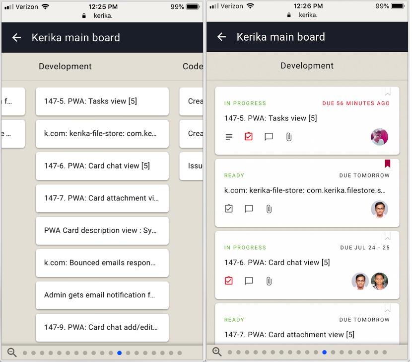
We have started beta testing Kerika for mobile devices
We have enough of our new mobile version built that we have started doing beta tests with a handful of users from around the world. Initial feedback has been very positive.
We expect to stay in beta mode for another few weeks and then make the mobile version available to all our users.
There will be no app to install: you will be able to use your Safari, Chrome or Firefox browser on your phone.
Updates to our Privacy Policy
We are making some changes to our Privacy Policy to get ready for some new analytics work we are planning to do. Here’s a summary of what’s changing, and why.
Using Amplitude for Product Analytics
We will use Amplitude to help us understand better how our users actually use Kerika, so that we can make better product decisions. In order to use Amplitude’s analytics, we need to send this information to their servers:
- An internal Kerika User ID: it is not your name, email or any other personal information.
- A device ID: this identifies each session, and doesn’t include any personal information either.
- Events (mouse clicks) that take place when someone uses Kerika: they tell us which parts of the Kerika software are being used, how often, and in which sequence.
Here’s an example:
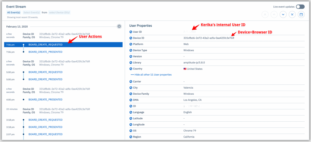
On the left side of this screen we can see that this user has been creating a series of boards, and that that our server had a fast response each time. We can see from the right side this was in California; if someone else were to complain about Kerika being slow, we could determine if it is a regional problem or a global one.
We have signed a strong protection agreement with Amplitude to protect our users’ privacy; you can find it online here.
Using Sentry for Error Tracking
We use Sentry to help us track and debug errors because we want to fix every single error that occurs, even when users don’t notice anything. (Which they don’t, 95% of the time .)
Using Sentry helps Kerika log every single thing that goes wrong. Here’s an example:
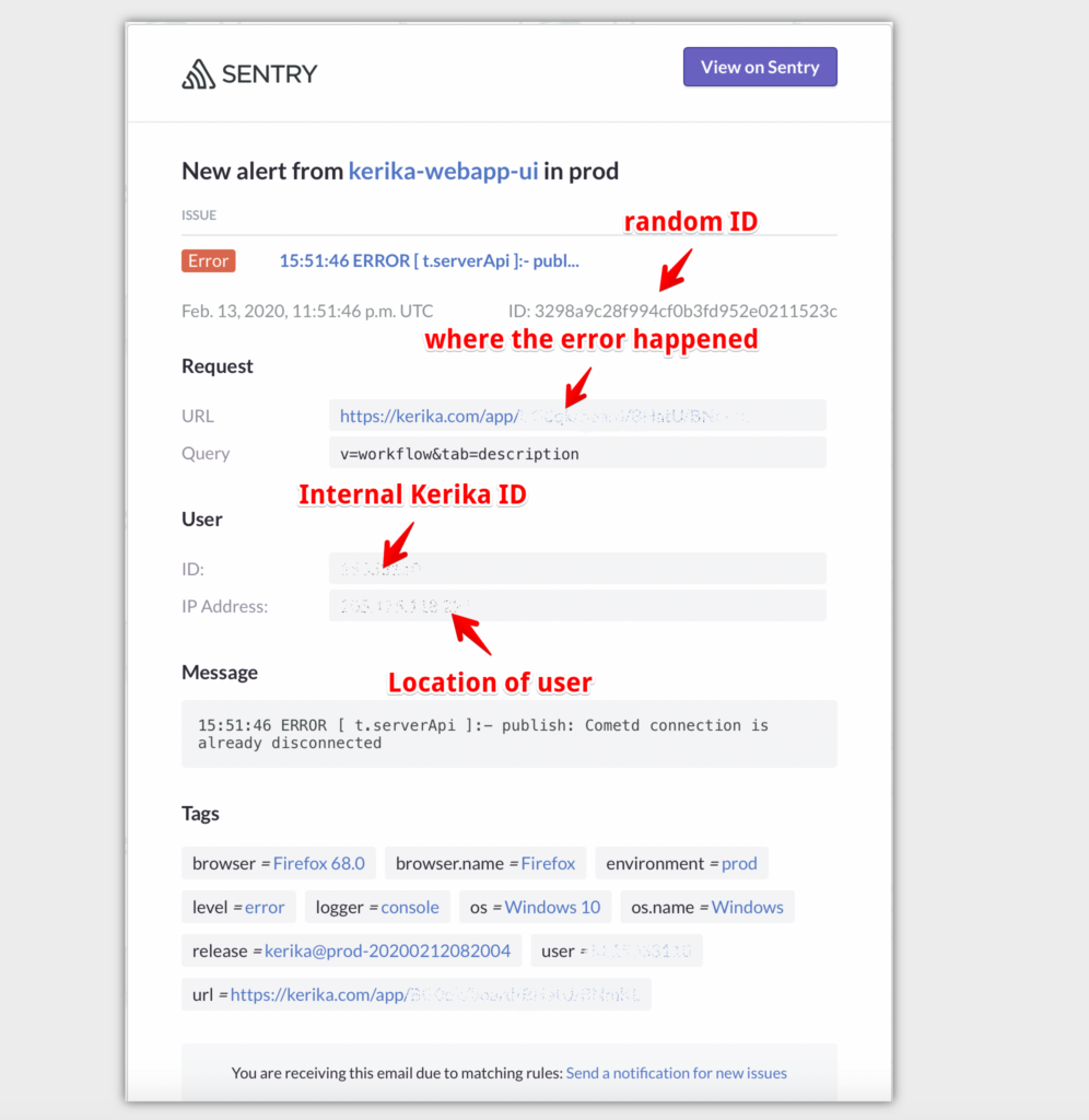
This example is of a temporarily broken connection. No one actually complained because Kerika restores connections automatically, but it’s still useful for us to know where inside the Kerika app the error was detected (the URL), and the context of the user:
- IP Location helps us understand whether there is a regional problem or a global one.
- Browser and operating system is very helpful in debugging problems that lurk within specific browser versions. In this example, the user is using a very outdated version of Firefox (v68 instead of v73).
Using Google for Website Analytics
This hasn’t changed in years, but we thought we would reiterate it here so you have a complete picture of your privacy protections. We use Google Analytics to help us understand how people find us and which parts of the website are browsed most often.
It turns out that even though we have over a hundred website pages, just a few ever get visited. Oh, well.
Using Kerika for Google Design Sprints
We have a complete set of templates for folks who want to use the Google Design Sprint methodology; you don’t have to be an expert at either Design or Sprints to get productive fast.
Here’s a quick overview:
Guarding against XSS code injection
We had posted earlier about making sure that (malicious) users cannot inject code into Kerika, in any of the areas where user input is possible.
Here’s the complete list of user actions that we are checking for XSS injecton now:
- Board Name
- Board Description
- Template Name
- Template Description
- Tag Name
- Card Attachment Name
- Board Attachment Name
- Card Chat
- Board Chat
- Column Name
- Task Name/Detail
- Canvas Text
- Canvas Attachment Name
- Canvas Shape/Object Name
- Account Name
- Account Billing Information
- User’s Name
Why our new mobile app is taking so long to build
We have been working for months now on our new mobile app, and it has been a tough slog! We are building it entirely using React (a Javascript framework) to make it possible to have a single code base across both desktop and mobile devices, and across all operating systems.
We took some time learning to be good with React: previously we had used Polymer, and before that we used JQuery, so there was some learning curve to traverse while we figured out the right way to code in React. But we are beyond that now.
For the past couple of months, it is really performance that has been our bugbear. In the spirit of “eat your own dogfood before trying to sell it”, we are using the emerging mobile app for our own work on a daily basis.
The trouble is: our main Kerika board is huge: it has usually around 600 cards, and 26 columns. This isn’t best practice, by the way, and we are not recommending you create boards like this, but we are talking here about our main board that tracks many different ideas and initiatives, not just product development.
So, when using our mobile app for our own board, we hit performance problems that few of our users are likely to encounter. We could, of course, have written us off as an edge case and ignored the performance issues, because for smaller boards (e.g. with around 20-30 cards), these performance problems completely disappear.
But, we decided to bite the bullet and get our mobile app to be good even with boards that are as wide and deep as our main board. And we have learned a lot from that experience: for example, it wasn’t the number of cards, but the number of columns that had the bigger performance impact.
We have another board with over 2,500 cards in just 2 columns (essentially a historical record of old work items) and we didn’t experience performance problems in the same way as we did with 500-600 cards over 26 columns. In fact, we found that 2,500 cards in 2 columns was much easier to handle than the latter case!
So, a lot of our efforts over the past few months have been trying to handle performance for scenarios that are out of the norm.
We are doing our testing on both iOS and Android at the same time, to catch browser-specific issues early. (We have been less diligent about Firefox testing, to be frank, but we expect clearing iOS and Android issues will effectively cover Firefox as well, making our final testing easier.)
Our end goal is a single code base that runs on any device. Right now that’s not true: our desktop experience is still using (mostly) Polymer, while our mobile is entirely in React, but we are trying to make sure we design all of the new code to work well on the desktop as well, so that we can slowly replace parts of the desktop code as we build the new mobile app.
(It’s not that our desktop code has any problems today — we are very confident about the quality of our desktop user experience — it’s just that we are too small a team to be able to split ourselves into multiple sub-teams to support every platform.)
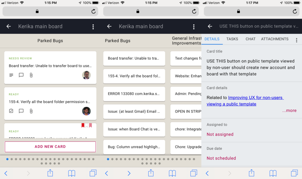
Here’s a composite view of what our mobile app looks like now: in “zoomed-in” view, in “zoomed-out” view, and card details:
Onwards!
Guarding against XSS/code-injection
It’s possible to copy-paste text into a Kerika Chat message, and there are legitimate use-cases for this: for example, a developer may ask a question to a coworker who replies with a code snippet.
Kerika handles code in chat messages by storing two versions of the message: as plain-text, and as the original format. When a chat message is displayed, the original format is used but not executed, which means the embedded code is visible, but doesn’t run in the browser. This makes it easy and safe to share code snippets through chat messages.
While making this improvement, we went through all the places where a user can type in text, Card Title and Description, Board Name and Description, Tag, Attachment Name, etc. to make sure we are guarding against malicious code injection.
An improved way to number cards
With our latest release we have introduced a new way to have your Task Board and Scrum Board cards numbered automatically.
Our original implementation was rather rudimentary: if you turned on Auto-Numbering (which you can access from the Board Settings dialog, by clicking on the gear icon/button on the top-right of the Kerika app), Kerika would automatically insert a card number as part of each new card’s title.
The card numbers inserted by Kerika were pure text that was prefixed to whatever you typed in as a card title. This meant that they could easily be changed by any Team Member (or Board Admin), and this, in turn, meant that what you saw as a card number couldn’t be completely relied upon as the real/original number of that card. A coworker could have easily edited that number to something quite different.
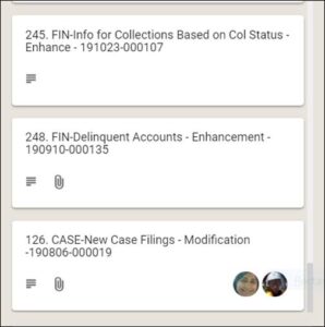
To make these numbers more reliable and trustworthy, Kerika now keeps the card number as a separate attribute (field) of each card: it is shown, when Auto-Numbering has been turned on for a board by it’s Board Admin, but it cannot be edited by anyone.
With card numbers being stored as a separate attribute of each card, we are also adding an improved way to search for cards by their numbers: if you type in a number in the Search box inside Kerika, the system will first look for a card with that number before showing any other results.
Card Numbering in Scrum Boards
Card numbers are always unique to each board: a card with number 100 on Board A will have no relation with a card numbered 100 on Board B. Each board will keep track of its own numbering, starting with “1”.
So what happens with Scrum Boards? Scrum Boards are different from regular Task Boards in that they let you share a backlog across multiple Scrum Boards. This lets you run several Sprints one after another, with each Sprint drawing from the same shared Backlog.
(And, of course, this also makes it possible to run several projects at the same time that draw from the same shared backlog.)
Since each board keeps track of its own sequence of card numbers, if you move a card from a Scrum Board back to the Backlog column it will lose the number it previously had.
That’s because once a card goes back into a shared backlog, we can’t be sure which board it will get pulled into the future: the card may return to the same board where it was originally located, or it may get pulled into a different Scrum Board.
The smart approach in this situation is to reset card numbers when cards go back to a backlog.
We have started purging defunct accounts
We have started purging defunct accounts: users whose email addresses don’t seem to be valid anymore.
We are not doing this in a hurry, but instead are trying to be methodological about it: if someone’s email bounces, and we see they haven’t logged in during the past 6 months, we are going to assume this user doesn’t exist within that organization anymore, i.e. has probably left the company where they were previously working.
(The 6 months of no-activity helps us avoid temporary email problems, such as when someone’s email server is down for a day.)
Also getting purged are new users with invalid emails: this can happen when an existing user mistypes a coworker’s email address at the time they invite people to join their teams.
An account is created at the time someone initiates the invitation, but if we find the email associated with that account is bouncing, we will delete that account.
A sneak peek at what we are working on…