All posts by user

A new template for tracking bugs and defects

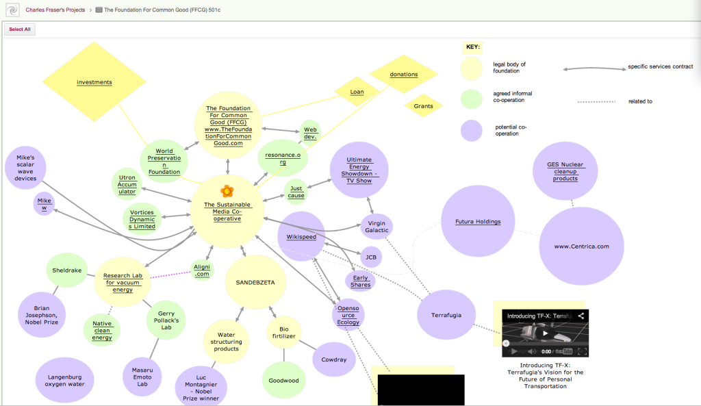
We just added another project template, for Kanban / Task Boards, that you can use to track and manage bugs/defects in a software or hardware product.

Bug Tracking Template
Click here to view this template

Here’s how it works:

  1. As new bugs/defects are found, add them to the Pending column. This is a holding area for new defects, before they get evaluated and prioritized.
  2. On a daily basis the Product Owner should evaluate items in the Pending column, considering both severity and priority.

    Severity is not the same as Priority: if a defect has a serious consequence, e.g. a software bug that causes data loss, then it would have a high Severity rating.

    But, some defects show up only rarely. So, you might have a defect with a serious consequence that happens very rarely, or affects very few users. In that case, you may want to reduce its priority.

    On the other hand, you may have a defect that is trivial, e.g. a confusing term on a website, but is a real annoyance for everyone. This bug could low severity, but high priority — because fixing it would immediately benefit a lot of your users.

  3. As the Product Owner evaluates each bug, it gets moved to the appropriate column: Fix Immediately, Fix Soon, or Deferred. Within each column, you can further prioritize bugs by moving the most important ones to the top of the column.

    Fix Immediately is for the most critical bugs; typically these need to be resolved with a day or two, and the software update may need to be delivered as a hotfix if the normal release cycle is too long.

    Fix Soon is for bugs that you definitely need to fix, but which are not super-critical.

    Deferred is for bugs that you are not likely to fix anytime soon. (If you don’t plan to fix a bug at all, move it to the Trash.)

  4. As each bug is picked up by a team member, move the card to In Progress, and assign the card to the team member: once someone’s face shows up on the card, it’s clear to everyone that the bug is being worked on, and by whom.
  5. As appropriate, use review processes to review and test the fix before moving it to Ready for Deployment.
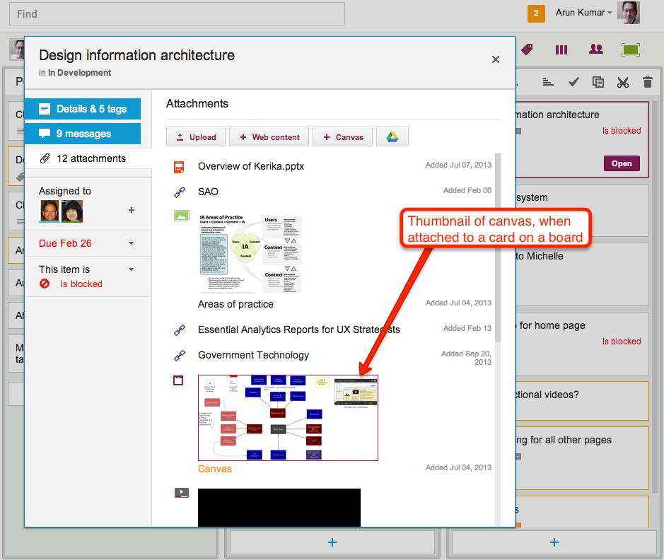
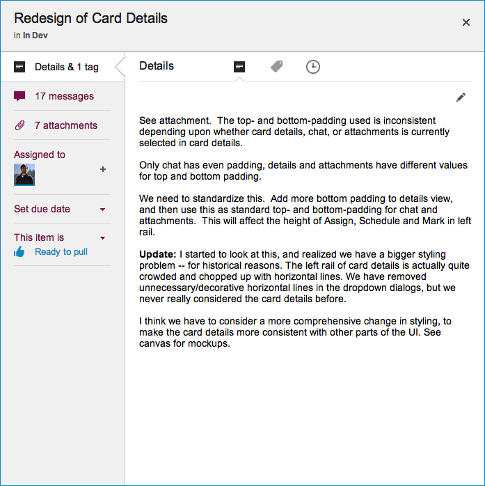
  6. Use tags that make sense: we have set up some sample tags for this template; if they don’t make sense, use whatever tags will work best for your team! (There’s a short video on how tags work, attached to this card.)

Another round of bug bashing…

Our current release (Sprint No. 37 since we moved to a Scrum methodology!) is focused on bug bashing: mostly server-related bugs, and a few that users might have observed themselves.

This is fairly typical of our development cycles: while we fix major bugs in every release, every once in a while we spend an entire release on just general bug bashing and cleanup.  These offer opportunities to catch up on infrastructure improvements, getting our test cases in better shape and other administrative work.

Release 37 should be done, with testing, by the end of the week: it will have about 65 work items completed, with another 21 items that were trashed.

Trashed items are usually duplicates of bugs: different symptoms with the same underlying cause.

Kerika looks different: horizontal project tabs

Our latest release makes Kerika’s user interface look even cleaner and easier to use: we have switched to horizontal tabs to hold all your open projects. (The old version had vertical tabs, running along the left side of the application.)

This makes for more efficient use of space, and provides a user experience that’s more familiar to browser users: the project tabs work like your browser tabs @ndash; you can close each one individually, and drag them across the screen to rearrange them.

It also makes it easier to use Kerika on a tablet: the new horizontal tabs provides a better use of screen real estate.

Task summary emails got a little smarter

One cool feature of Kerika is that you can get a 6AM email @ndash; local time, no matter where you are @ndash; that summarizes all the tasks that are overdue for you, due today, and due tomorrow.

And, if you are a Project Leader on any team, your task summary email can also include all the items that are overdue, due today and due tomorrow across the entire team @ndash; even if you are not assigned to those cards. (It’s an easy way for Project Leaders to plan their day.)

Now, these emails got a little smarter: if you move a project to Trash that still has outstanding due dates on cards, these are no longer included in your task summary email.

Heartbleed: no heartache, but it did prompt a complete security review

So, here’s how we dealt with the Heartbleed bug…

We learned about the bug just like you did: through news reports early on April 7th. Heartbleed was a “zero-day” bug, and the OpenSSL team put out an updated (patched) version of the OpenSSL protocol the same day, which meant that everyone, everywhere, had to scramble to get their systems patched as quickly as possible.

(And the bad guys, meanwhile, scrambled to grab sensitive information, with the Canadian tax authorities being among the first to report that they had been hacked. Of course, “first to report” isn’t the same as “first to actually get hacked”. Most people who got hacked either never found out, or never said anything…)

Kerika uses OpenSSL too, and our immediate concern was updating the Elastic Load Balancer that we use to manage access to our main Amazon Web Services (AWS) servers: the load balancers are where OpenSSL is installed; not on the Web servers that sit behind the load balancer.

Using Amazon Web Services turned out to be a really smart decision in this respect: Amazon just went ahead and patched all their load balancers one by one, without waiting for their customers to take any action. In fact, they patched our load balancer faster than we expected!

Patching the load balancer provided critical immediate protection, and gave us the time to do a more leisurely security review of all our operations. This was long overdue, it turned out, and so we went into “housecleaning mode” for over a week.

One part of this, of course, was updating all our Ubuntu Linux machines: Canonical Software was also very prompt in releasing a patched version of Ubuntu which we loaded onto all of our development, test, and production services. So, even though the OpenSSL vulnerability had been patched at the load balancer, we also applied patches on all our development, test and production servers even though these couldn’t be directly accessed from the Internet.

Next, we decided to clean up various online services that we weren’t actively using: like many other startups, we frequently try out various libraries and third-party services that look promising. We stick with some; others get abandoned. We had accumulated some API keys for services that we weren’t using any more (e.g. we had a YouTube API key that no one could even remember why we had gotten in the first place!), and we deactivated everything that wasn’t actively been used.

Closing unneeded online accounts helped reduce our “attack surface”, which adds to our overall security.

And, of course, we changed all our passwords, everywhere. All of our email passwords, all of our third-party passwords. All of our online passwords and all of our local desktop passwords. (On a personal level, our staff also took the opportunity to change all their banking and other online passwords, and to close unneeded online accounts, to reduce our personal attack surfaces as well.)

We got new SSL certificates: from Verisign for our production load balancer, and from GoDaddy for our test load balancer. Getting a new SSL certificate from Verisign took much longer than we would have liked; getting one from GoDaddy took just seconds, but on the other hand, Verisign does have a better reputation…

We reviewed our internal security policies and procedures, and found a few places where we could tighten things up. This mostly involved increased use of two-party authentication and — most importantly — further tightening up access to various services and servers within the Kerika team. Access to our production servers is highly restricted even within the Kerika team: we use AWS’s Identity & Access Management service to restrict access using roles and permissions, even within the small subset of people who have any access to the production server.

Finally, we are adding more monitoring, looking out for malicious activity by any user, such as the use of automated scripts. We have seen a couple of isolated examples in the past: not malicious users, but compromised users who had malware on their machines. Fortunately these attempts were foiled thanks to our robust access control mechanisms which manage permissions at the individual object level in Kerika — but, like every other SaaS company, we need to be vigilant on this front.

All of this was good housekeeping. It disrupted our normal product development by over a week as we took an “all hands on deck” approach, but well worth it.

Making it faster to create new projects, and to copy/paste them

Kerika is starting to get used in larger organizations more: big global companies, and state and local governments, and as we move into these types of user communities we are finding that people are more likely to create large numbers of projects.

(On average, people create 4-5 projects if they are relatively passive users of Kerika, while more active users — like Project Leaders — might create 30-40 projects over a couple of months.)

To make this smoother, we have been improving the performance of the creation of new projects, as well as the copy-paste function for projects.

It turns out both are closely related, so improving one should help with the other!

Dropping the “Render Server” feature

One of our oldest features has outlived it’s usefulness…

(No, we didn't shoot this dog. Or any other dog.)
(No, we didn’t actually shoot this dog. Or any other dog.)

We have something we call the “Render Server”: it’s a separate server from the rest of Kerika, and it’s sole purpose has been to create thumbnail images of Whiteboard projects.

This feature was originally built to make it easier for people who created rich, layered Whiteboards — boards where canvases are contained with other canvases, like the amazing Foundation for Common Good Whiteboard project created by Charles Fraser‘s team (in the UK, and worldwide) which looks something like this:

Foundation for Common Good

This is just a partial view of the top-level of a series of canvases, layered within each other to create a rich, multi-media world.

The Render Server helped people understand that some shapes on a canvas contain other canvases within them: for example, if you hovered your mouse over one of the circles on this canvas, you could see — somewhat dimly — a thumbnail of the canvas that was contained within that page:

Showing layered pages

This feature was also used when you added canvases to cards on Task Boards and Scrum Boards: the card details dialog would show a thumbnail of the canvas, like this

Thumbnail image of a canvas attached to a card

This feature was cool, and made for great demos, but it was ultimately not all that useful in a practical sense.

(And that’s true for a lot of cool ideas: things that make for great demos don’t always provide great utility in regular use.)

The thumbnails were too small to be of much use on Whiteboards, and when shown on card details for Task Boards and Scrum Boards they just took up too much space.

So, it’s buh-bye to the Render Server: a cool idea, whose time seems to have passed.

(No, really: we didn’t shoot the dog! We promise!)


Getting rid of UI crud

Our next update to the Kerika software, scheduled for release this weeekend, will have a bunch of minor styling updates — over a hundred styling changes, in fact.

Most of these are fairly subtle; it’s quite likely you will not notice over 90% of them at all, because this new release is really a UI cleanup effort rather than a big feature release.

Over the past couple of years Kerika had acquired some “UI crud”: little inconsistencies in the fonts, colors, and interactions that had build up over time as you release new features, and we have been releasing new functionality every 4-6 weeks for over 3 years now. It’s like barnacles on an otherwise beautiful wooden boat…

Polishing the boat
(Not us, but somebody else, polishing somebody else’s boat.)

For example, we found there were minor variations in shades of grey throughout the app: a light-grey shading in one place was off by an octect or two from a light-grey shading in another place. A tooltip was missing from one button here or there, or a tooltip wasn’t phrased as well as it could have been.

Taken individually, these are very trivial indeed — and, unless you examine the entire UI with a magnifying digital color meter, like we did, you wouldn’t have found these tiny inconsistencies, but they can have a cumulative effect that makes the UI seem vaguely fuzzy. (Just like barnacles, if left un-scrapped, can slow down even the most beautiful boat.)

The most visible change we made is the card details display: what you see when you open up a card on a Task Board or Scrum Board

New Card Details dialog

This display is cleaner than what we used to have: it has a more consistent appearance with the rest of the Kerika user interface, and gives equal prominence to all the user interface elements within this dialog — because all of these elements are, in face, equally important to users. Our previous design gave undue prominence to Details, Attachments and Chat, which reflected nothing more than the historical evolution of the Kerika software; now, everything about a card is equally accessible.

The layout is also a lot cleaner: unnecessary decoration has been eliminated, and the overall style is more “flat” (i.e. in keeping with Microsoft’s Metro/Modern design styling, which even Apple has now adopted for iOS 7).