
All posts by user
Clive Boulton: Love GitHub? You’ll enjoy Kerika
Clive Boulton, the Lead of the Google Developer Group in Seattle wrote a Tumblr blog post a while back that summed up Kerika’s key value proposition very nicely:
Kerika is the only task board that’s designed for distributed teams. Everyone working in the same office. Stop reading. Everyone else grok this.

Why we haven’t published our API (yet)
We are sometimes asked (usually by our more techie users) whether Kerika has a published API.
The short answer is “No”; the longer answer is “Not yet.”
We do have a server API, of course, that the Kerika front-end client application itself uses, but it is a very proprietary and non-standard API at present.
This is largely because of an early decision we made to use CometD for our real-time client-server communications.
CometD is a form of a long-poll architecture, but our implementation, unfortunately, is not very standard, in part because we built an “API generator” a long time ago that allows us to create new APIs fairly quickly using metadata descriptions of the desired features.
This was helpful when we were first getting started, but, quite honestly, it isn’t an approach that makes a lot of sense any more and we have migrated away from using that API generator.
But, because of our history/legacy code, we currently have a mix of auto-generated APIs and newer API, and this isn’t really something that we want to publish and support for external third-party development.
We plan to redo our API this year to make it more standard and easier for third-party developers to use, at which point we will publish it and start encouraging more platform development around Kerika.
Tall Tales from our users: Kerika as an Agile alternative to PowerPoint
Another note from a user which we wanted to share with you…
Just this week we had a fundraising administrative group meeting where our people collected for a 4-day meeting.
One of my software developers attended the meeting and we were scheduled to do a 1.5 hour presentation in the last slot of the 3rd day at 3 PM.
At 11 AM that morning, while he was in the meeting, I created a Kerika project for our presentation. I added the cards and attached screen shots and links that I wanted to present.
I messaged him in the meeting to get him to add cards to the project for IT issues that had been discussed in the previous 2.5 days so that we could address them in our session.
While he added cards, I added more screen shots to his cards and we organized and combined the cards while being in separate rooms so that by the time 3 PM rolled around, I showed up for the meeting and we did our presentation together.
It was ‘very agile’ indeed.
It probably wasn’t as polished as a PowerPoint but it was a lot more relevant as we put it together so quickly.
While we presented the different topics, we swiped the cards through the ‘Active’ and into the ‘Done’ column.
As we neared the end of our time limit, we were then able to adjust on the fly the topics that we would present with the time we had left.
Of course, we didn’t finish but it allowed us to present the most meaningful information with the time we had.
True Tales from our Customers: Adding Kerika Spice to a presentation
One of our users wrote in last night with this great story, which we wanted to share with you…
I did a one hour webinar for the software company (Software AG) that we develop all of our software with as they were impressed with the way we were using their software development environment (NaturalOne).
I threw a little Kerika spice into my presentation as it has become such an important part of our development environment and I actually used it to prepare my presentation.
Instead of preparing the presentation by myself I used a Kerika project and had my software developers contribute cards and instructions in the areas that they specialized.
While I was doing a live presentation I was referring to the cards on my other monitor and swiping them to the ‘Done’ column as I completed them.
I know you like to hear stories about how people use your software and this worked very well for this presentation. It was recorded and I will send you a link to it once it is published. It might put you to sleep at night, except for the Kerika part.
Improving Kerika on iPads
Remember: you don’t need an app to use Kerika on iPads: you can simply use Safari or Chrome — just go to to kerika.com, and login just like you would on a desktop.
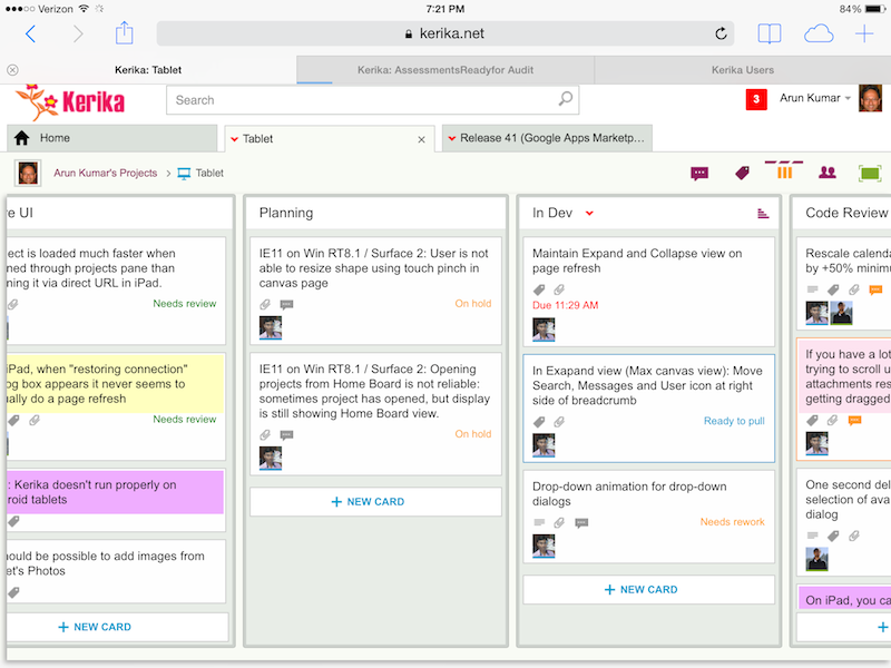
What’s great about building a pure HTML5 software like Kerika is that many of these improvements are also going to improve the user experience on desktops and laptops.
Here’s the laundry list:
Big changes:
- You can add photos from your iPad to cards: you can take existing images from your photo library, or simply take a picture on the go and add it to a card.
- We worked out a bunch of quirks related to Internet Explorer, which, unfortunately, remains sui generis when it comes to browsers.
- In general, Kerika is now a lot smarter about dealing with laptops that have both mouse and touch interfaces.
- We have improved performance and responsiveness, across the board.
Usability improvements:
- We have redesigned our “Max Canvas” view so that it provides the most useful display, when you need the most space available to view a large board. In particular, you can now access Search even when you are in the Max Canvas view.
- If a column is partially hidden, e.g. at the left- or right-edge of a Task Board or Scrum Board, clicking on the “+New Card” button at the bottom of the column will make the entire column slide into view, so you can clearly see what you are typing.
- The Yes/No confirmation buttons on the Workflow dialog have been resized, so they are easier to press (unambiguously) with a finger on a tablet. Which, of course, improves usability for laptop users as well, in keeping with Fitt’s Law.
- On a related note, we rescaled the calendar control used for setting due dates on cards, to make it easier to use with a finger (without making a mistake).
- It’s easier to scroll through a long list of attachments on a card without accidentally dragging them with your finger.
- The user interface makes it clearer how you can slide your view of a board, by swiping.
- The panning motion, when you swipe left/right, is smoother.
- Frequently, card history can take more than a few seconds to load if the tablet is slow or the wireless connection is slow: if this happens, the user sees an indication that the system is fetching the history.
- Particularly on tablets, it’s easier to scroll down through long card details.
- We have added a subtle animation on drop-down dialogs (e.g. for Workflow, Chat, Tags, etc.) to help people understand how these work.
Bugs fixed:
- On iPad, it’s easier to edit text: the cursor shows correctly when you press and hold your finger, bringing up the “magnifying glass” that lets you move the cursor to a specific character.
- The “hint text” shown on text boxes, e.g. “Enter the card’s description…” won’t get included when you copy/paste from the tablet’s clipboard.
- A one-second delay in showing the list of available colors, for setting the color of a card, has been eliminated. (Yes, we care about one second delays…)
- A one-second delay in showing the Tab Overflow button — the button that appears to the right-edge of all your open project tabs when there are too many tabs to display — has been fixed.
- It was difficult to select a name from the list of auto-completed suggestions presented to you when you want to add someone to a project’s team. That’s been fixed.
- A bug related to selecting the colors at the bottom of the list of available colors has been fixed.
- If you tried to change the curve of a line on a Whiteboard or canvas, a bug that caused shadows to show up has been fixed.
- A bug related to how the text box toolbar was displaying (the buttons for this were showing up in an untidy way if there wasn’t enough space) has been fixed.
- On canvases, the thumbnail images of some files were showing up stretched when viewed in Safari, although they were fine when viewed using the Chrome browser; this has been fixed.
- Also on canvases, it’s easier to swipe across the canvas without moving stuff accidentally.
- When you are using an iPad in portrait mode (i.e. holding it vertically), card details show up properly centered.
What remains:
A ton of work on Android, unfortunately… Android tablets vary so much in terms of processor capability that even the same browser, e.g. Chrome, can behave very differently on different Android tablets & even tablets from the same manufacturer.
Some Android tablets will work better, as a result of all this work we have done, but we can’t yet guarantee that all of them will work perfectly.
There’s a similar, albeit smaller, challenge with Windows Surface machines
Windows laptops and desktops generally work fine, and so do “convertibles” (i.e. dual-screen machines where you can use the mouse or touch the screen), but Windows Surface is still causing some issues because of weirdness within Internet Explorer.
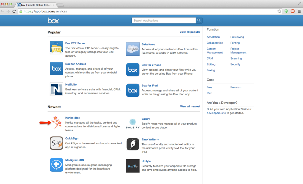
Box vs. Google: what’s different, if you are a Kerika user?
We got an email this morning from a user that we decided to answer here, because the topic is relevant to many of our old users…
We are wondering what the differences between Box vs Google are going to be. Also, if we move over to a Kerika+Box account, will we have to rebuild what we have set up in Kerika+Google?
To answer the first question: the Kerika user interface is the same, whether you use Kerika+Box or Kerika+Google.
And, we fully intend to keep the user interface the same across these two cloud storage platforms — and any others that we might support in the future.
That said, the Kerika user experience, which is more than just the user interface, is a little different due to the quirks of Box vs. Google.
For example, Box makes it really easy to sign up as a new user, and keep your old email account. You can do that with Google, too, but it’s a lot more cumbersome.
Box also works really well with Microsoft Office files: Box doesn’t try to convert your files into it’s own proprietary format, i.e. it doesn’t have its version of Google Docs, so if you like working with Microsoft Office, Kerika+Box is probably the better choice.
(Note: it’s possible to use Kerika+Google and not have your files converted to Google Docs, by setting a user preference, but that kind of misses the point of using Kerika+Google in the first place…)
If you like to view and edit your files right in the browser, then Kerika+Google is the better choice because Google Docs is getting better all the time.
For both Kerika+Google and Kerika+Box, we try to make sure all your Kerika-related files are neatly stored within your own cloud platform, but that’s a little better on Kerika+Google than with Kerika+Box:
Google allows Kerika to create as many nested folders as we need, which means that you only see a top-level folder called “Kerika.com” when you view your Google Drive, and all your projects, across all the accounts you work with, are all stored inside here.
Box doesn’t allow us to create nested folders in the same way, so you will see a lot more top-level folders in your Box account as your Kerika collaboration network grows.
So, the same user interface for both Kerika+Google and Kerika+Box, but a slightly different user experience with pros and cons for both Google and Box.
And the user interface will remain the same in the future: we have no intention of adding features that will only work with Google or Box — only features that will work well with both.
Now, for the second question: if you create a new Kerika+Box account, you will need to create new projects in this account because it is not connected in any way to your Kerika+Google account.
This may be a bummer for some of our old users who have a lot of projects built up using their Kerika+Google accounts, and now want to switch over to using Kerika+Box.
The reason this limitation exists is that the underlying cloud platforms are completely different, and come from two companies that are competing with each other rather than collaborating in any way.
This makes is impossible for us to move content from a Kerika+Google account over to a new Kerika+Box account, even if they are owned by the same user, since even if we tried to move over all the cards, boards and canvases, we wouldn’t be able to automatically move over any related files.
Sorry about that :-(
Using status indicators on Task Boards and Scrum Boards: Done!
(The sixth, and last, in a series of blog posts on how you can make use of the status indicators on cards, in Task Boards and Scrum Boards.)
In our last post we talked about how to use the “Is blocked” flag; today, let’s take a look at “Done”.
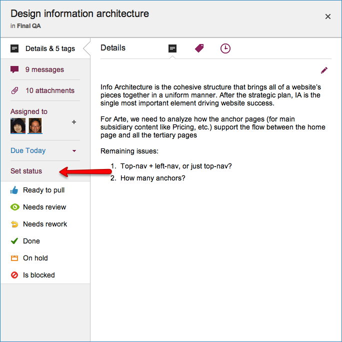
“Done” is where you want to get to: it’s a special column that’s always to the right edge of every Task Board and Scrum Board.
(You can always chose to hide the Done column, of course, just like you can hide every other column on the board.)
Marking a card as “Done” is simply a quick way of moving it to the Done column, which can be handy when you have a very elaborate workflow — and we have seen folks whose boards have up to 20 columns!
In the near future when we add Work-In-Progress (WIP) Limits for Task Boards and Scrum Boards, the Done column, of course, will not be subject to WIP.
We are also planning on adding more metrics to help Project Leaders and Account Owners understand how well their projects are going, and these will naturally make use of the Done count.
All posts in this series:
Using status indicators on Task Boards and Scrum Boards: Is Blocked
(The fifth in a series of blog posts on how you can make use of the status indicators on cards, in Task Boards and Scrum Boards.)
In our last post we talked about how to use the “On Hold” flag; today, let’s take a look at “Is Blocked”
“Is blocked” sounds similar to “On hold”, but it should be used in a different context: Blocked is a red flag to the team — it indicates that you are unable to proceed with a task, and you need help.
The essential difference between Blocked and On Hold is that:
- You, or perhaps your boss, chose to put something On Hold.
- You were forced to mark something as Blocked.
For teams working in a Kanban or Scrum model, the highest priority for a Project Leader should be to unblock cards.
Unblocking cards (and hence, people) is the most useful thing that a Project Leader can do to help move work smoothly.
This is why “Is blocked” is shown in red on a card, so that you can literally raise a red flag!
All posts in this series:
- “Ready to Pull”
- “Needs review”
- “Needs rework”
- “On hold”
- “Is blocked”
- “Done”
Using Status Indicators on Task Boards and Scrum Boards: “Needs rework”
(The third in a series of blog posts on how you can make use of the status indicators on cards, in Task Boards and Scrum Boards.)
In our last post we talked about how to use the “Needs review” flag; today, let’s take a look at “Needs rework”.
In an ideal world, cards would only move from left to right: starting off on the left-most column, e.g. the Backlog in a Scrum Board, and moving in stages to the Done column.
In the real world, however, work can sometimes need rework, and that’s what the “Needs rework” status indicator can be used for.
The amount of rework that’s needed will vary widely, depending upon the project and the team:
If someone new has just joined a well-established team, that person may need some time to understand exactly what’s expected of them at each stage of the project’s workflow: they may, for example, be too quick to move a card from “Planning” to “In Development”, without realizing what’s expected of a card that’s fit to exit the Planning stage.
This new person may find that her work gets pushed back to the left, marked as “Needs rework”.
It’s imperative that whoever pushes back work as “Needs rework” also provides some precise description of what rework is needed.
This is most often done using chat, but sometimes a marked up document, screenshot or other materials may be more useful, particularly if the task is complex.
But, simply marking a card as “Needs rework”, without providing a good explanation, is never a good idea: it will generate ill-will within the team, discourage the new person, and simply result in more work for everyone.
Some times of work will always require a lot of rework: e.g. design.
Mockups of new products or features, or copy for new advertising, will go through a lot of rework before it is considered ready to move along a workflow.
This is quite normal, which brings up another critical point: good Project Leaders will ensure that there is no stigma attached to cards being marked as “Needs rework”.
If people are made to feel, however subtly, that their work is of poor quality because many of their cards are frequently marked as “Needs rework”, this will have a very bad effect on individual and team morale.
It’s really incumbent on the Project Leaders to ensure that people understand that “Needs rework” is simply a status indicator, not a judgment of someone’s abilities!
All posts in this series:
- “Ready to Pull”
- “Needs review”
- “Needs rework”
- “On hold”
- “Is blocked”
- “Done”