All posts by Kerika

About Kerika

Kerika is the only task management tool that's designed specially for global, remote teams.

A shift towards short-lived cookies

In an earlier blog post we noted that Google is making it increasingly hard for people to create and maintain distinct Google IDs, and this is creating more problems for Kerika users, forcing us to rethink our “cookie strategy”. Here’s the background:

Long-lived and short-lived cookies

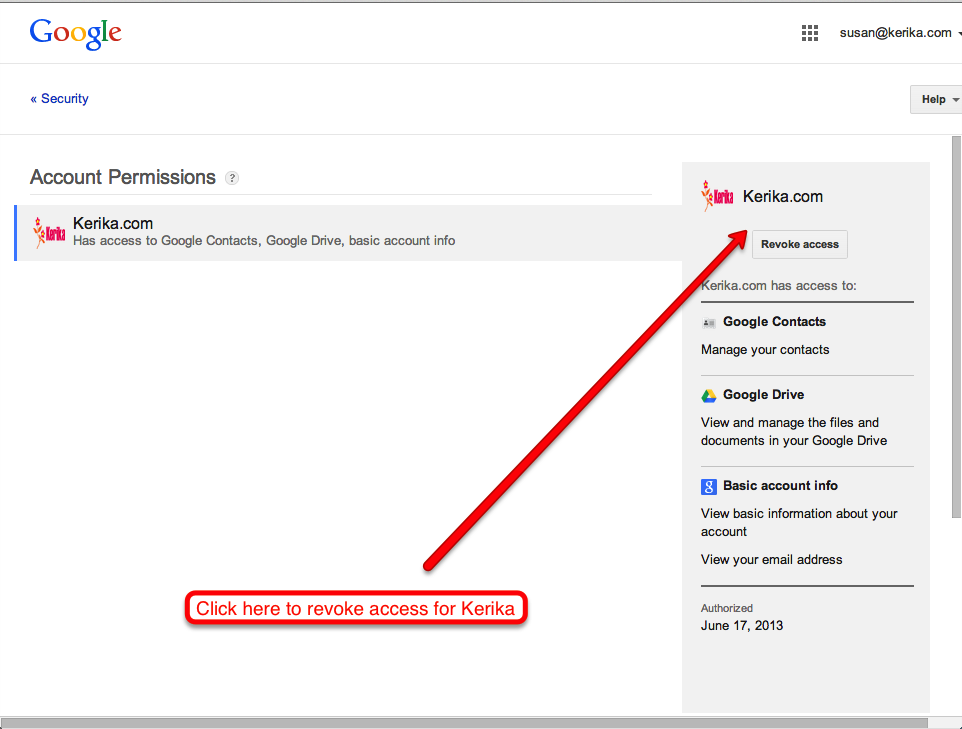
When you sign in to Kerika, you do so using your Google ID: the Kerika server gets an authorization token from Google and places a cookie on your local computer so that you don’t have to sign in again, if you close and then reopen your browser.

We had been using what’s known as a “long-lived cookie”: one that doesn’t automatically expire when you close your browser. That made Kerika more like a news site than a banking site: when you login to a news site as a registered user, you get a long-lived cookie so that you don’t have to login again, even after you have closed your browser (or even restarted your computer).

Banking sites, on the other hand, use “short-lived cookies”: if you close your browser tab, open a new one and try to access your bank account again, you will be asked to re-login.

Short-lived cookies are generally used for more sensitive websites, like banking, because there is a big tradeoff in terms of user convenience. Kerika had previously opted for long-lived cookies because we wanted to make it really convenient for people to get back to their Kerika boards after having closed their browser.

The problem we face

The problem we are facing now is that it is increasingly more likely that your Kerika login is out of sync with your Google login. There are at least two ways in which this could happen, one of which was always a risk, and the other a new risk resulting in the shift in Google’s approach to user IDs:

  • The old problem: people with multiple Google IDs would frequently switch between them, without logging out of Kerika. For example, someone has two Google IDs: A and B. She may have signed up with Kerika while she was logged in as User A. Since we were using long-lived cookies, a Kerika cookie identifying her as “User A” will stay on her machine until she logs out of Kerika.
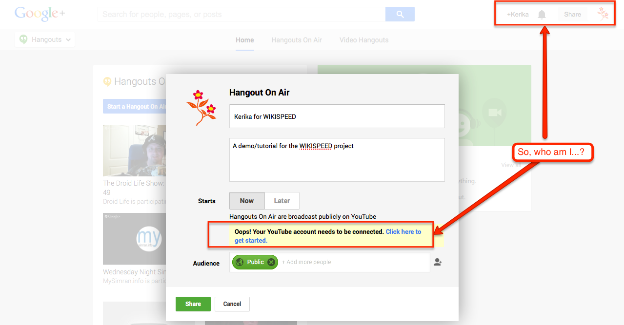
    But, in the interim she may have separately logged out of Google as User A and logged in as User B (perhaps to check her Gmail on a different ID). This would result in a situation where she is known to Kerika as User A, and currently logged into Google as User B. In this scenario, she would be unable to open any files attached to her projects because of the mismatch in IDs.
  • The new problem: Google is making it easier for people to be logged in as two different IDs, using the same Chrome browser. (Note: this is true only with the Chrome browser; not true with Safari, Firefox or IE as far as we know.) This considerably increases the odds that a user is currently logged into Kerika as User A, and simultaneously logged into Google as User B.
    Because the user never consciously logged out from Google – just switched IDs while on YouTube or Gmail or somewhere – she may be unaware that she isn’t who she thinks she is…

The short-term solution

We can mitigate this problem by switching over to short-lived cookies. This makes the user experience a little more annoying, in our opinion (because you have to login more frequently to Kerika, or remember to keep your browser alive), but it should help reduce the odds that your Kerika ID is out of sync with your Google ID.

The long-term solution

Allow users to sign up directly at Kerika, without using their Google IDs!

Google+ isn’t ready for world domination

We just spent an hour trying, fruitlessly, to set up a “Google Hangout on Air”, and about the only thing we can conclude is that all those folks who are worried about Google’s plan for world domination can relax: Google isn’t close to having a single ID to track everyone.

In order to do a Hangout on Air (a public Hangout, that up to 10 people? can view), you need to have a YouTube channel connected to your Google+ account.

Well, we do have a YouTube channel for info@kerika.com, and Google+ account, also for info@Kerika.com, but that’s not good enough for Google which keeps providing this singularly unhelpful message:

Trying (and failing) to start a Google Hangout

Clicking on the “Click here to get started” link, which you might reasonably expect to take you to a control panel screen of some sort, just takes you down a wild-goose chase of outdated help pages from Google. These help pages have clearly not kept up with UI changes at YouTube, nor even with UI changes on Google+ itself.

Trying to make sure our Google+ profile is complete doesn’t help either: Google+ tells us that our profile is 85% complete, and that we have done everything we need:

Stuck
Stuck…

at 85 percent
at 85 percent

Pretty painful experience; we are going to stick with GoToMeeting for now.

It’s now easier to work with Microsoft Office files

Although Kerika is built on top of Google Drive, you can still share files in Microsoft Office format.

Here’s how it works:

  • By default, your files are converted to Google Docs format when you add them to a card or canvas in Kerika, but if you prefer, you can keep them in their original Microsoft Office (or other program, like Adobe) format.
  • Go you personal preferences page, at https://kerika.com/preferences, and you will see this preference switch:
Setting your Kerika preferences

Toggle the “Use Google Docs for projects in my account” to OFF, and your Microsoft Office files will remain in their original format even as they get shared using Google Drive.

To make this preference even more useful, we have added a “smart download” feature: if you are storing your files in Microsoft Office format, clicking on a file attached to that card will automatically download that file for you, so that you can open it in Microsoft Office.

For example, if you have added a Microsoft Word file to a card, and are storing it in the original MS Office format, clicking on the attachment will download the file and launch Microsoft Word so that you can immediately start editing the file.

In some cases you might see a “403 Access Denied” message appear: if you do, there is a simple workaround for this problem – just open docs.google.com in a separate browser tab, and try again. It will work this time.

A very important point to note: if you download and edit a file, make sure you attach the modified document as a new attachment to your card (or canvas); otherwise your team members won’t see the latest version!

Usability testing is surprising cheap (revisiting Jakob Nielsen)

Jakob Nielsen, of the Nielsen-Norman group, is an old hand at Web usability – a very old hand, indeed, and one whose popularity and influence has waxed and waned over the last two decades.

(Yes, that’s right: Mr. Nielsen has been doing Web usability for 2 decades!)

Kerika founder, Arun Kumar, had the good fortune of meeting Mr. Nielsen in the mid-90s, when he was just embarking upon his career as an independent consultant. The career choice seemed to have come from necessity: Mr. Nielsen has been working in the Advanced Technology Group at Sun Microsystems, and they had recently, with their usual prescience, decided to disband this group entirely leaving Mr. Nielsen unexpected unemployed.

(This was before Sun concluded there was money to be made by re-branding themselves as the “dot in dot com“. As with so many opportunities in their later years, Sun was late to arrive and late to depart that particular party.)

It must have seemed a treacherous time for Mr. Nielsen to embark upon a consulting career in Web usability, back in the mid-90s, when despite Mosaic/Netscape’s success a very large number of big companies still viewed the Internet as a passing fad. And Mr. Nielsen, from the very outset, opposed many of the faddish gimmickry that Web designers, particular Flash designers, indulged in: rotating globes on every page (“we are a global company”, see?) and sliding, flying menus that made for a schizophrenic user experience.

Despite the animus that Flash designers and their ilk have directed towards Mr. Nielsen over the past decade – an animus that is surely ironic given how Flash has been crumbling before HTML5 – his basic research and their accompanying articles have stood the test of time, and are well worth re-reading today.

Here’s one that directly matches our own experience:

Elaborate usability tests are a waste of resources. The best results come from testing no more than 5 users and running as many small tests as you can afford.

And here’s the graph that sums is up:

Diminishing returns in usability testing

Identifying bottlenecks is easier with visual task boards

One great advantage of a visual task board like Kerika is that it is a really fast and easy way to identify bottlenecks in your workflow, far better than relying upon burndown charts.

Here are a couple of real-life examples:

Release 33 and Release 34 are both Scrum iterations, known as “Sprints”.

How Scrum works
How Scrum works

Both iterations take work items from a shared Backlog – which, by the way, is really easy to set up with Kerika, unlike with some other task boards ;-) And for folks not familiar with Scrum, here’s a handy way to understand how Scrum iterations progressively get through a backlog of work items:

We could rely upon burndown charts to track progress, but the visual nature of Kerika makes it easy to identify where the bottlenecks are:

In Release 33, the bottleneck is obviously within the Development phase of the project:

Release 33: a bottleneck in Development

When we take a look at the Workflow display, it’s easy to quantify the problem:

Quantifying the bottleneck in Release 33

By way of contrast, here’s Release 34, another Scrum iteration that’s working off the same Backlog:

Release 34: a smaller bottleneck

This iteration doesn’t have the same bottleneck as Release 33, but warning signs are clear: if we can’t get our code reviews done fast enough, this version, too, will have a develop a crunch as more development gets completed but ends up waiting for code reviews.

In both cases, Kerika makes it easy to see at a glance where the bottleneck is, and that’s a critical advantage of visual task boards over traditional Scrum tools.

iOS 7 Maps: more beautiful than before, still slightly insane.

Here’s a simple screenshot that shows why Apples iOS 7 Maps is more beautiful than ever, but still slightly insane… Here’s what happens if you search for “Ups klahanie”, while standing on Klahanie Boulevard in Issaquah, Washington: Apple suggests you go to a UPS store in Vancouver, British Columbia. In other words, it finds a suitable destination for you that’s in another country altogether.

Searching for the nearest UPS store


The basic flaw with iOS Maps, as we have noted before, is that it makes no effective use of GPS data even though the software was created for use only with iPhones, all of which, always, have had GPS capabilities. This has been

But this particular search provides a clue to what’s actually going in Apple’s servers: the word “Klahanie” means “outdoors” in the Chinook language, and the Chinook people can be found across several places in the Pacific Northwest region, beyond their origins in the lower Columbia River region (where Washington State borders Oregon).

So, somewhere in Vancouver the Chinook influence has also resulted in a local street being named Klahanie, and that’s triggered Apple’s Maps to serve up that absurd result (instead of the UPS store that was less than a mile away from where the search was being done).

How we handle Date/Time displays (in a very smart way)

We are improving our “smart display” of dates and times, to make sure they are as easy for users to comprehend as possible.

(At this point you might well be wondering: “why is this a problem in the first place? Don’t people know how to read dates or times?”)

The underlying problem we are trying to solve is that “relative time” is more useful than absolute time, if you are dealing with a short time span.

For example, the word “Yesterday” has much more cognitive value than July 19, 2013 (which is also “yesterday”, as of the time this blog post is being written). “Yesterday”, “today”, “tomorrow”, “two hours ago”, “recently”, etc. are all very powerful ways to convey a sense of how far away a particular event is from the current moment.

But, as one of users – Carlos Venegas, from Lean Office Innovation – recently pointed out, this works best for short periods of time: for example, it is helpful to know something that happened “2 days ago”, but much less helpful to be told that something happened “12 days ago”. In the latter case, the cognitive advantage of using relative time disappears and quickly becomes a burden for the user: 12 days ago is too far in the past, and now the user has to do some mental calculation to arrive at the more useful value of “June 10, 2013”.

This issue became more pressing when we built the Due Dates feature, because time doesn’t have an absolute value when you are dealing with a distributed team. For example, the Kerika team is distributed between Seattle and India: a time difference of 12.5 hours in the summer, and 13.5 hours in the winter.

This time difference is large enough to make terms like “today” ambiguous: depending upon when you are talking with your cross-border colleagues, you may have very different ideas of when “today” ends.

To address this, we made our Due Dates feature smart: it automatically adjusts for timezone differences, so that when someone in India marks an item as due “today”, Kerika ensures that people in Seattle understands what that means in terms of Pacific Time.

We also are improving our display of relative time, using a more detailed algorithm:

  • First of all, any time reference that is more than 3 days away is shown in absolute values: e.g. “July 15”, rather than “7 days ago”.
  • The concepts of today, tomorrow, and yesterday are preserved: the system figures out what timezone you are located in, and uses these terms in a smart way.
  • If an item is due by the end of the day, the time is shown using your current timezone: e.g. “11:30AM PST” rather than just “today”, for an item that is supposed to be done by the end of that day in India. This removes misunderstandings that would otherwise exist across timezones.
  • As you get closer to a time, the display gets more precise: anything due within the next hour is displayed in minutes, e.g. “45 minutes”.
  • As you get very close, the display gets a little vaguer, because of the greater uncertainty about when something might actually happen. So anything that’s two minutes away is marked as recently.

All of this makes for a very smart display of time, while keeping the user interface very simple: users set dates using a simple calendar control, without having to worry about the details of where others on the team are currently located, and how they might perceive these values!

Setting Due Dates on cards

With our next release (next week), you will have the ability to set Due Dates on cards; this is how it’s done:

Example of setting a Due Date on a card

The concepts are very simple, yet very elegant and powerful:

  • By default, all cards are “Not scheduled”, which means no Due Date has been set. Of course.
  • When you open up a card, you will find a new menu/button that lets you set a Due Date.
  • Due Dates are presented using words where possible, e.g. “Due Today”, “Due 2 days” ago”, etc., since these are easier for people to grasp than actual numbers.

When you set a Due Date, Kerika automatically takes into account your location, so that coworkers in other timezones understand exactly what you mean by “Due Today” or “Due Tomorrow”.

  • For example, if someone in India sets a Due Date for July 19, they expect the task to complete by midnight, July 19, Indian Standard Time.
  • When someone in Seattle looks at that card, they will see that it is due by 11:30AM July 19, Pacific Daylight Time. In other words, Kerika automatically adjusts for the 12.5 hours timezone difference that exists (during the summer) between Seattle and India.

Due Dates are presented right on the card when you are looking at a task board, and hovering over the date with your mouse will show the exact time:

Seeing the Due Date time on a card

In this example, the card was due three days ago, at 5PM Pacific Daylight Time.

All of this is done automatically and behind the scenes, in keeping with Kerika’s unique focus on making collaboration easy for distributed teams.

Daily Email Summary

We are introducing a new user preference, set to ON by default, that lets you get a daily summary of your most pressing tasks:

  • All the tasks that are due today.
  • All the tasks that are due tomorrow.
  • All the tasks that are overdue.

You can set the preference like this, by visiting https://kerika.com/preferences:

Preference setting for Due Date emails

The daily email that you get looks like this example:

Example of a daily email summary of your tasks

This daily email summary will get sent to you at 6AM every day, no matter where you are: Kerika figures out which timezone you are in, and sends you the email so that it’s the first thing you look at when you wake up!

When you are looking at a task board, you can easily spot the cards that are overdue – they are marked in red – and the cards that are due today – they are highlighted in blue. Here’s an example:

Due Dates are highlighted on task boards

This next release is an important step on our way to implementing a Dashboard! Stay tuned…