We have been one of the last jazzy Web apps out there that was still running on Internet Explorer 9, but that’s going to change: with our next release, due in a month or so, we will be asking Internet Explorer users to upgrade to IE10 or later.
The main reason for this change is that all “modern” browsers — and IE9 qualifies as “modern” only when it stands next to IE8 — do a lot of work within the browser itself that Kerika currently does: stuff like managing and manipulating the DOM structure of the Kerika application.
This means that the Kerika client-application — the bit that you actually see and use in a browser — is unnecessarily complicated, and somewhat slower, than it needs to be, because we are doing some work that IE10+, Chrome, Firefox and Safari all do within the browser itself.
Dropping support for IE9 will enable us to provide a faster user experience, with less complexity in the code.
Some of our Kerika+Box users have been complaining about the number of email notifications they get when new projects are created: this has to do with Box, rather than Kerika, but it’s helpful to understand what’s going on, and what you can do about it.
When you create a project in Kerika, Kerika creates a dedicated folder for the files that will be used in that project. This folder is shared with whoever needs access to that Kerika project.
Every Kerika user can set a personal preference: you can choose to share your new projects with your account team automatically when they are created, or just with people as and when you add them one by one to a Kerika project. By default, this is set to “share with account team” since this helps people discover new projects within their organization.
One downside of this: whenever you create a new project team, especially if it owned by a service account, a new Box folder will get created for this project and shared automatically with everyone who is part of that account.
This was resulting in way more emails than anyone wants to see, so we have made a change in the way we work with Box:
When people get added to a Box folder, through Kerika, they will no longer get an email notification.
However, the Account Owner will still be notified; there doesn’t seem to be any way around this.
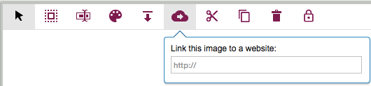
One little-known feature of Kerika’s Whiteboards: if you have an image (picture) on a canvas, you can also add a link to a Website, so that anyone clicking on the picture would be taken straight to that website.
(It’s one of several little-known features that we hope will become well-known, with our recent redesign of the Canvas toolbar; we have built too many really cool features that not enough people are aware of!)
One common use of this feature is to create an external-facing page that includes a logo: you can add the logo’s image to your canvas, and then point that logo to your company’s website.
It’s simple: just select the image, and then click on the “Link to website” button on the Canvas toolbar.
With our latest release we are adding a feature that will make it easier for folks to create, and maintain, very elaborate Whiteboards: any team member can lock a canvas to discourage other team members from making changes.
This isn’t a very complicated function; it has a very simple purpose: if you have been working hard on a particular canvas, which could be a stand-alone Whiteboard, part of a series of nested canvases in a Whiteboard, or attached to a card on a Task Board or Scrum Board, you may become worried that other team members might come by to visit your board and carelessly make changes to your pristine creation.
(After all, we creative types can get really possessive about our beautiful canvases :-)!)
To discourage others from making changes, just click on the lock button that appears to the far end of the Canvas toolbar:
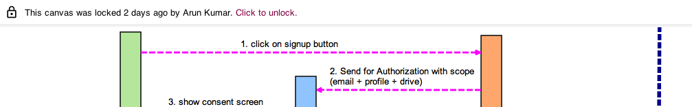
For Team Members, this is a “soft lock”: any canvas that’s locked by one Team Member can be unlocked by any other Team Member, so you are not really shutting out people from making changes, merely discouraging them by signalling that you would like to preserve a canvas in a particular way.
Canvas locked by Team Member
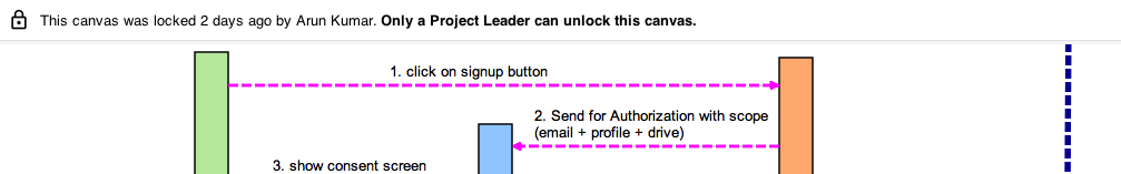
But for Project Leaders, this is a “hard lock”: if a Project Leader locks a canvas, it can be unlocked only by another Project Leader. (Remember: projects can have more than one Project Leader!)
Canvas locked by Project Leader
So, if a canvas gets to a truly pristine state that you want to preserver forever, have the Project Leader lock it, and the rest of the team will be able to view it but not make changes.
And, of course, if canvases are embedded (nested) inside each other, each canvas can be locked or unlocked, as you like, giving you maximum flexibility.
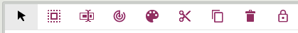
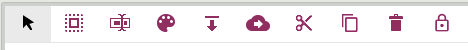
We have updated the toolbar for canvases to provide a better user experience for folks working on standalone Whiteboards or when attaching canvases to cards on Task Boards and Scrum Boards.
What used to look like this:
What Canvas Toolbar used to look like
Now looks look this:
What Canvas Toolbar looks like now
The Upload File and +Web Content buttons have been replaced with simple icons that take up less space.
On the left, there is a new Select All button: this function was kind of buried before, inside the old “Action” button, but now it is more visible and easier to access.
There is a new Lock button on the far right: this is a new function that we will talk about more in a separate blog post, but we can summarize it here as a way to freeze canvases to prevent people from making changes.
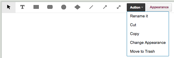
When a shape, e.g. a rectangle is selected, you used to see something like this:
What the Selected Object toolbar used to look like
Now, you will see this:
What the Selected Object toolbar button looks like
When a shape (or other object is selected, all the other drawing buttons are temporarily hidden, because they can’t be used. (You can’t draw a shape while you have a shape selected.) This makes the toolbar far less cluttered, by not displaying useless buttons.
A new button lets you Rename a shape. This is old functionality that you can still access by simply double-clicking on the title of an object, or by using the right-mouse button menu, but this new design makes that function more explicit and easier to access.
A new button lets you Change a Shape: this is new functionality. You can change a rectangle to an ellipse, for example, without modifying any other aspect of the shape.
A new button makes it easier to change the Appearance of an object: it’s color, fonts, etc. Again, this is old functionality, but made more explicit and easier to understand.
New buttons make it clear that you can Copy, Cut and Paste objects. This functionality was buried under the old Action button; now it is more explicit and easier to access.
And finally, a simple Move to Trash button makes it clearer how you can delete an object. This removes some confusion that Mac users would experience: on a Mac, deleting is normally done using the Backspace key, but within browsers this would take you back to the previous page because that’s how Macs work.
When you select an image that’s on your canvas, your toolbar used to look like this:
What you used to see when you select an image
Now, it looks like this:
What you now see when you select an image
This is a major improvement: the toolbar is not only less cluttered, but all the functions are more explicit and easier to access and understand, especially:
Download file: same function as before, new button. This will let you download any file on your Canvas, from your Box or Google account.
Link to website: again, an old function that let you link an image on your canvas to an external website.
DESIGN STANDARDS
For the buttons we are mainly using icons from Google’s Material Design standards because that was already in line with our styling, although in some cases we thought Google’s designs were too “blah” and went for something a little punchier.
BACKSTORY
We haven’t updated the Canvas features in a while — we had been concentrating on improving the Kanban and Scrum aspects of Kerika — but lately some of our users have been telling us about the amazing collaborative spaces they have built using Kerika (check out the folks working on the Ebola challenge at OpenIDEO) and this inspired us to try to improve the Canvas!
Other very cool users include the folks at the Foundation for Common Good, who are working on a variety of social good projects, and the teachers at the Iowa Mennonite School who have been using Kerika for art projects and other learning activities.
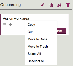
Maybe this isn’t obvious after all… We just realized that a long-time Kerika user (over 3 years of using Kerika on a daily basis!) didn’t know that there is a right-click menu available in Kerika!
If you move your mouse over a card on Task Board or Scrum Board and press the right mouse button, this is what you will see:
Right mouse menu
This menu is handy for selecting all the cards in a column, which you can then grab and drag over to another column or even mark as Done.
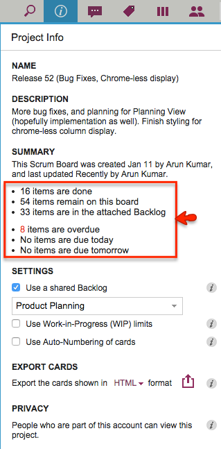
We have made a small layout change to the Project Info dialog to make it easier to read: now the summary data on cards and dates are organized in a bullet list instead of being laid out as a sentence:
Cleaner look to Project Info
This isn’t a big deal, of course, so why are we bothering to blog about it?
Well, for one thing it shows our obsession with details, which is probably a good thing — right? And, for another, it highlights the influence of one of our favorite researchers on Web usability: Jakob Nielsen who has consistently emphasized that on the Web people scan text, not actually read.
We have been working on some designs and ideas for a “Dashboard” feature in Kerika for many months now. Actually, a couple of years now.
Along the way we convinced ourselves many times that we had solved the problem in an ideal way.
At other times, we convinced ourselves that there was no way to solve a particular aspect of the problem, so our obviously ugly solution was the best possible solution.
Looking back on all these iterations, it’s very humbling to think about how easy it is to think something is perfect, until something better comes along — at which point the old thing is suddenly, unbearably ugly.
In other words, the ugliness of each design is obvious, in retrospect.
So everything we are proud of today: we will be ashamed of in a couple of years…
The news that Lenovo pre-installed adware on all consumer laptops sold in the US for the last three months of 2014 (yup, that would be the Thanksgiving through Christmas prime shopping season of the year) is being sadly under-reported by the mainstream press, although the tech press has a better idea of just how much mischief Lenovo did.
The really outrageous point here isn’t that adware came along with the other bloatware that all Windows users suffer from: it’s the fact that this adware was deliberately designed to undermine SSL, which underpins all security on the Internet.
Here’s how SSL is supposed to work: if you connect to Kerika, you are using a secure, encrypted connection to somebody that you genuinely believe is Kerika, Inc. of Issaquah, Washington, United States.
But how do you really know that it’s Kerika on the other end, and not someone pretending to be Kerika?
The only reliable way is to click on the lock icon shown in your browser (whenever you are on a secure SSL connection to any website), and your browser will then tell you who you are connected to, and more importantly, why the browser believes you are actually connected to Kerika and not somebody pretending to be Kerika.
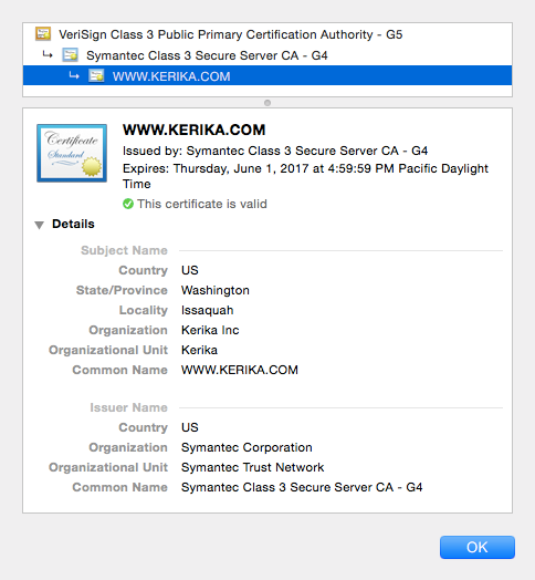
Kerika SSL certificate
The image above is the actual SSL certificate shown when you connect to Kerika, and then click on the lock icon in your browser.
It says, in effect, that a company called Symantec Corporation is the one that vouches for Kerika’s identity: in other words, it is Symantec Corp. that is assuring you that it really is Kerika that you are connected to, and not somebody pretending to be Kerika.
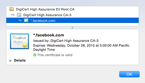
These SSL certificates could be issued by anyone, for example Facebook relies upon a company called DigiCert:
Facebook SSL
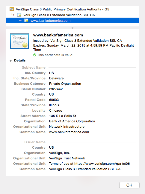
And Bank of America relies upon a company called Verisign:
Bank of America SSL
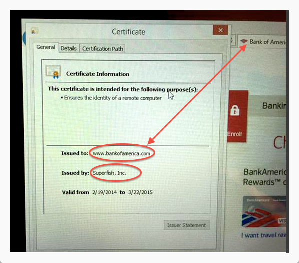
Unless you happen to be using a Lenovo computer that you bought last Christmas, in which case there is a “man-in-the-middle” that you weren’t aware of:
Lennovo’s fake SSL
(Above image captured by security researcher Kenn White, @kennwhite)
On this Lenovo computer, an adware company called “Superfish” is the one that’s vouching for Bank of America, which isn’t right at all!
This is a classic “man-in-the-middle” attack scenario: most people would see the lock appear on the browser when connecting to a secure website, like Bank of America’s, and assume that they are safe. Instead, their communications is actually being intercepted by Superfish before it gets to Bank of America.
(And, by the way, this is pretty much how most Windows PC manufacturers make money: there is so much price competition in the Windows market that they all resort to bloatware and adware to juice up their profit margins…)
And because the same piece of adware was distributed on literally thousands of machines, the same private encryption key is being used on all of these machines, which makes it easy for people to use these bogus SSL certificates to create man-in-the-middle attacks on any number of banks and other secure websites.
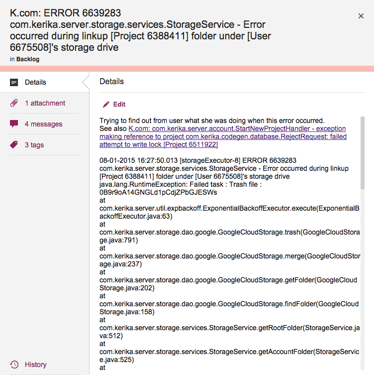
Cards shouldn’t really have very long titles, most of the time, since the details of the task are better described within the card itself, but sometimes having a really long card title is unavoidable.
This is a problem that we have encountered ourselves, for example when we want to track bugs: if our Java-based server software records an exception (error), we need to track at least the top-level of the stack trace that we get from the Java virtual machine that’s running the server software, and this can get pretty long because it includes a bunch of critical information like the time stamp, process ID, etc.
Cards with really long titles
Previously, Kerika’s UI wasn’t super-friendly when it came to long card titles: the entire card title would be displayed when you were viewing a Task Board or Scrum Board, but when you opened the card to view its details, the UI would only show the two lines of card title at a time.
(And this was by design: when we first designed Kerika, we really did think that 2 lines of text would be plenty for most people!)
With our latest release we have eased up on this: when you open a card, you can see the entire title, even if it is pretty long.
(Not that we want to encourage you to write really long cards!)