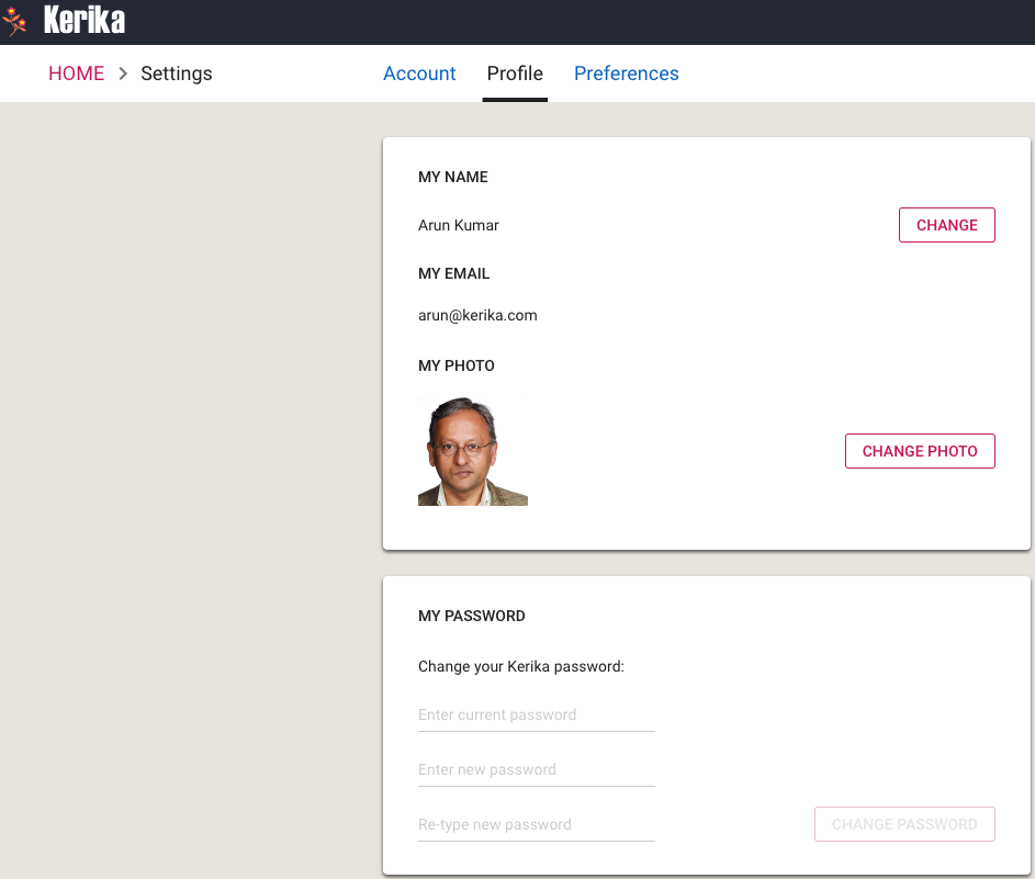
We have updated the My Profile page (you can access yours at https://kerika.com/my-profile) to be consistent with our new look-and-feel:
My Profile
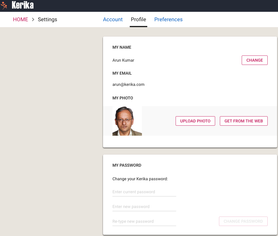
Updating your photo is easy: you can either upload something from your laptop, or get something that’s already online, e.g. your LinkedIn profile photo:
Change Photo
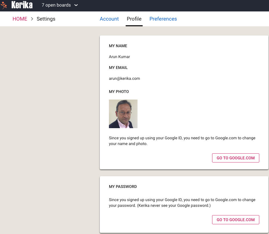
If you are a Kerika+Google or Kerika+Box user, it will look a little different, since we never see your Google or Box password (and hence are in no position to help you change it), and we also rely upon Google/Box to give us your name and photo:
One of our users pointed out that Kerika wasn’t allowing people to be invited if their email addresses were from one of the newer top-level domains that are being used: e.g. “.build”.
We have fixed that. The problem was the client software had some validation rules, written a long time ago, that checked for three characters to appear after the “.” in the end of an email address.
That’s obviously not a good idea anymore, now that there are dozens of top-level domains…
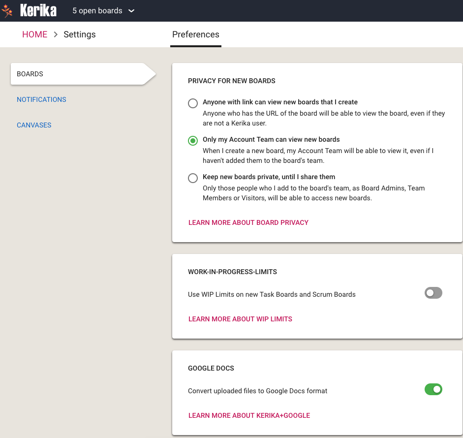
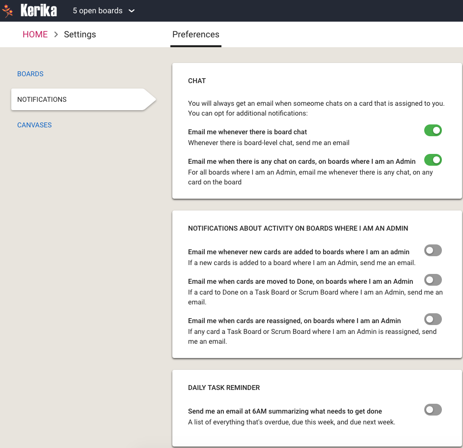
We have restyled your Preferences page, to be more in line with the new design of Kerika that we released a couple of months ago. It now looks like this:
Board Preferences
We are using the familiar “card container” style for showing different categories of preferences, like WIP limits, along with the left-side tabs that are similar to those you find on the Home page.
The Boards tab lets you set the following preferences:
The privacy of new boards you create: you can make them accessible to anyone with a link; to just people who are part of your Account Team; or to only those people you invite to the board as Board Admins, Team Members or Visitors.
Whether to use Work-In-Progress (WIP Limits) on new Task Boards or Scrum Boards that you create.
Whether to have your documents converted to the Google Docs format, if you are using Kerika+Google, or whether you want to retain them in their original format e.g. Microsoft Office. (This preference isn’t shown to Kerika+Box users, or those users who signed up directly.)
Notification Preferences
In the Notifications tab you can decide how much you want to hear from Kerika when stuff happens (that concerns you).
If you are assigned a card on a Task Board or Scrum Board, and someone does chat on that card, Kerika will always push that to you as an email: we assume that since you are responsible for a card, you need to know sooner rather than later when someone has a comment or question about that work item.
If you are a Board Admin, however, you can decide how many notifications you want when stuff happens on boards that you are responsible for.
For example, you could be notified if someone adds a new card on a board: this usually means that there is new/more work to be done by your team, so you might want to quickly check whether it is important — or whether it is even relevant for that particular board.
And, as a Board Admin, you might want to know whenever someone moves a card to Done. This is usually a welcome notification: people like to hear that stuff is getting done, but if a team/board gets a lot of stuff done every day these emails can be a nuisance and you might want to turn off this preference.
And, depending upon how involved you want to be with each card and each Team Member, you can get notified whenever a card is reassigned from one person to another. Some Board Admins like to be very much in control over who is doing what, so if a Team Member takes the initiative to reassign work to another Team Member the Board Admin may want to know right away. Other Board Admins take a more relaxed, hands-off approach and let the team handle its own work allocation.
Finally, you can choose to get a 6AM email summary of everything that is overdue, due this week, and due next week: for all cards assigned to you personally, as well as a all cards on boards where you are one of the Board Admins. You have the additional option of getting this list summarized by date, or by board — or both.
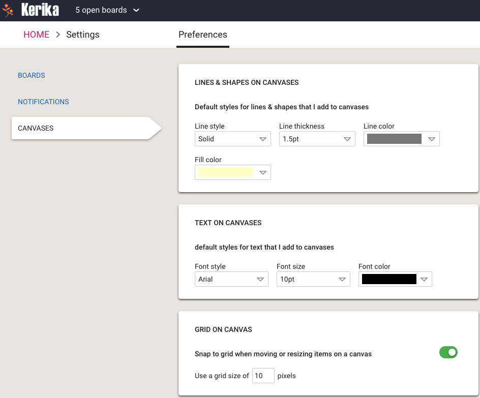
Canvas Preferences
The Canvas Preferences let you determine how lines, shapes and text look like, by default, when you use Whiteboards.
One useful preference in this tab is to have items snap to grids: this helps you lay out process diagrams more neatly.
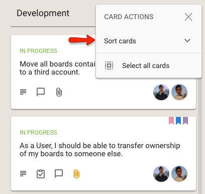
While fast access to actions is generally a good thing in user interfaces, we think there are some circumstances where it might be a good idea to deliberately slow down users, if they are likely to rush into making a mistake.
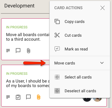
One such tweak we have introduced is to collapse the Move and Sort options for arranging cards within a column into sub-menus:
Collapsed Sort menu
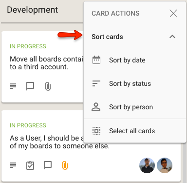
When clicked, the Sort cards option expands to show the different sorts that are available:
Expanded Sort menu
Effectively, this use of a sub-menu within a an already short menu is a deliberate decision on our part to slow you down from rushing into a sorting action.
An inadvertent sort can cause some havoc if the team had previously spent many hours, or even days, carefully grooming the cards on a column (like the Backlog, for example) to arrange them in a precise order.
One rushed sort could wreck all that, so perhaps access to Sort needs to be a little harder?
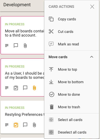
We have done something similar for the Move actions that are available on cards:
Collapsed Move menuExpanded Move menu
What do you think? Smart move on our part, or dumb? Let us know.
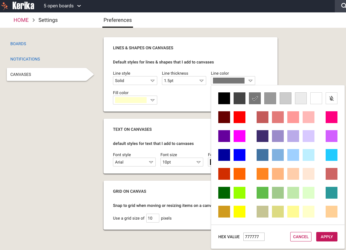
We have restyled the Color Picker that’s used on Whiteboards and a few other places inside Kerika to be more finger-friendly: the old design was very cramped and not usable on touchscreens.
Color Picker
With this new design, each color swatch is large enough to meet design guidelines for touch devices.
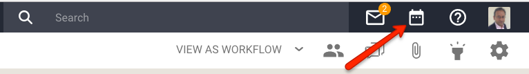
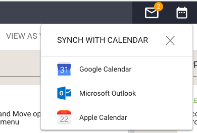
We made some user interface tweaks to make sure people are aware of a really great feature in Kerika that’s existed for a while, but was buried in a Preferences screen that not everyone paid attention to: you can have your Kerika Due Dates automatically show up on your Google, Microsoft or Apple Calendar.
Well, that’s buried no more: we have added a Calendar Synch button in a more prominent place on the top-right of the Kerika app:
Calendar button
Clicking on this button will let you choose the type of calendar you want to synch with:
Calendar choices
(Hint: you can have your Kerika Due Dates synch with more than one calendar, if you like.)
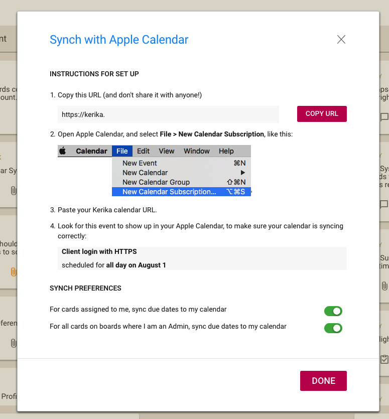
Pick your favorite calendar type, and you will see detailed instructions on how to set up syncing of your Kerika Due Dates. Here’s an example of syncing with Apple Calendars:
Calendar instructions
The URL is personal, and should be kept confidential. (That’s why we aren’t showing it in the illustration above.)
The URL is long and random so it will be impossible for others to guess, but it’s not a good idea to share it with others unless you really want them to know all your Kerika Due Dates, e.g. if you have an assistant or delegate that helps manage your daily schedule.
At long last, we have built Views — one of the most commonly requested features, and something that we had been obsessively designing and redesigning over years, trying to figure out the best way to handle this need.
We have done it now. Views has been built, and is automatically available across all your Task Boards and Scrum Boards, whether they are owned by you or shared with you.
We are starting off with four standard Views, and we will built more in the future, and add a way for you to build your own Views as well.
The Views we have built are:
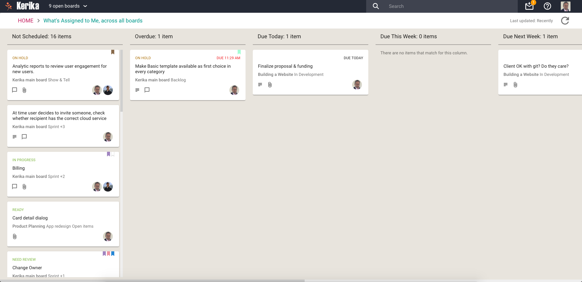
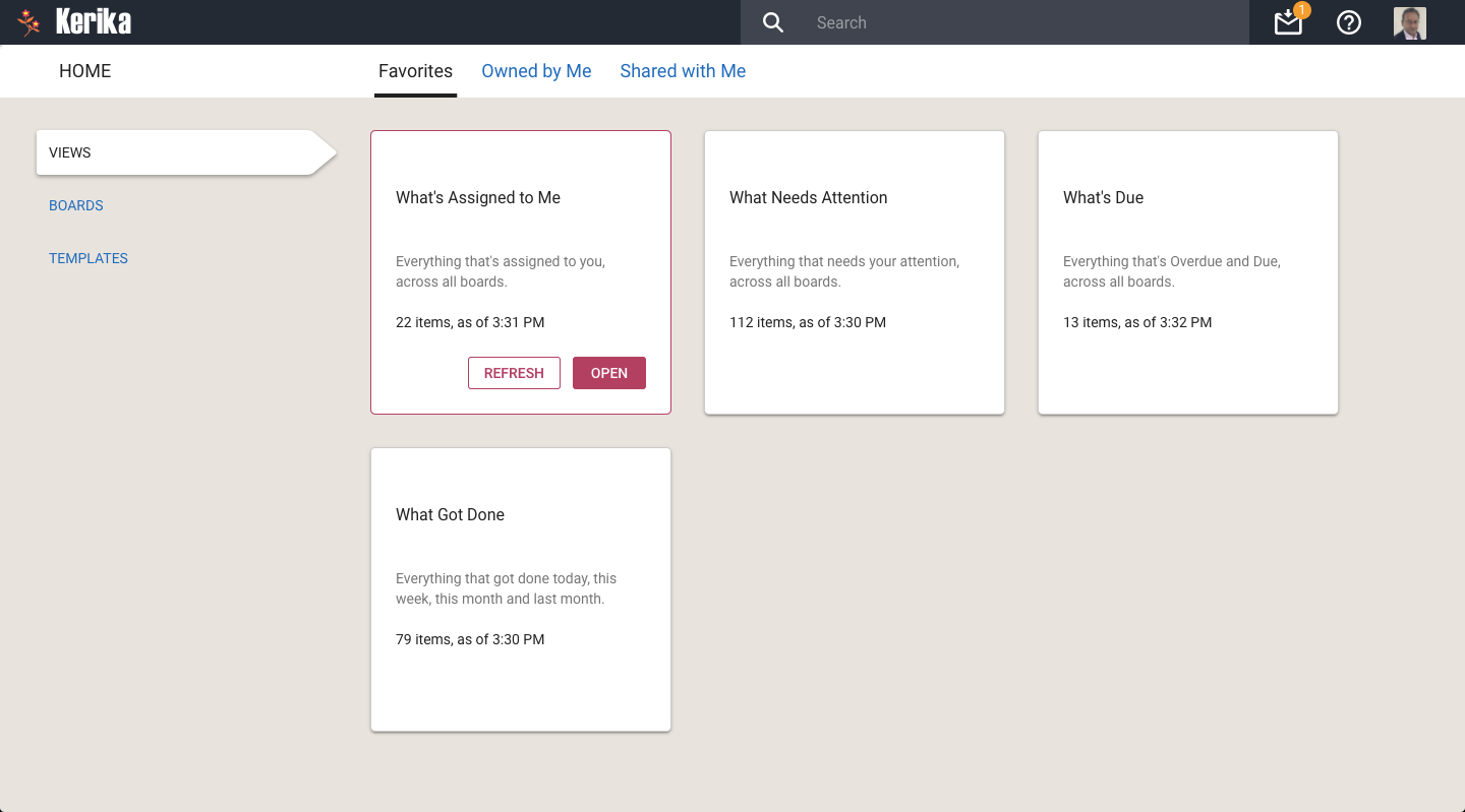
What’s Assigned To Me
The most commonly asked for feature by people who are working on several projects — and, hence, several boards — at the same time. This is what it looks like:
What’s Assigned To Me
Everything that’s currently assigned to, on all boards except for those that are in the Trash or Archive, are collected for you into a single View, where cards are organized as follows:
Not Scheduled
Overdue
Due Today
Due This Week (excluding what’s already included in Due Today)
Due Next Week
Due This Month (excluding what’s already included in Due Today and Due This Week)
Due This Quarter
Due Next Quarter
It is a comprehensive summary of everything you need to get done, and it will be invaluable for managers and anyone else who has to work on multiple projects at the same time.
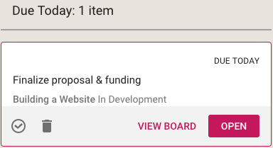
If you select a card in a View, like this
Selecting card from a View
You get quick access to key actions:
Move to Done
Move to Trash
View Board
Open
Open opens the card right there, inside the View itself. View Board, on the other hand, opens the card in the board in which it is located.
Both are useful, depending upon the card and what you want to do: in some cases you just need to update a particular card — e.g. reschedule it, add a comment or file — and opening the card in the View itself, which is very fast, is enough.
In other situations you might want to be sure you are understanding the context of the card, and it is better to see where it is on the board that contains it. This can be helpful for cards that you are not quite sure about.
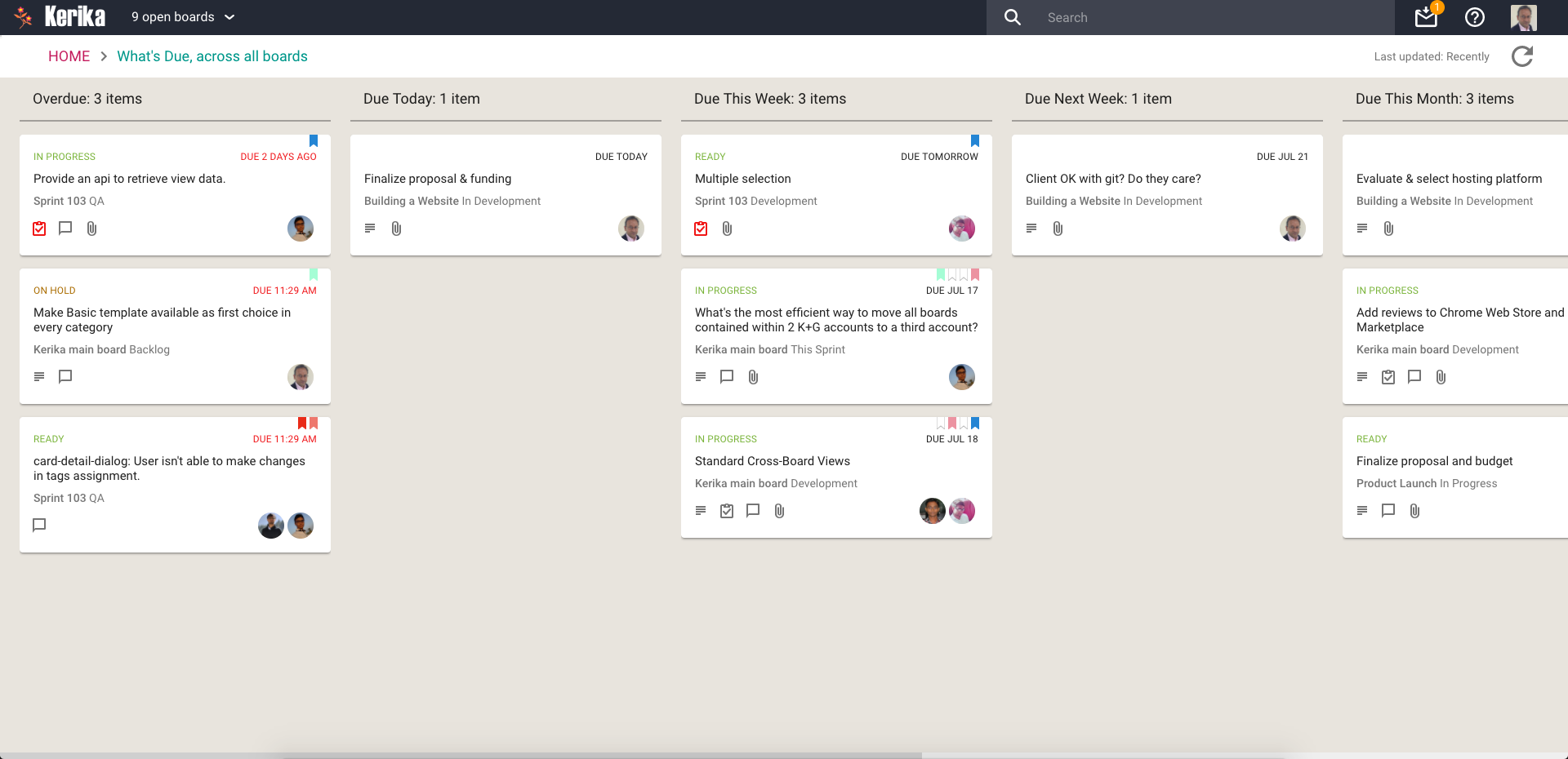
What’s Due
This View will be particularly helpful to managers (Board Admins): it summarizes everything that’s due, on all boards where you are one of the Board Admins:
What’s Due
This basically brings to life everything that you can also (optionally) get in your 6AM Task Summary email.
Cards are organized for you as follows:
Overdue
Due Today
Due This Week (excluding what’s already shown as Due Today)
Due Next Week
Due This Month
Due Next Month
For this View, as with the What’s Assigned to Me View, we try to be smart about not showing duplicate cards: if something is due today, for example, it will show up in the Due Today column, but not get duplicated in the Due This Week or Due This Month column.
This makes it easier for you to plan your schedule: you can see what needs to get right away, and what needs to get done later.
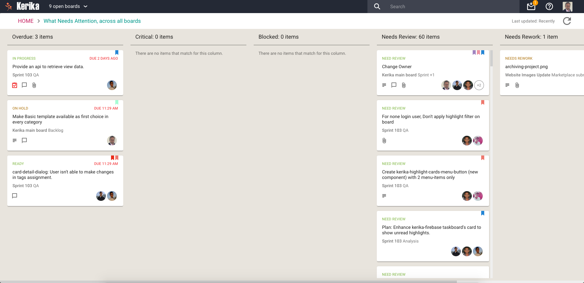
What Needs Attention
Again, a View that will be of particular interest to managers concerned with several ongoing boards:
What Needs Attention
Here, Kerika tries to show everything that needs a little extra attention: things that are
Overdue
Flagged as Critical
Flagged as Blocked
Flagged as Needs Review
Flagged as Needs Rework
Flagged as being On Hold
These items typically represent your risk profile across all your boards, and Kerika brings it all together in a single View.
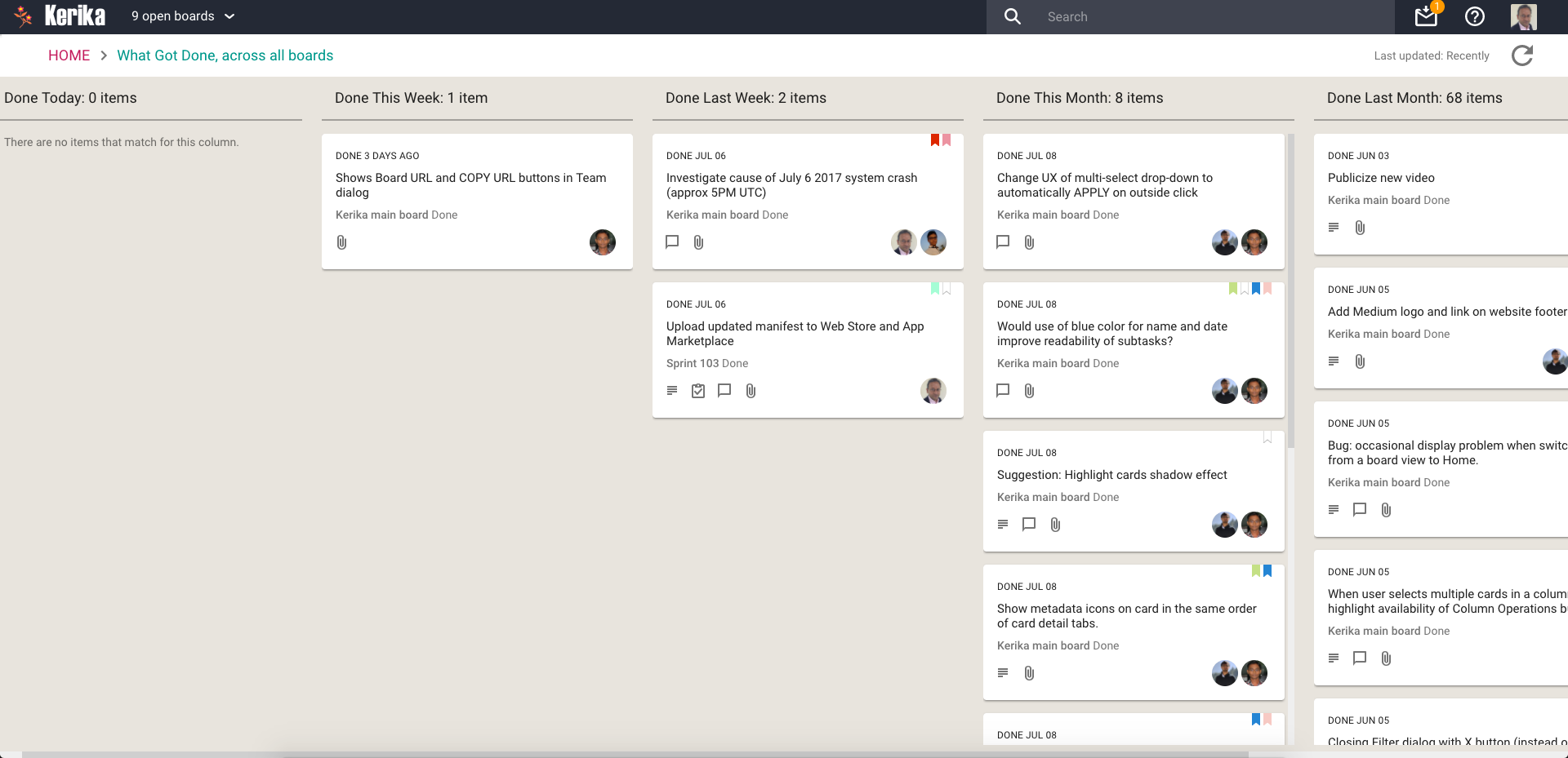
What Got Done
Great for anyone who needs to produce a status report, or any manager who needs to monitor progress across many different projects:
What Got Done
Across all boards where you are a Board Admin, this View summarizes
What got done Today
What got done This Week (excluding items shown in This Week)
What got done Last Week
What got done This Month (again, excluding items shown for Today and This Week)
What got done Last Month
What got done This Quarter
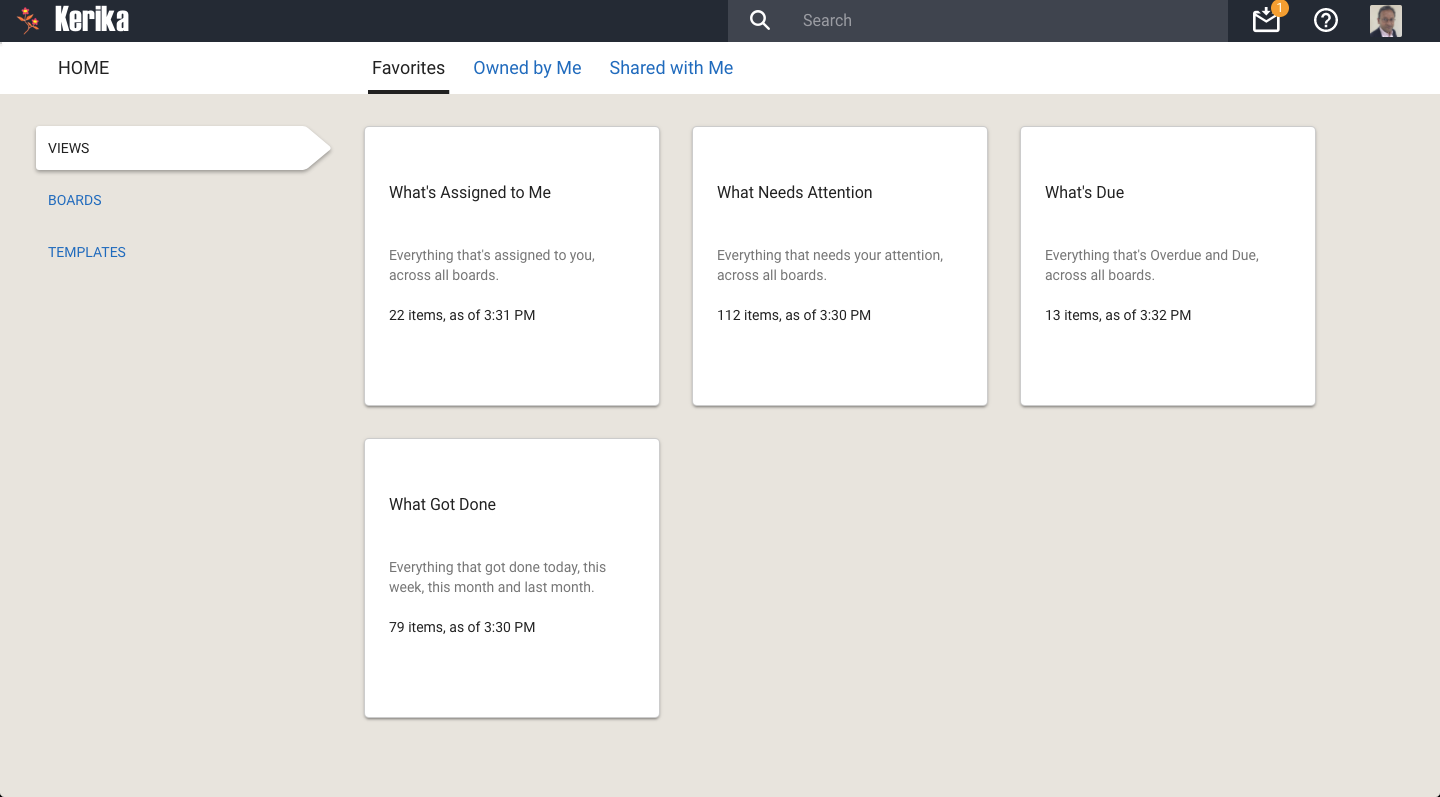
Accessing Views:
All your Views can be accessed from a new tab called Views (naturally) on your Home Page:
All your Views
On each View card, Kerika shows how many items are included in that View, and as of when. The Views are automatically refreshed when you open them, but in-between they are not updated because we do not expect the information shown to change on a second-by-second basis.
If you are worried that your View is out of date, you can update it by selecting it on your Home Page:
Refreshing a View
You can also update any View that you currently have open, by clicking on the Refresh button shown on the top-right of the View:
Refreshing a View
We will let you go crazy with these Views, for now. In the future we will add more (we already have some ideas on that front, but would love to hear from you as well!) and also add a Custom View capability.
We have done a bunch of small bug fixes and usability tweaks to the Tasks feature we introduced a few weeks ago:
When a user’s last Task within a card is marked as Done, the user’s name is removed from the list of people shown as being assigned to that card. (Previously you had to do this cleanup manually.)
When a Task that was previously marked as Done is changed to be “undone” (open/remaining), the user who had previously been assigned to that Task is added back to the list of people shown assigned to the card.
Bug fix: If someone is assigned to a Task, and this person had previously completed a Done Task, this user wasn’t getting added automatically to the list of people shown on the card. This has been fixed.
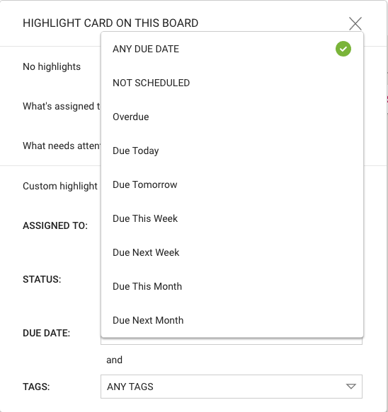
In the recently added Highlights feature, we let you create your own custom highlights:
Smart choices for Due Dates
We fixed a problem where “This Week”, “Next Week”, etc. wasn’t including Overdue Tasks and cards, which could give users a somewhat misleading impression of what they needed to get done in a particular week or month.
After all, if something is already overdue, you will need to get that done this week along with anything that’s scheduled for this week!
Our introduction of lazy loading, as part of our recent redesign, was originally limited to just three columns: Backlog (for Scrum Boards), Done, and Trash.
We figured that these columns were most likely to be very long, and would therefore benefit the most from implementing lazy loading.
This worked well; so well, in fact, that we have expanded our use of lazy loading to work with all columns, across all Task Boards and Scrum Boards.
The practical effect of this should be to reduce the time needed by the browser to load large boards, for all users, on all kinds of computers.