We occasionally get requests from Gmail users for a free Academic/Nonprofit Account; we often have to turn down these requests.
With a free account from Gmail, Yahoo, Outlook, etc., it is impossible for Kerika’s staff to confirm that a user is truly from a qualifying organization.
As a result, these requests don’t get quick approvals, which is available for people signing up with an email address that clearly points to a nonprofit or academic account.
We can make exceptions in particular situations where we are sure a Gmail user is using Kerika solely for a nonprofit purpose, but this is rare.
If you are working at a nonprofit or university, please sign up with your official email address.
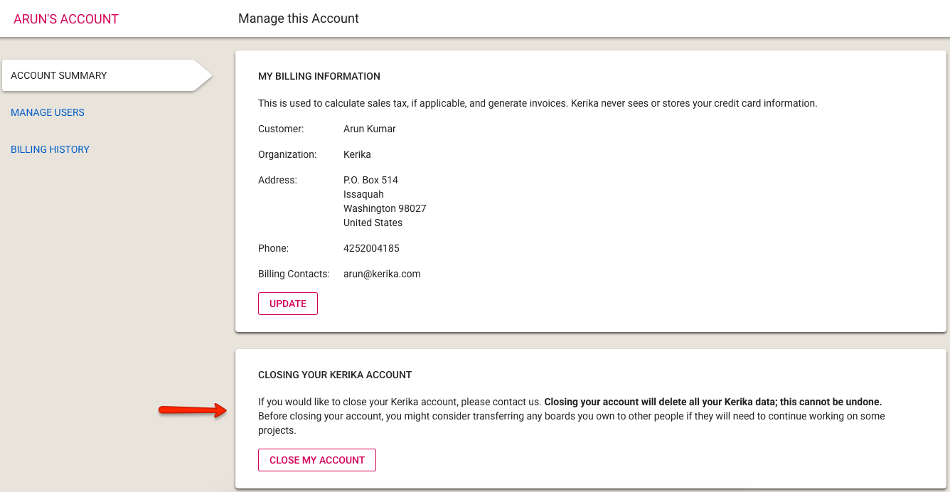
We have made this easier: you can go to the Manage Account page inside the Kerika app and you will see this section at the bottom:
Closing Kerika Account
Clicking on the Close My Account button (and the subsequent confirmation dialog box) will generate an email to Kerika’s Admins, who will then manually close the account.
We have decided not to automate the actual account closure step since it is irrevocable: once your account is closed, all the boards and content on those boards are deleted and cannot be restored.
To help users, we usually wait for a few hours — up to a day at most — before actually deleting the account, in case someone wants to send us an “Oops, I didn’t mean to do that…” email.
This isn’t something that you will see, as a customer, but we have spent several months improving our internal systems for managing users, accounts, payments and invoices.
We used to do things in a very ad hoc way before, as we concentrated all our efforts on improving the Kerika app, but we realized earlier this year that we had reached the limits of ad hoc approaches and needed a lot more automation to handle growth.
Everything, pretty much, is now automated: our admin staff can quickly look up any any user or account, see which payments have been made (online or offline), and manage changes to accounts.
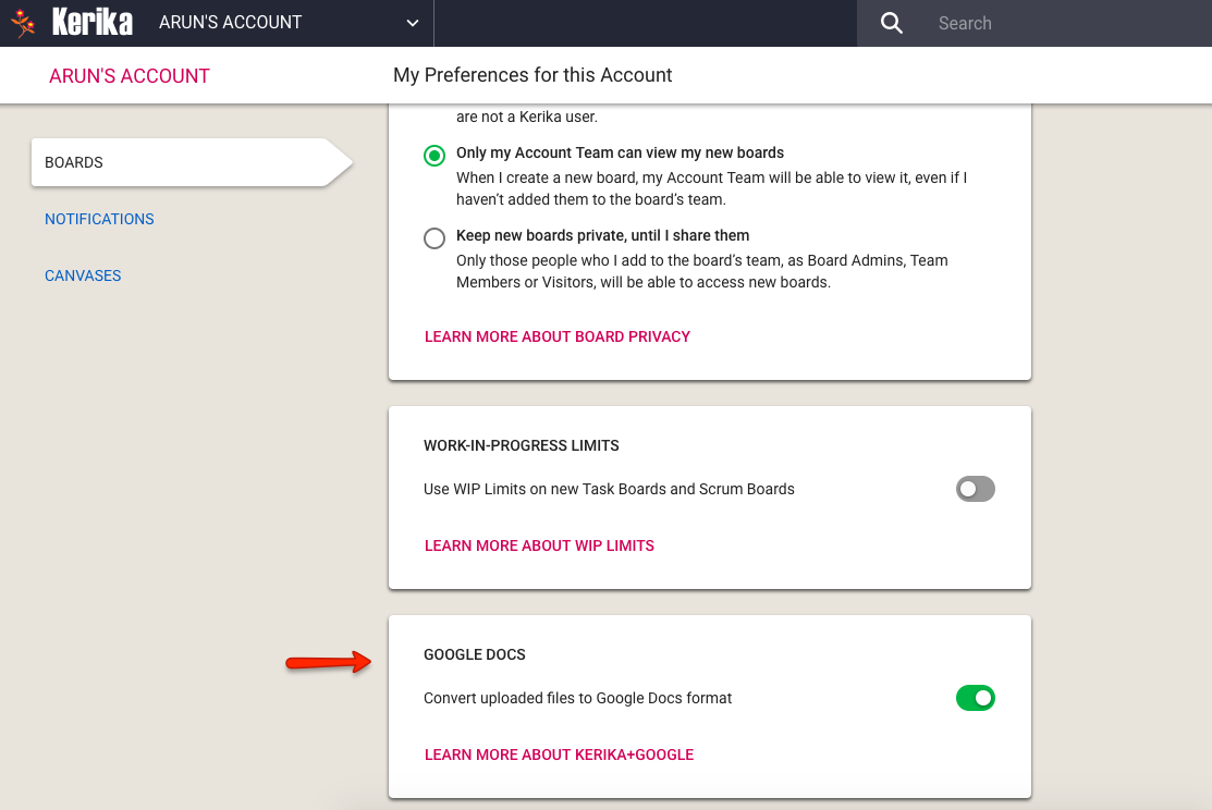
If you are using Kerika with Google, you don’t have to convert your documents to the Google Docs format in order to use Google Drive.
Google Docs Format Preference
You can use this preference setting to ensure that your Microsoft Office documents, for example, are retained in MS Office format even while they they are stored and shared using Google Drive.
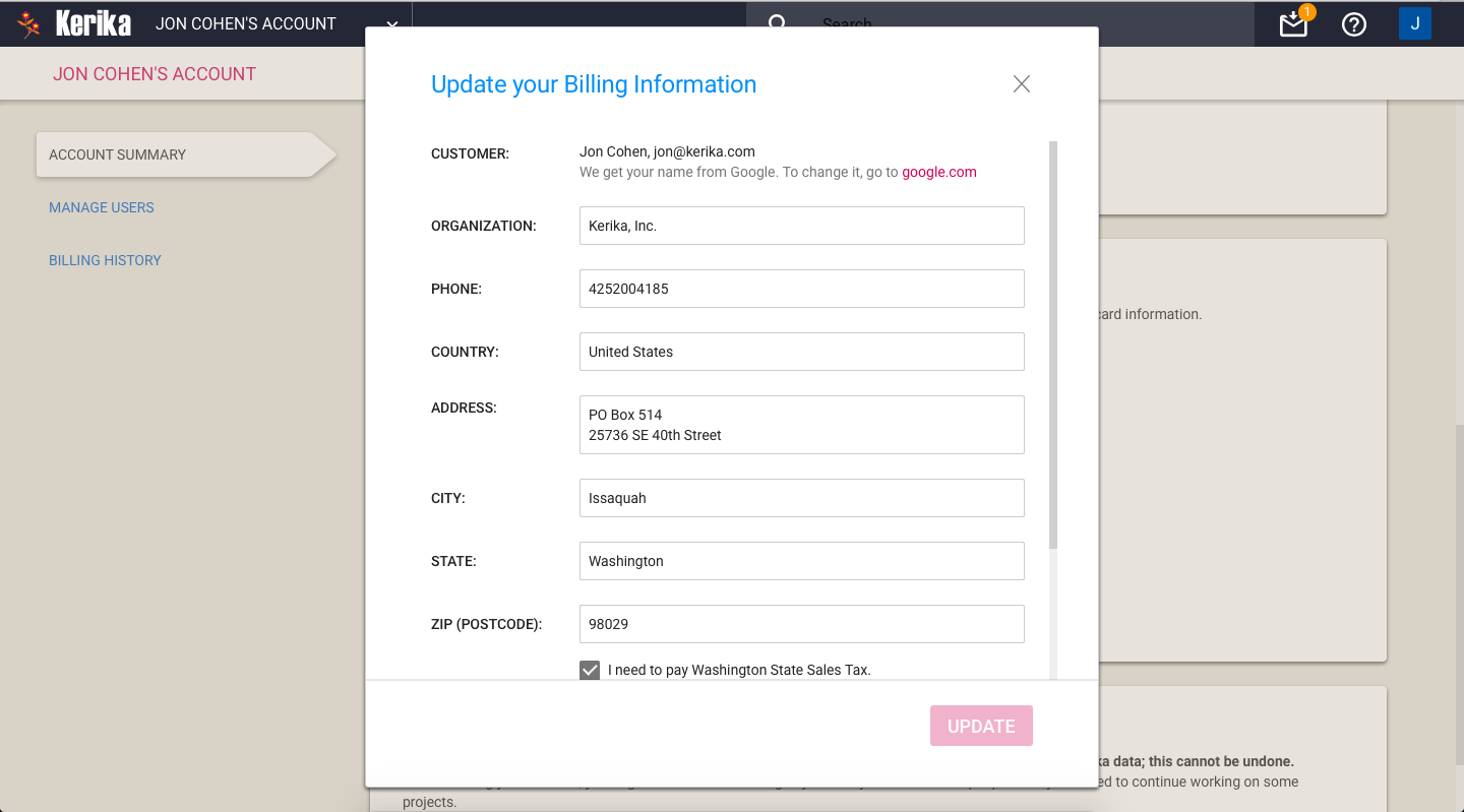
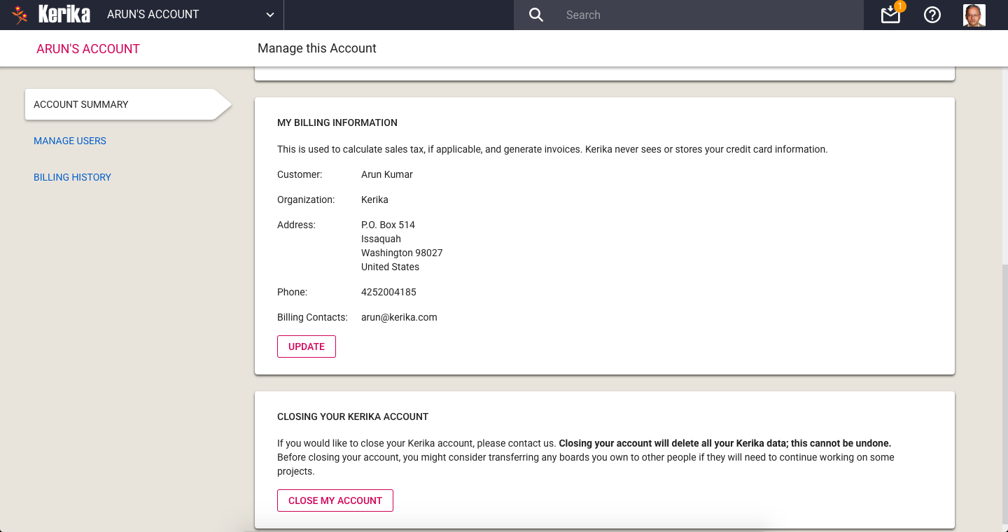
If you purchase subscriptions, or do other actions like request a refund, Kerika prompts you to update your Billing Information:
Updating Billing Information
This information is needed to complete a transaction:
Your name or organization (school, college, nonprofit, company, government agency…) are used to ensure invoices and receipts are addressed to the correct person (the purchaser).
Your phone number is needed to handle any problems we face processing your invoices or purchases.
Your address is used to create invoices and receipts, and to check whether we need to charge you Washington State sales tax.
At the bottom of this screen you can optionally include Billing Contacts: people who need to get copies of all your transactions, such as your organization’s Purchasing Department or outside accountants/bookkeepers.
We store this information securely: as you may have already noticed, all access to Kerika servers is done using SSL/HTTPS, and within the Kerika virtual network, our servers communicate with each other using SSL as well.
We never ask for your credit card information: we use Stripe to handle all online payments, and we never see your credit card at any time.
If you pay by bank check or electronic funds transfer, this information is handled by Bank of America: details of these transactions, such as your bank information, are stored only at Bank of America and not stored on the Kerika servers.
The rollout of our new billing system seems to have been smooth — so far, fingers crossed! — and with this you now get better controls over who is part of your Account Team:
Manage Users
Please note that you don’t get charged for Visitors: if someone is only a Visitor on your boards — i.e. is not a Team Member or Board Admin on any board you own — you don’t need to pay for this person.
It doesn’t matter how many boards this person “visits”.
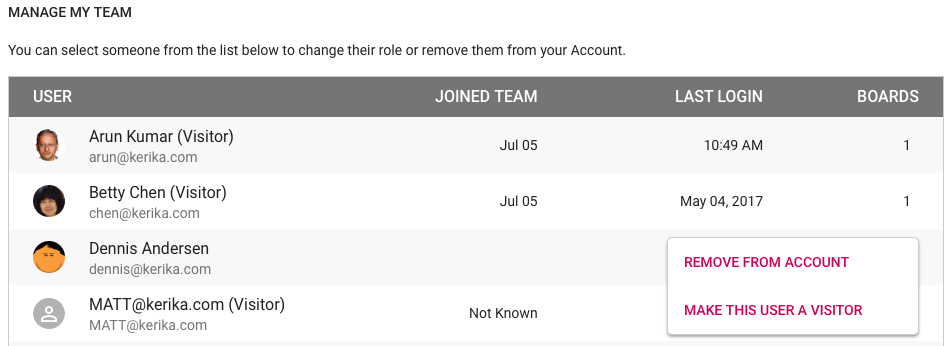
Visitors do show up on your Manage My Team list in the Manage Users tab, so you are reminded that they have access to some, possibly all, of your boards, and you can remove a Visitor entirely from your Account in the same way that you might remove a Team Member or Board Admin.
With the new billing system that we will be rolling out next week, Kerika will also be adding a slew of account management features that will make it much easier to purchase subscriptions, manage teams and handle your payments.
Manage Account options
The Manage Account screen has a new layout, with three tabs on the left: Account Summary, Manage Users, and Billing History.
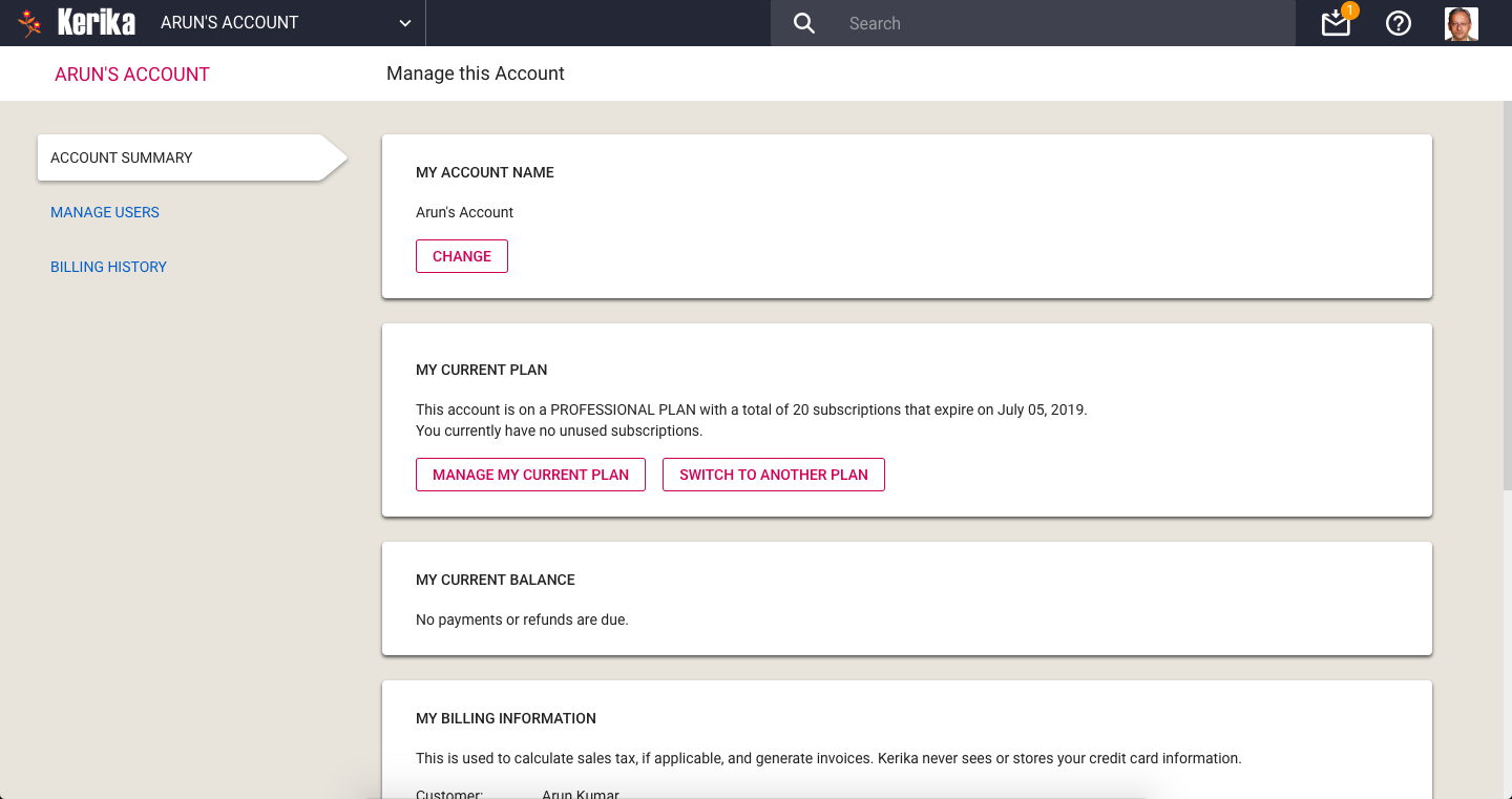
Account Summary
This page has several sections, starting with your Account Name at the top. When you create an Account, you can give it any name that you like, and on this page you can change it if needed. Changes to the Account Name are shown instantly to everyone who is viewing boards owned by your Account.
Next is a section that lets you manage your Kerika subscriptions. You can see which plan you are currently on — Individual, Nonprofit or Professional — and switch to a different plan if needed.
People on a paid Professional Plan can manage the number of subscriptions they currently have (you need enough to cover your current Account Team, which consists of everyone who is currently a Board Admin or Team Member on the boards owned by your Account.)
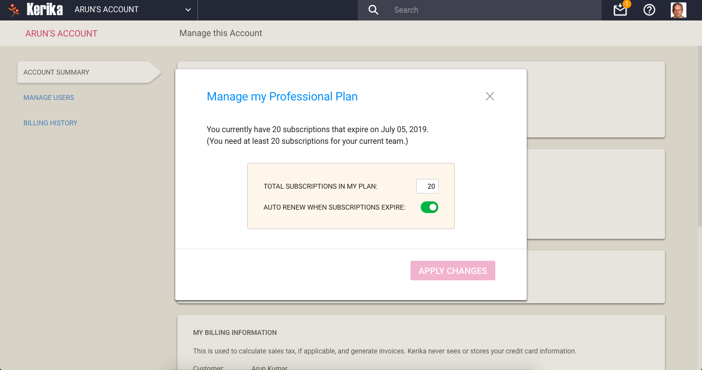
Managing your Professional Plan is easy: you can increase the number of subscriptions you have, or decrease them.
Manage Professional Plan
All subscriptions have the same end-date: this makes annual reviews and renewals easy for Account Owners. You can also decide whether you want to turn on, or off automatic renewals of your subscriptions.
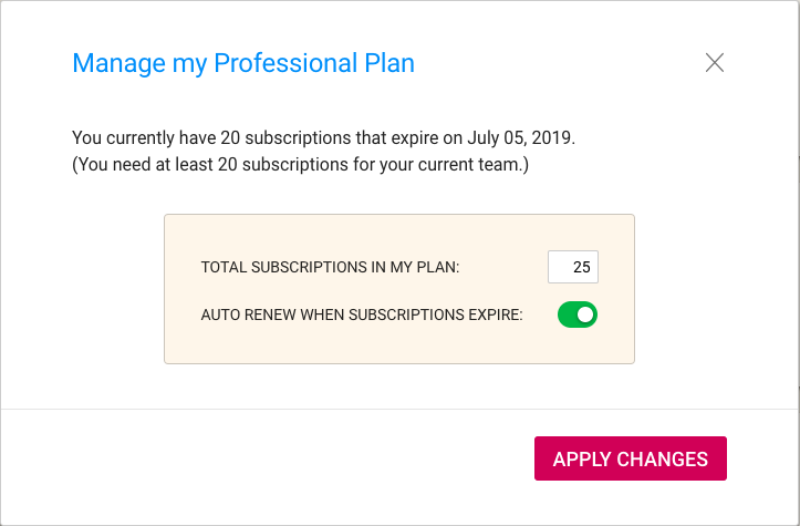
Changing number of subscriptions
In the example shown above, the user is increasing the number of subscriptions from 20 to 25. The system reminds the user that he needs at least 20, for the size of his current Account Team.
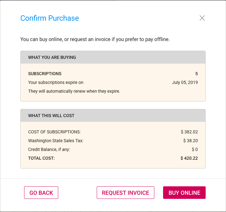
Confirm purchase
With our new billing system, it’s easy to make purchases online, or request that an invoice be sent to you.
Online purchases are handled by Stripe, so Kerika never sees your credit card information.
If your Account currently has a credit balance, because you had reduced the number of subscriptions, this is reflected in your purchase: by default a credit balance is applied to future purchases, but you can also request a check be mailed to you if you don’t plan to use your credit balance.
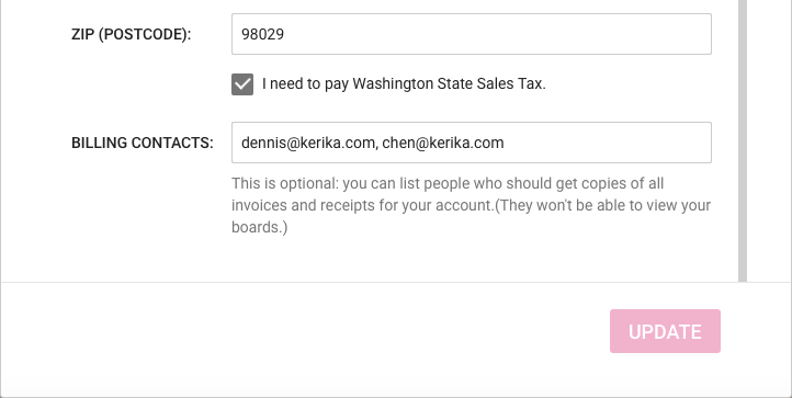
If you are located in Washington State (in the USA) we may be required to charge you Washington State Sales Tax. You can specify whether this applies to you by updating your BillingInformation:
Billing Info
Your Billing Information contains just your address and phone number; we never ask for, or store, your credit card or bank information.
Updating Billing Information
One useful new feature we have added is the concept of Billing Contacts:
Billing Contacts
Billing Contacts can be any set of people who need to get copies of all your Kerika transactions, e.g. your manager or Purchasing Department. Every purchase will generate a PDF for the transaction which will be automatically emailed to all the Billing Contacts for the Account.
Billing Contacts can include people from outside your organization, e.g. if you use a bookkeeping service from another company. Billing Contacts only get copies of your receipts and invoices; they don’t have access to your boards, and are not considered part of your Account Team.
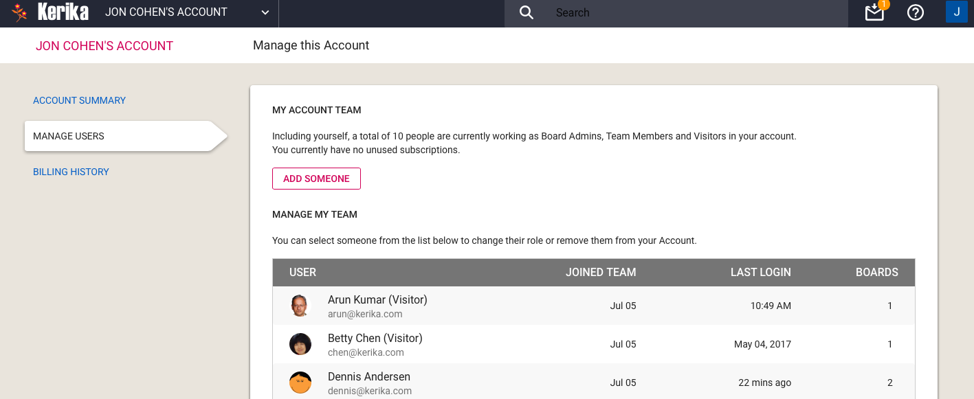
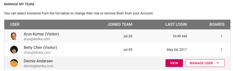
Manage Users
The Manage Users page has been enhanced as well: you can see at a glance who is currently part of your Account Team, and now it is possible to invite someone to join the Account as a whole: previously people could be invited to join only a specific board.
Manage Users
For each member of your Account Team, Kerika will list the date when they joined your Account, the date of their last login, and the total number of boards where they are currently a Board Admin or Team Member.
This makes it easy to see at a glance how active someone is, if you are wondering whether to continue paying for their subscriptions.
(Note: in some cases the “Joined Team” information may not be available if it was months or years in the past; we didn’t start tracking this information until we started building the new billing system.)
Selecting a member of your Account Team offers additional actions:
Account Team actions
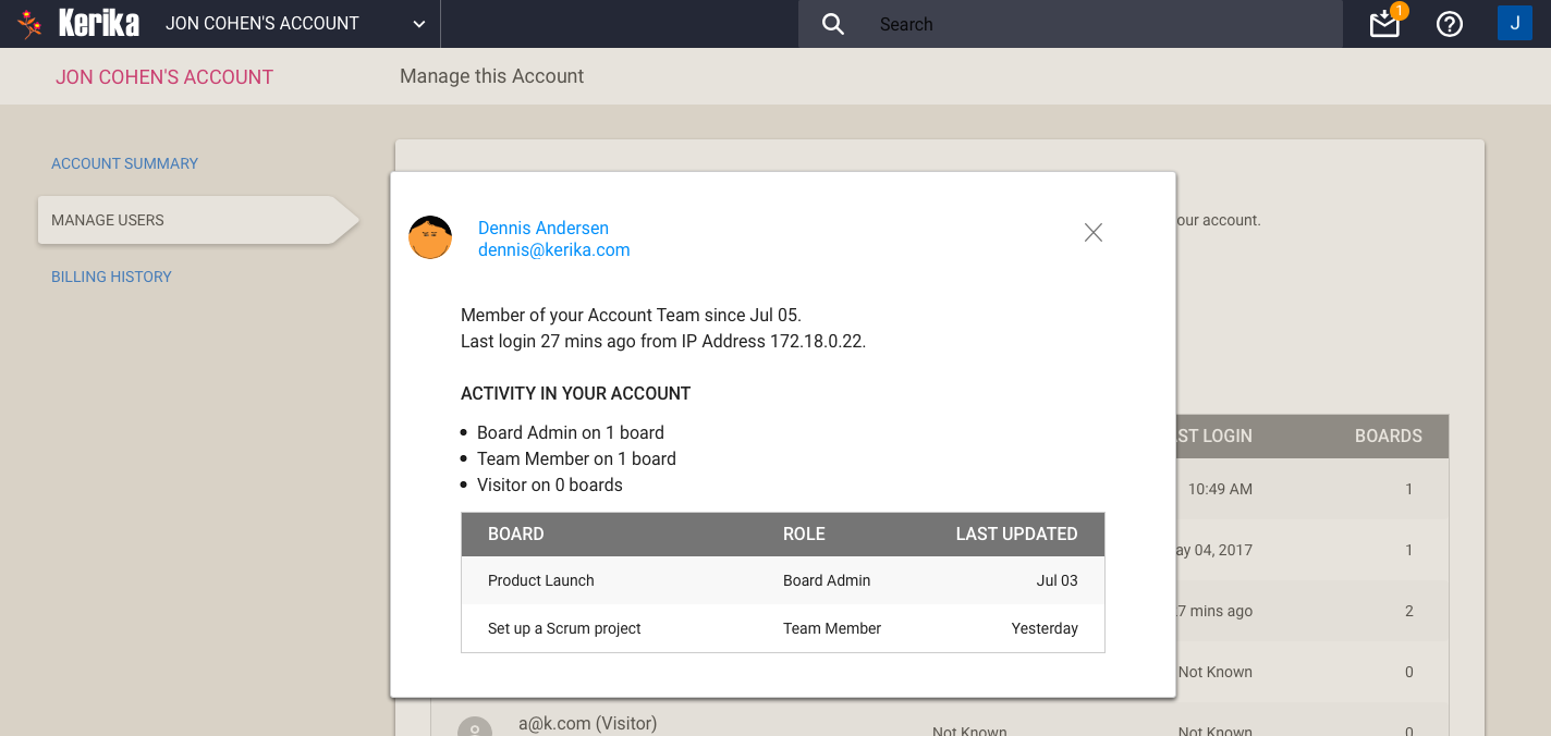
Clicking on the View button gives you a more detailed view of particular member of your Account Team:
Account Team Member detail
One new feature is you can see the IP address last used by the team member: this can be helpful in security reviews.
With the Manage User button, you can also remove someone from your Account Team altogether, demote their role to Visitor (across all boards owned by that account).
Remove from Account Team
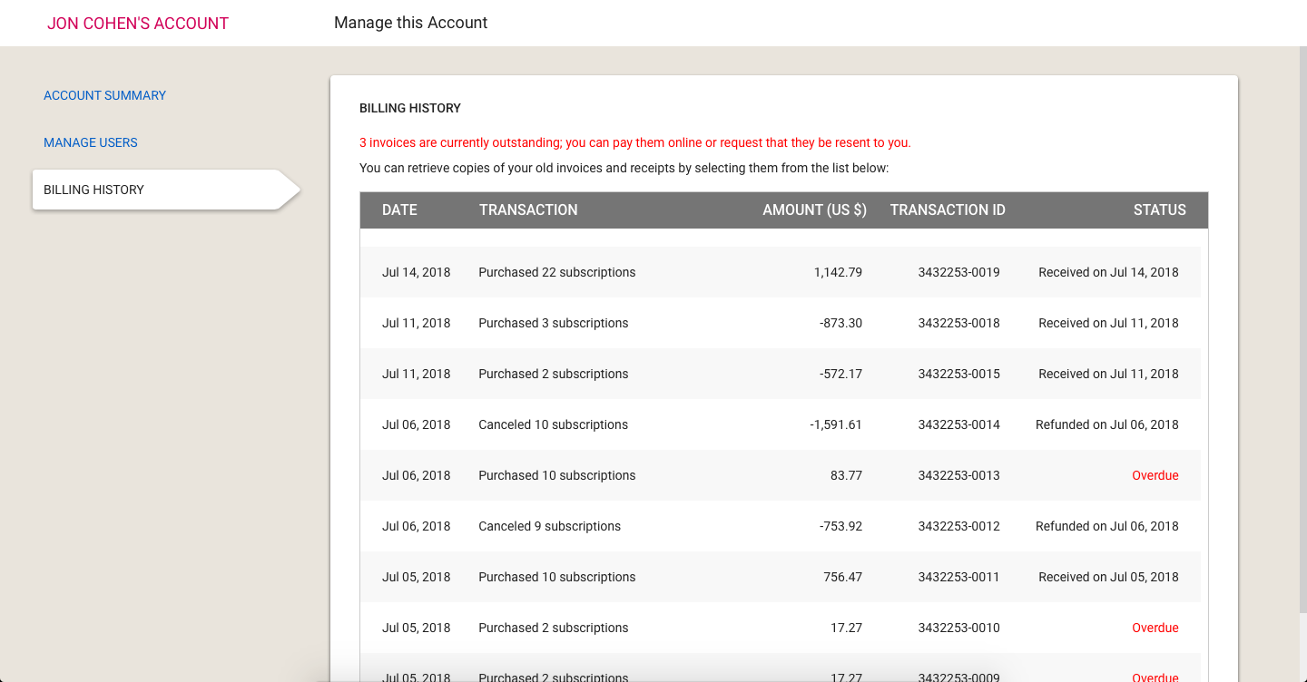
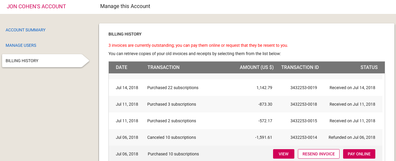
Billing History
Going forward, all transactions — including online and offline payments — will be tracked automatically by the new billing system.
We will start keeping a history of your transactions going forward (we won’t have all the old transactions; sorry) and they can be accessed through the Billing History page:
Billing History
If you have an overdue invoice — and we sincerely hope you don’t! — you can pay it online, or request it to be resent to the billing contacts for the Account:
Overdue Invoice
Summary
The new billing system took a lot of work, over many months, but it was long overdue: our old billing process was largely manual, and somewhat error-prone.
Unlike some of our competitors, we understand that even though Kerika is software-as-a-service (SaaS), not everyone is set up to make online purchases. That’s why we have made it equally easy for people to receive invoices and make payments offline, e.g. by bank check or funds transfer, and have these transactions show up inside their Kerika account with the same flexibility as online purchases.
All of this should go live at the beginning of next week!
We recently got hit by spammers signing up as Kerika users, using fake emails from domains like mailinator.com, which seems to exist principally to help people do bad things on the Internet.
After signing up, these spammers (who seemed to be based in the Philippines) would invite hundreds of people with accounts on Tencent’s qq.com service in China. This would result in invitations being sent to these qq.com people to join the spammers on their Kerika boards.
To avoid a repeat of this problem, we are using Google’s reCAPTCHA in “silent” mode, on our signup and login pages — for people who sign up directly with Kerika using their email addresses.
This doesn’t affect the majority of our users, since most people sign up using their Google or Box accounts. And because the reCAPTCHA works silently, it shows up only when Google has reason to doubt that the person at the keyboard isn’t human.
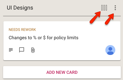
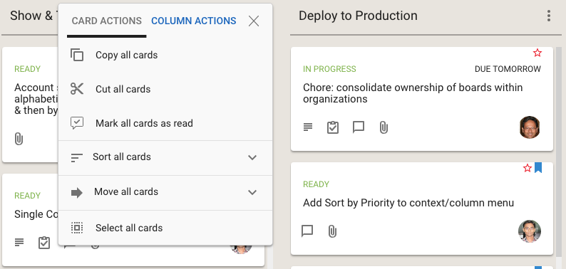
We used to have separate button, and associated menus, for actions related to cards and for actions related to columns:
Separate card and column actions
This reflected the history of the Kerika product: we first designed and built the card actions, and much later added the column actions.
In retrospect, however, we concluded that separating these into two separate menus was not a good idea: it was confusing for our users to remember which menu supported which action. (Even the Kerika team, which uses Kerika for everything that the company does, was having trouble remembering the differences between the two buttons and menus.)
We have fixed that usability problem with our latest release: a single button is shown, and the popup menu that appears includes both card actions and column actions:
Combined Card and Column Actions Menu
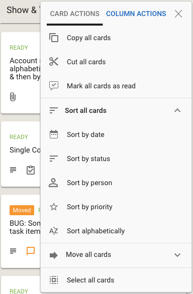
Clicking on the Sort and Move actions brings up all the sorting and moving options you have; the Sort menu now has a much richer set of actions:
Sort options
We have also done some small tweaks to the sorting action: Sort by Status now puts the On Hold cards at the bottom of the column, below all the ones flagged as Normal.
We had previously been using SSL certificates for our website (kerika.com) and this blog (which is on a subdomain: blog.kerika.com) that we got from GoDaddy, but we have moved away from them.
What pushed us away was their aggressive approach to billing customers: they automatically renewed our SSL certificates after just 9 months into a 12-month contract, which we found unacceptable. Talking to their customer service people was an unhappy experience as well, so we decided to not do any more business with GoDaddy.
Now we are using a SSL from Amazon for our website and app (kerika.com): Amazon actually provides free SSL certificates to sites hosted on Amazon Web Services, and it was easy and simple to set up.
However, AWS doesn’t provide wildcard SSL certificates so we couldn’t handle our blog as well — particularly as our blog isn’t hosted at AWS. Instead we got a SSL certificate for the blog from RapidSSL which is reasonably priced.